Cogeco Amphitheatre
ATRV 2016-11-18 © Adrien Williams-003_2880x2158.jpg
 

COGECO AMPHITHEATRE

Location 100, avenue des Draveurs, Trois-Rivières, Quebec, Canada

Status Built 2016

Client City of Trois-Rivières

Type Performance, Cultural, Public

Building Area 12 458 m² (total) / 4 945 m² (indoor)

Capacity 8 988 (fixed seating + lawn)

Roof Dimensions 80 x 90 m

Roof Height 26 m

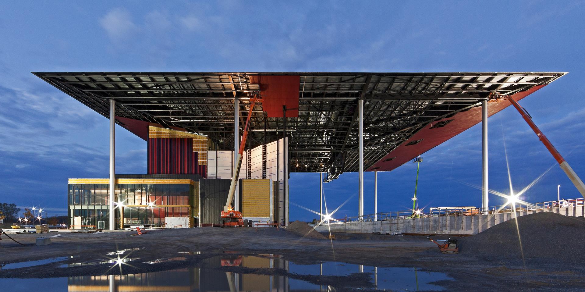
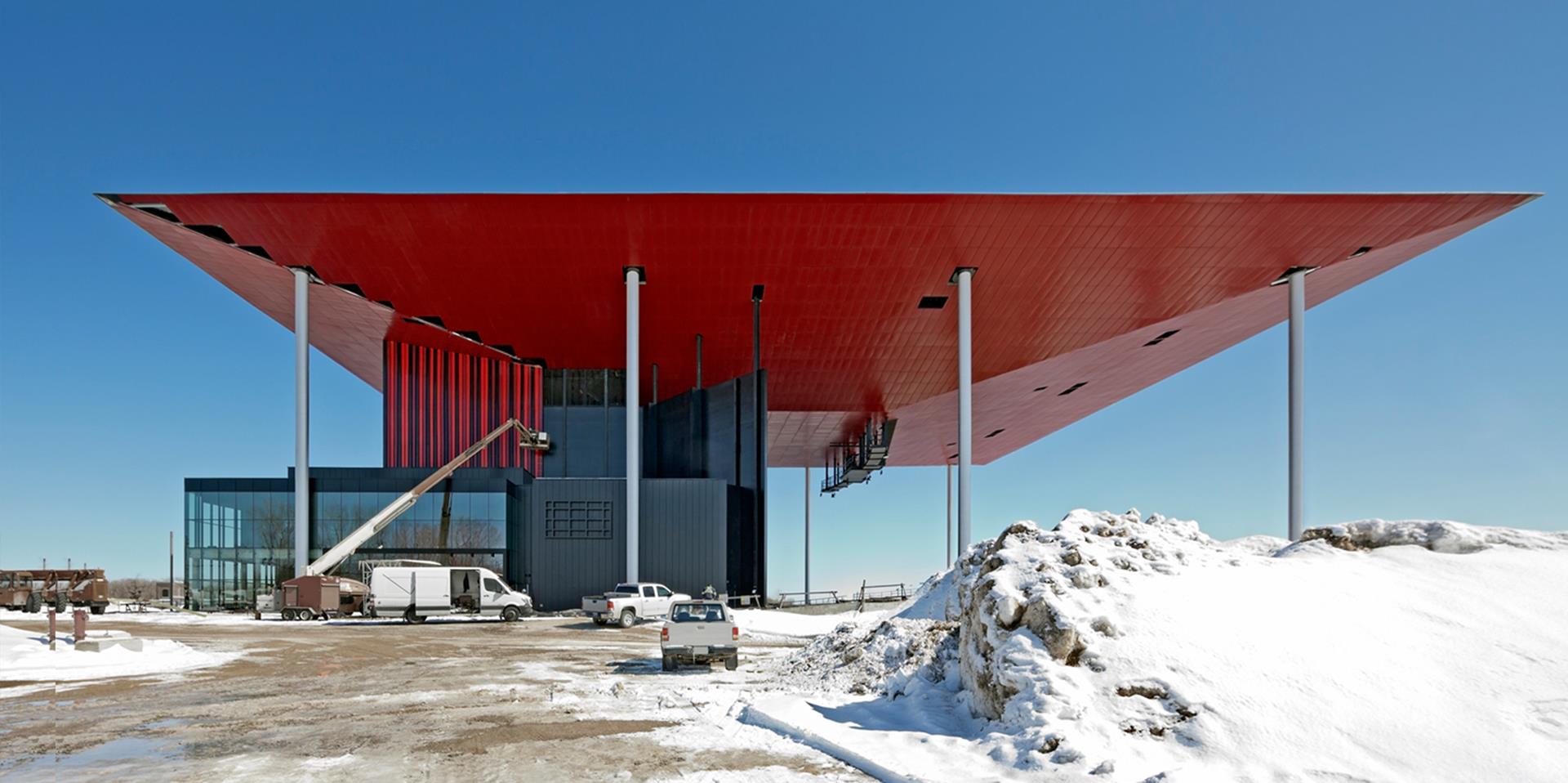
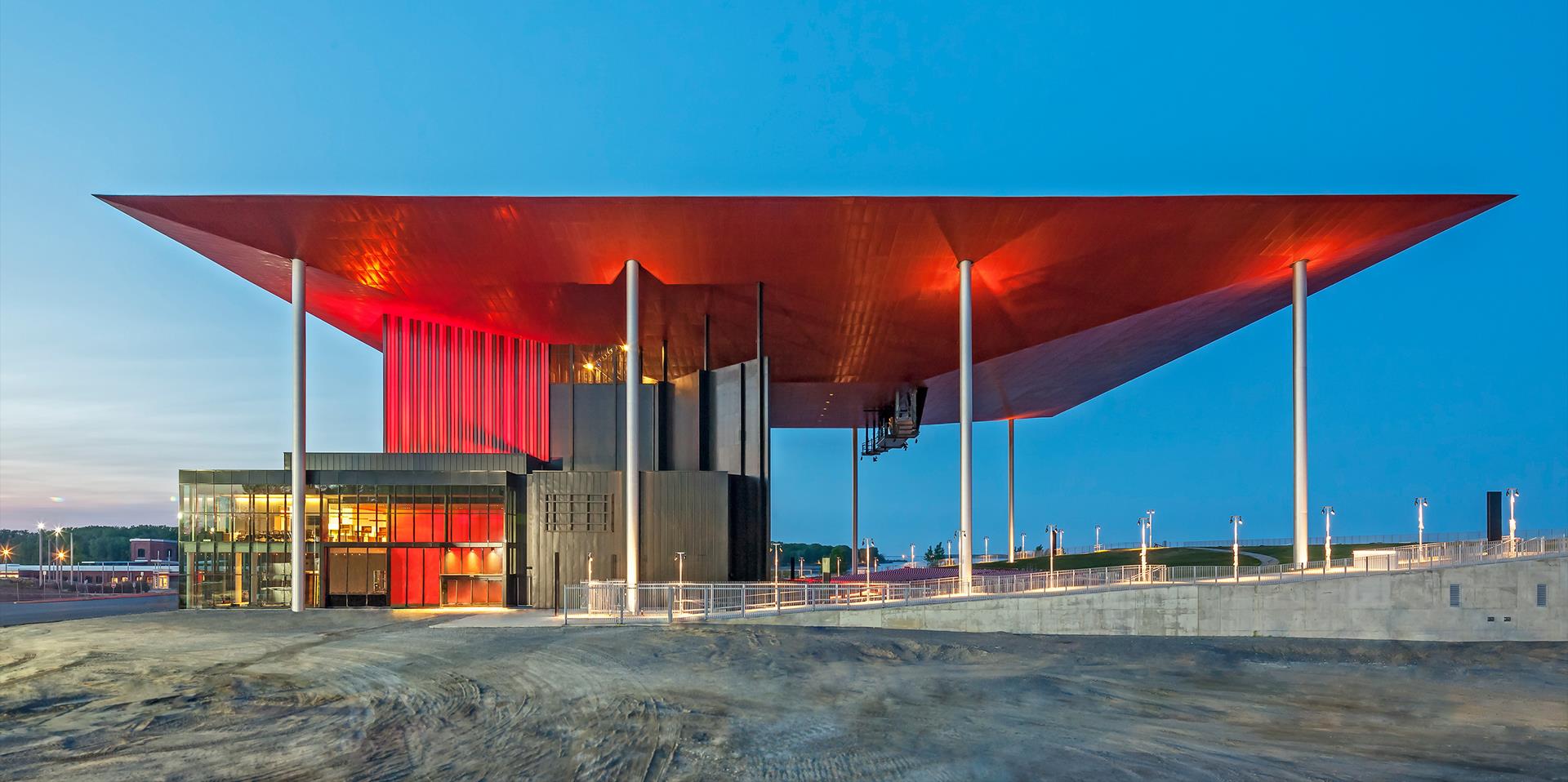
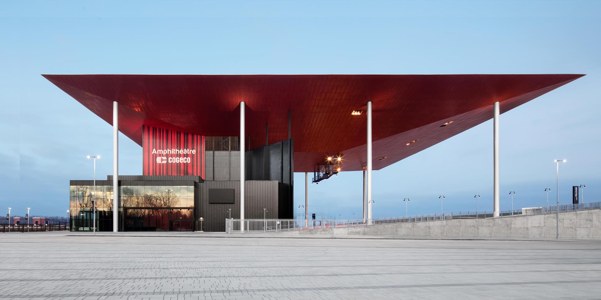
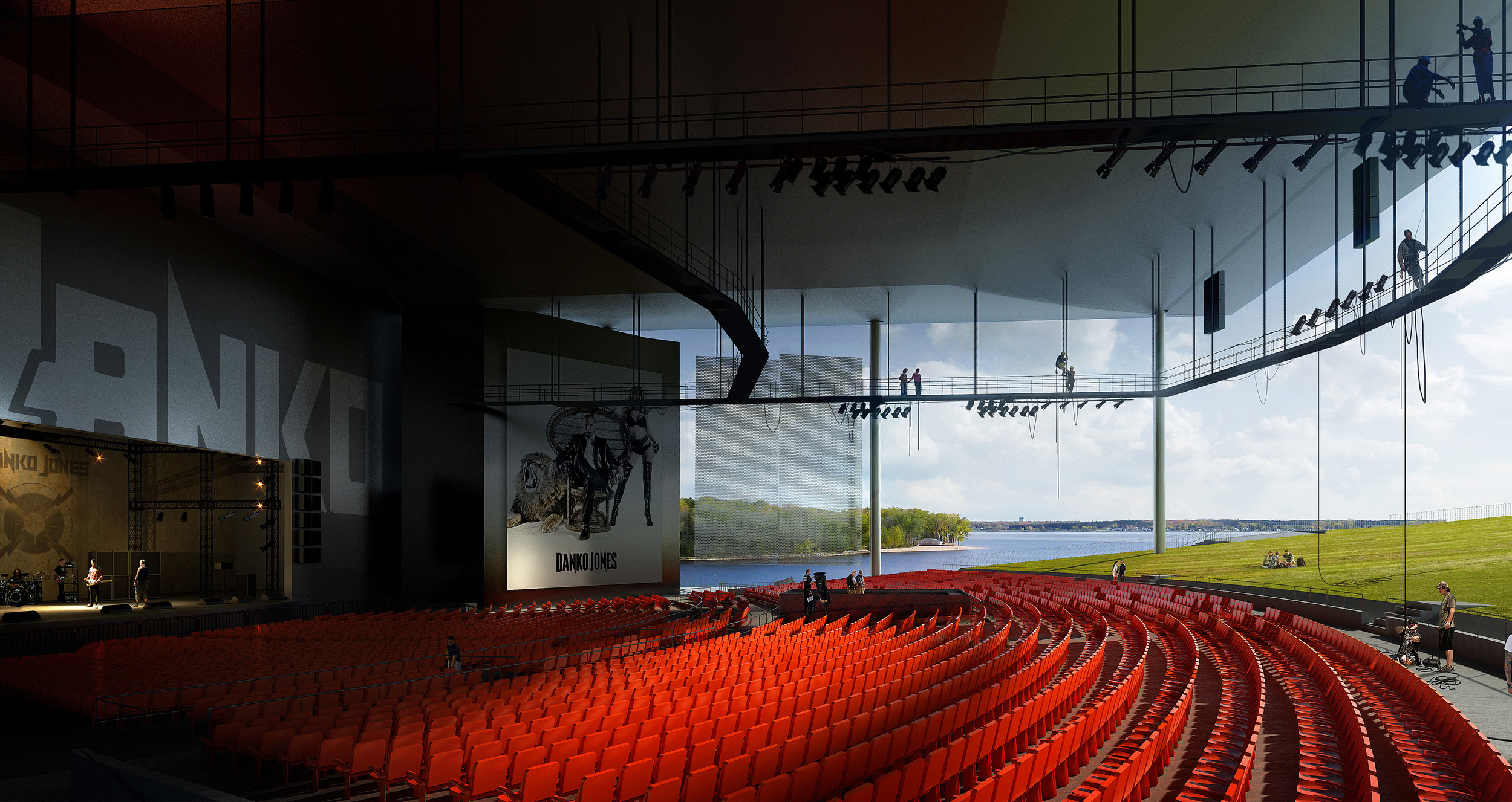
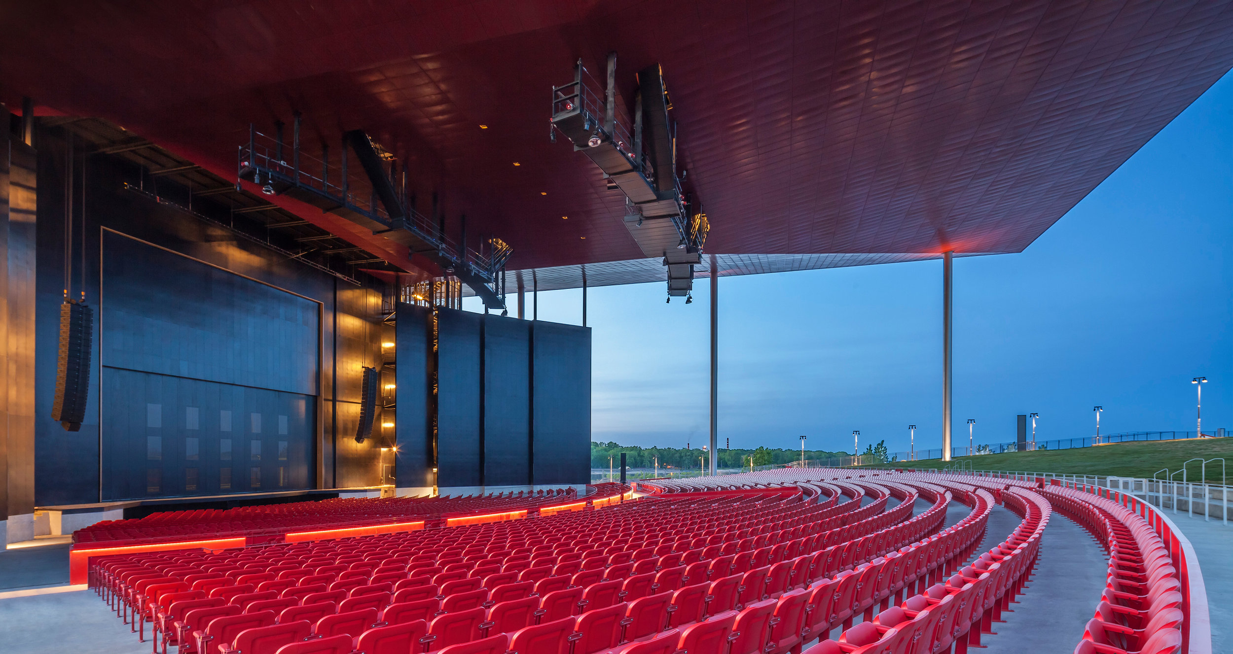
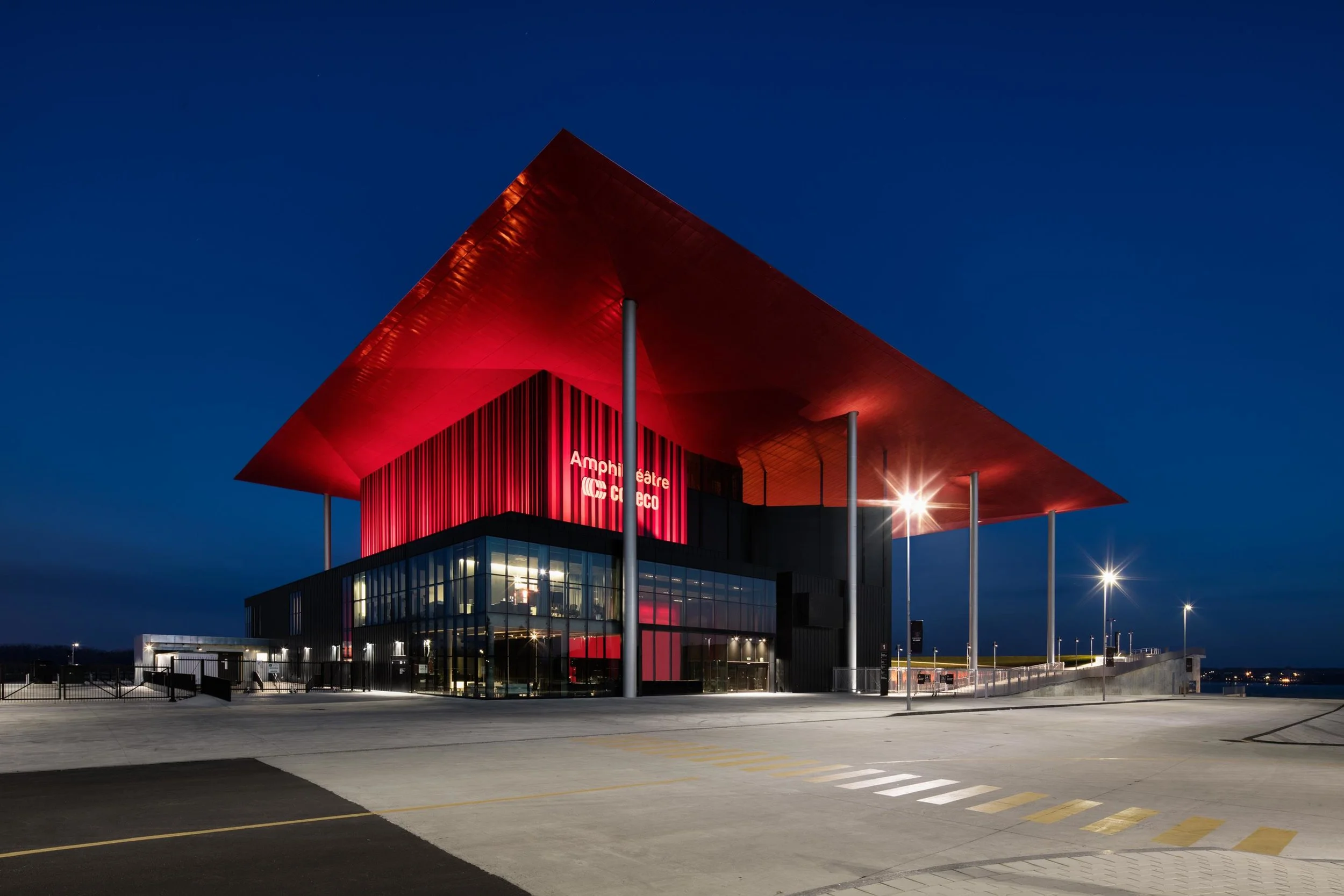
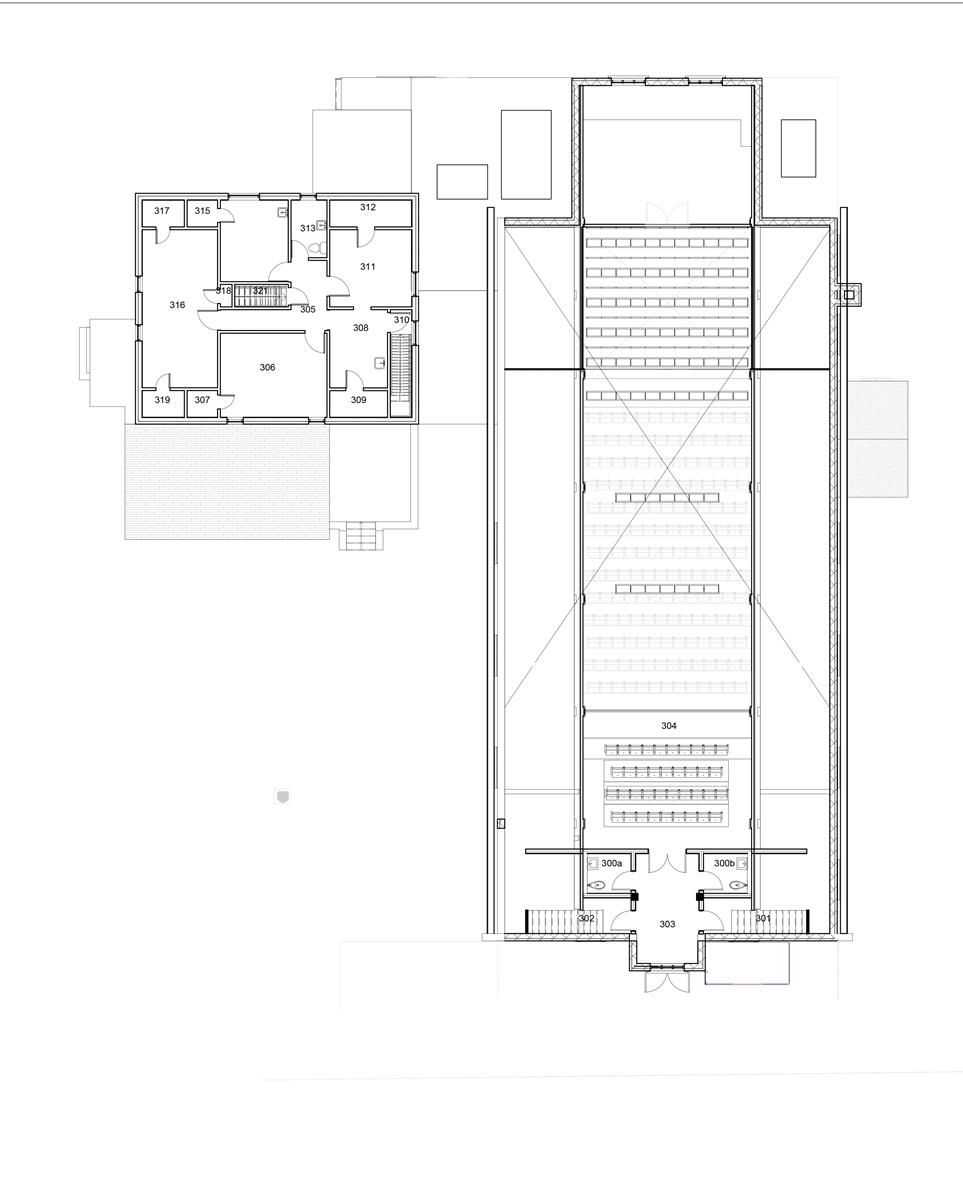
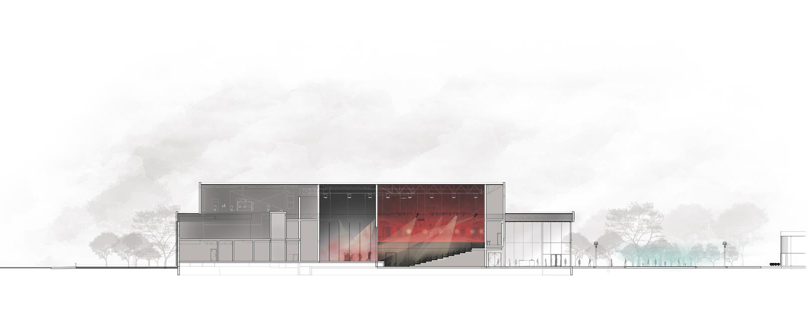
The Cogeco Amphitheatre is an iconic venue located in Trois-Rivières, Canada. The building hosts outdoor performances for up to 9 000 people with a stage that becomes an indoor cabaret during winter with a capacity of 700 seats.


Photo Marc Gibert

A Strategic Site

In 2010 an architectural competition was launched for the design of a new 9 000 seat amphitheatre to revitalize the city’s depressed economy while at the same time support its cultural offering.

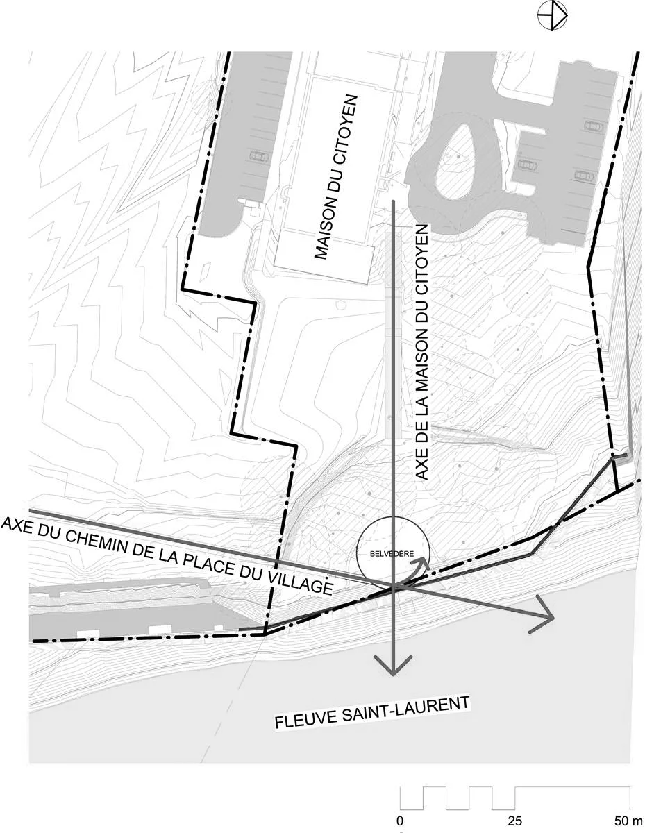
The project creates a landmark on one of the city’s most beautiful site, previously occupied by a paper mill that was shut down in the early 2000s due to the industry’s collapse. The site’s location, adjacent to the harbour front park, the city centre, the Saint Lawrence River and Saint Quentin Island, called for a majestic, harmonious and vibrant construction.

“Because of its location on an open site along two major waterways, it is much more than an amphitheatre,” says architect Paul Laurendeau. “It is a new landmark that extends the citys’ boundary to the water.”

Photos Adrien Williams


The Monumental Roof in Construction

Views of the project from the competition renderings in 2011 to the final built work in 2016.

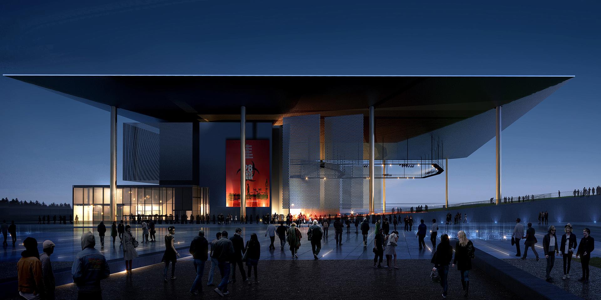
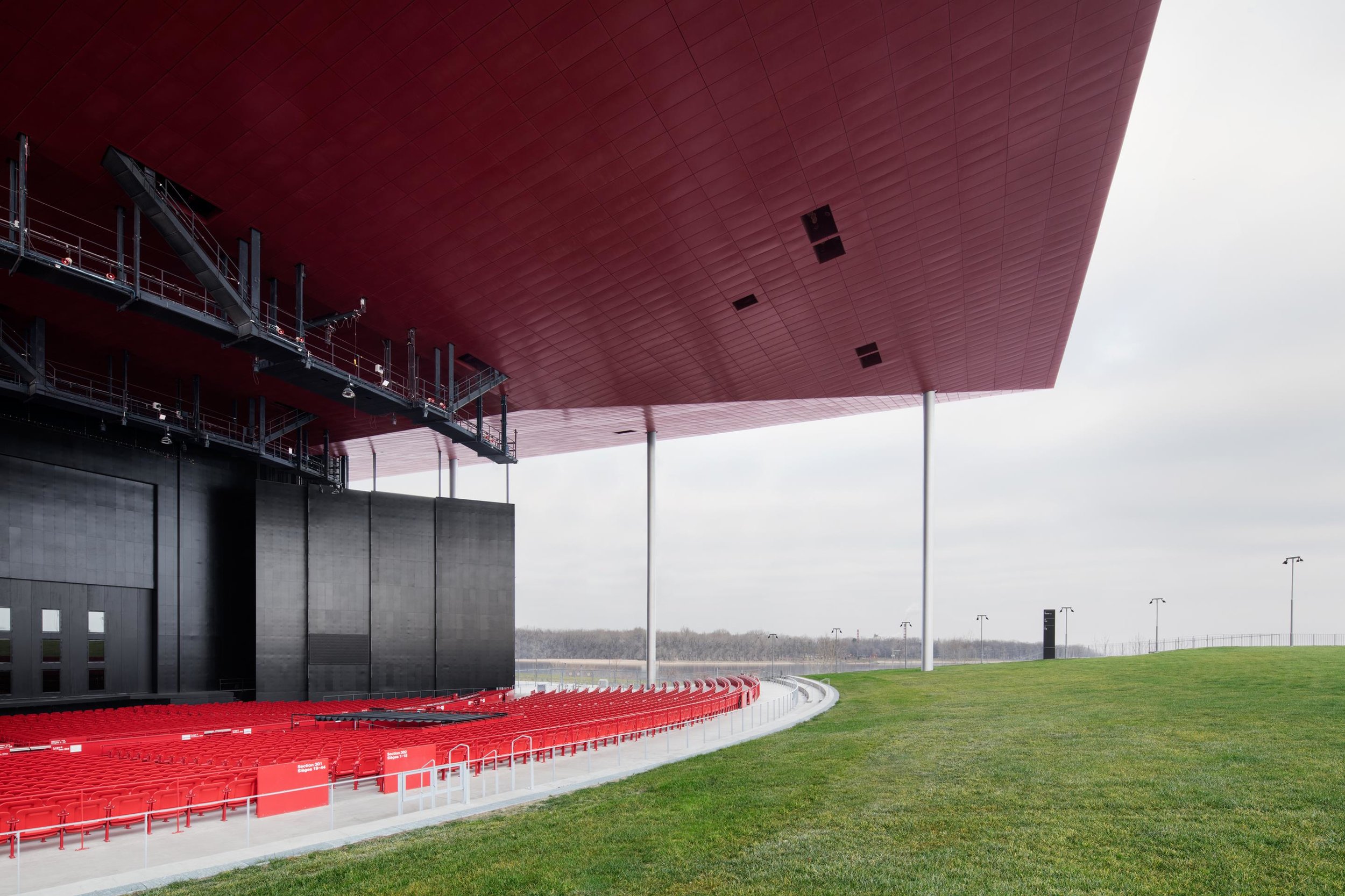
The iconic roof with it sharp edge and 8 slender columns has been realized as planned. Its colour evolved from black to red to create more drama and intensity in relation to its function.
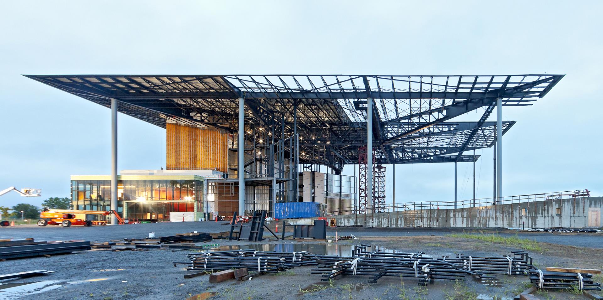
 

We Wanted to Create a Landmark for Trois-Rivières

“The idea was to have a big roof, actually a huge roof, to act as a symbol that can be seen from far away.”


Wood Letters

Are they made of wood? The 6-meter tall letters that spell the name of the city TROIS-RIVIÈRES are made of 200 mm thick cross-laminated timber wood supplied by KLH of Austria. They were cut at the factory and sent by container over the Atlantic from Hamburg to the port of Montreal.

Watch the video to see the cutting of the wood panels and their installation.

ATRV Cross Laminated Timber.jpg
ATRV 2016-11-18 © Adrien Williams-006_2880x1920.jpg
 

Colours

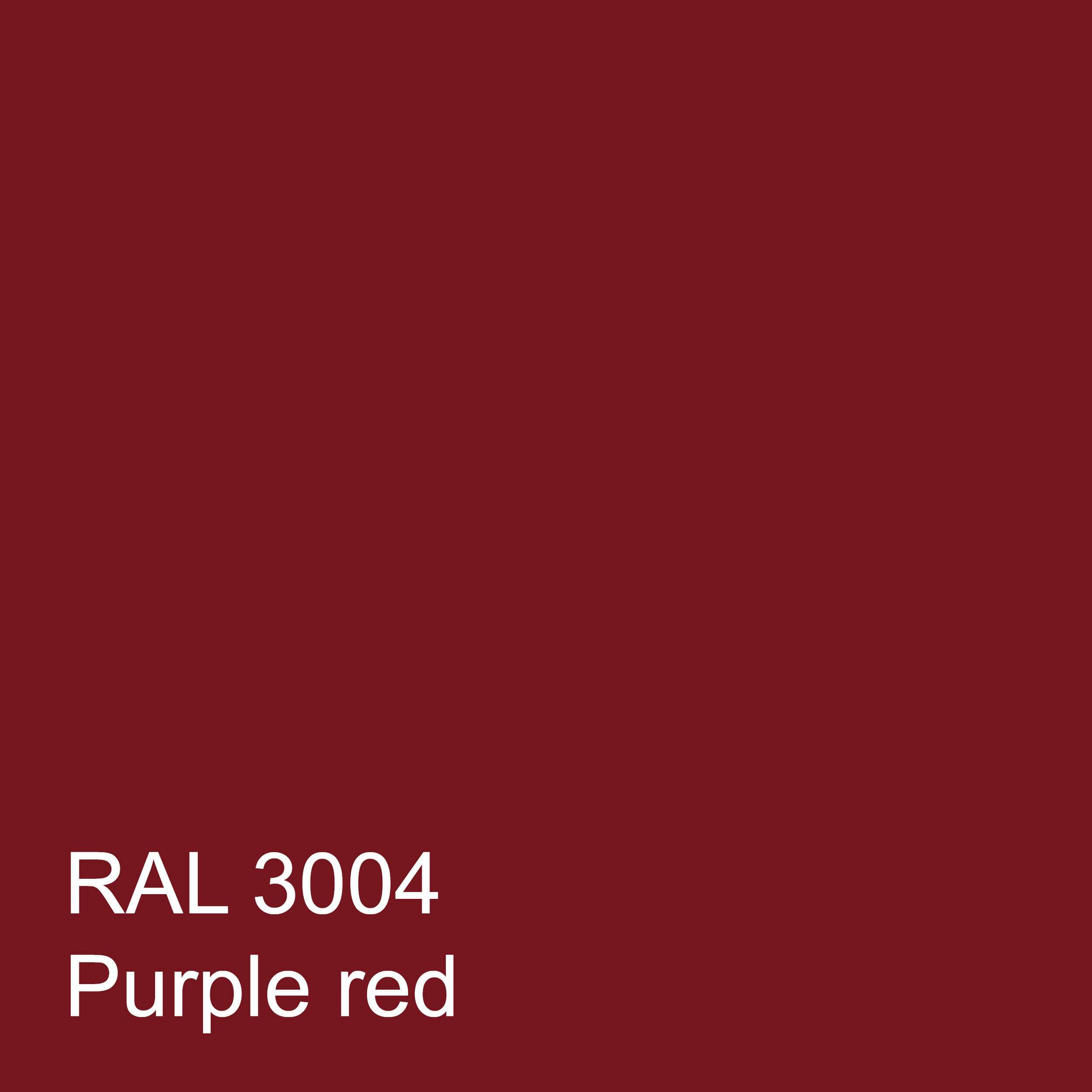
Colours give life and express a building’s function. The choice of black and red is a common combination for theatres and performance spaces.

How do I select colours? I rely on free association, experience and testing.

Photo Marc Gibert

Photo Marc Gibert


The Beauty of Concrete

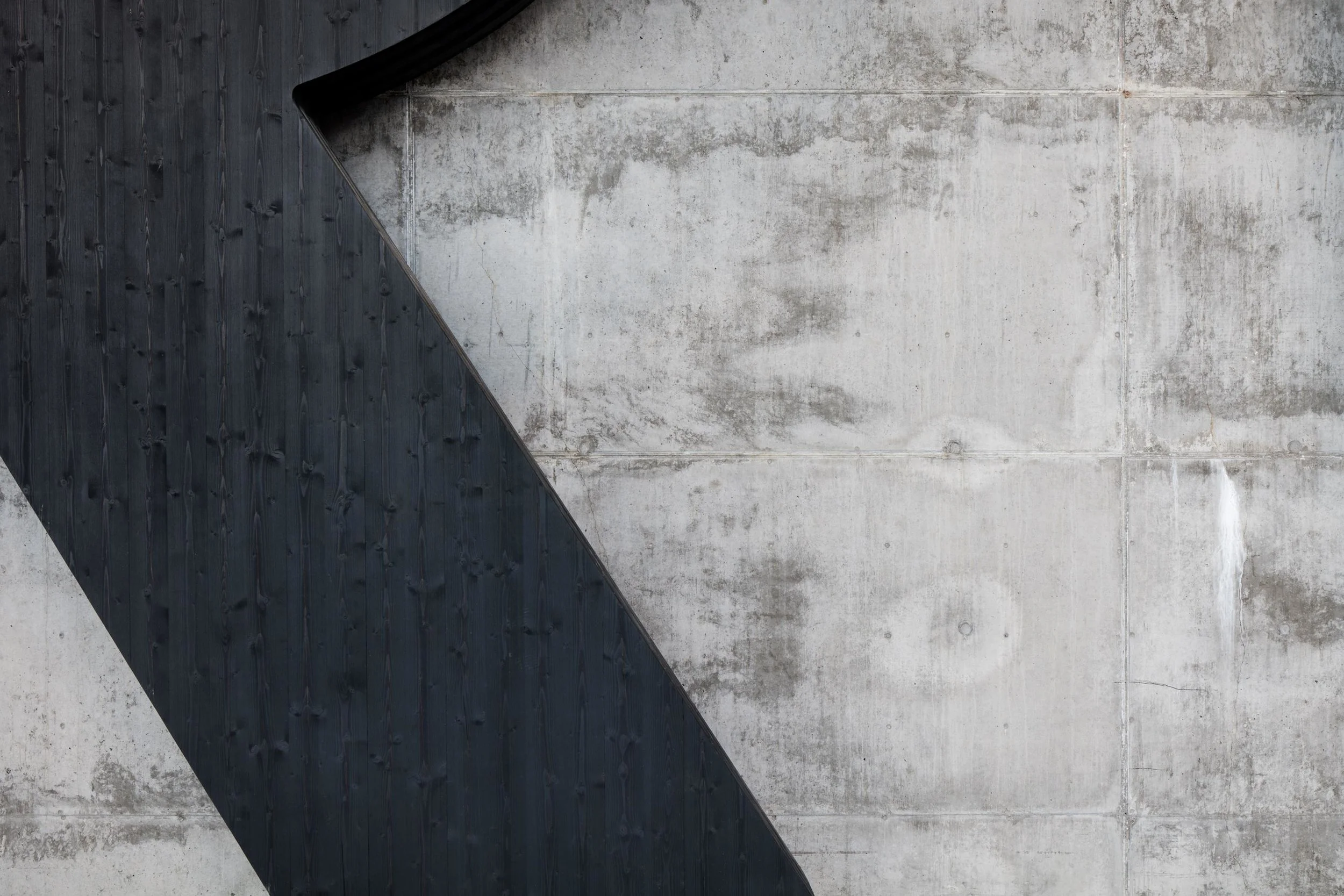
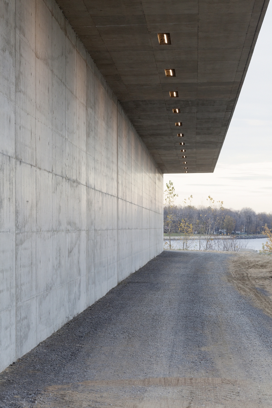
Concrete is a natural material with tactile properties. It imposes a sense of solidity and eternity. It’s surface is shiny when poured into smooth formwork.

Photos Marc Gibert and Adrien Williams


The Audience

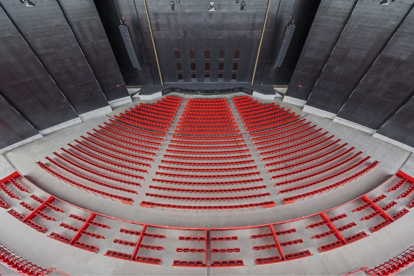
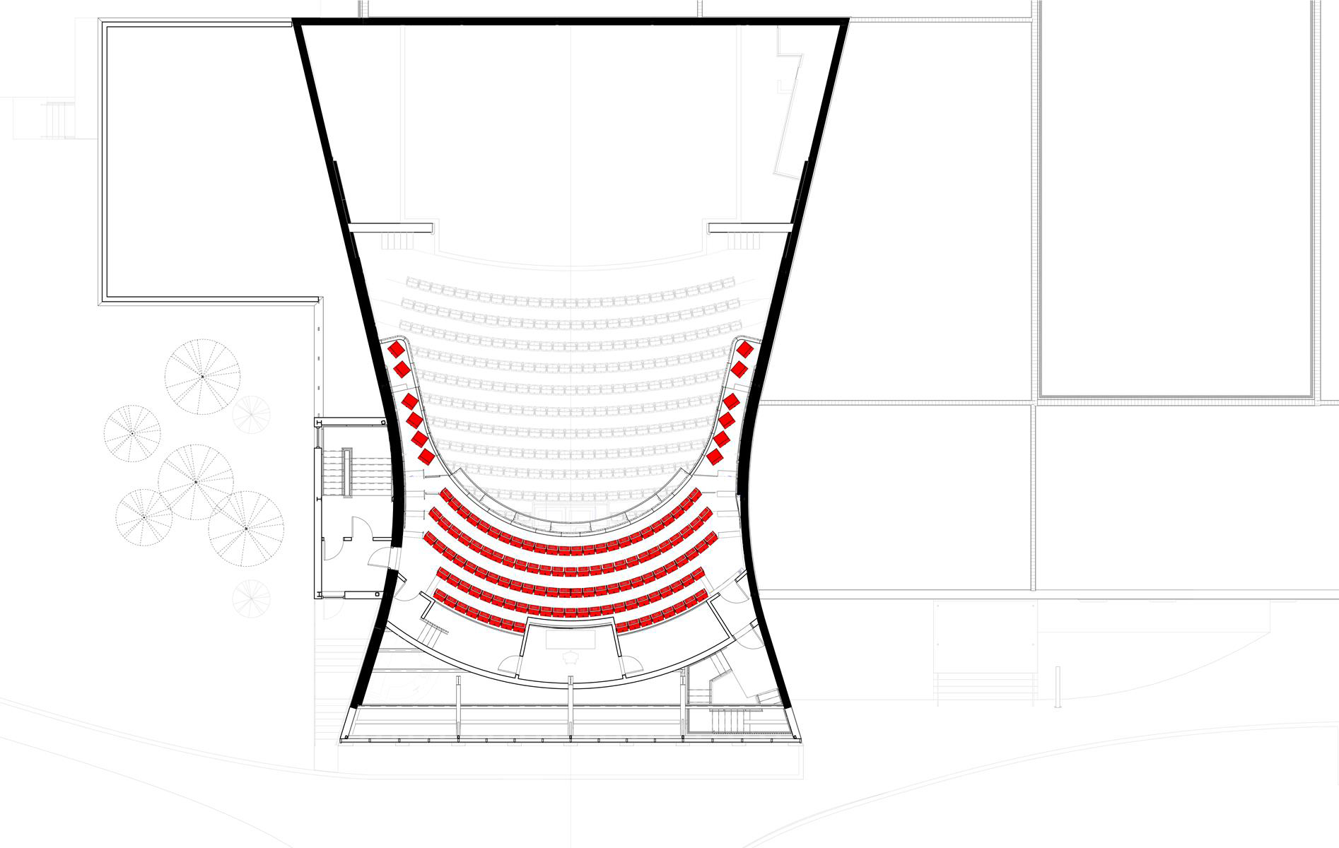
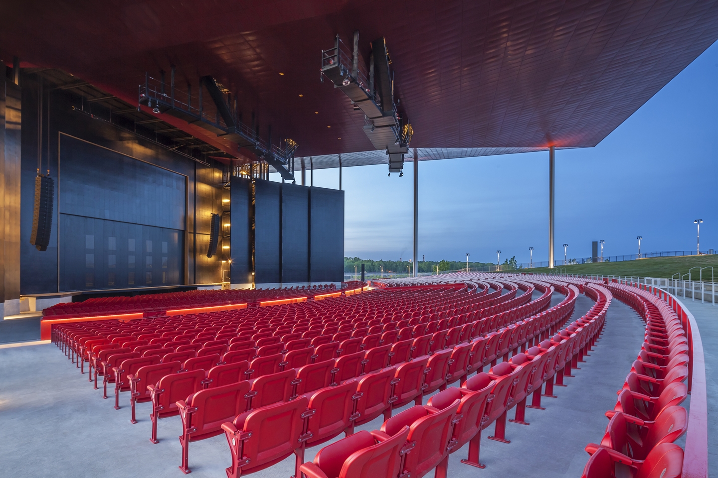
The audience seating is the most important part of the Amphitheatre. There is a zone with fixed seats for 3 500 people and a gentle sloping lawn that can hold about 5 200. Sightlines determine the rake of the slope to offer optimal visibility towards the stage.

Photo Marc Gibert


The Seating Layout

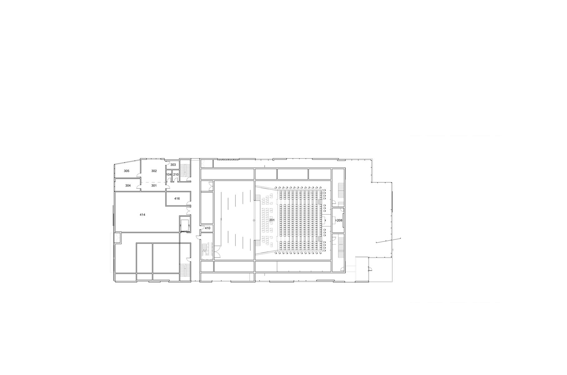
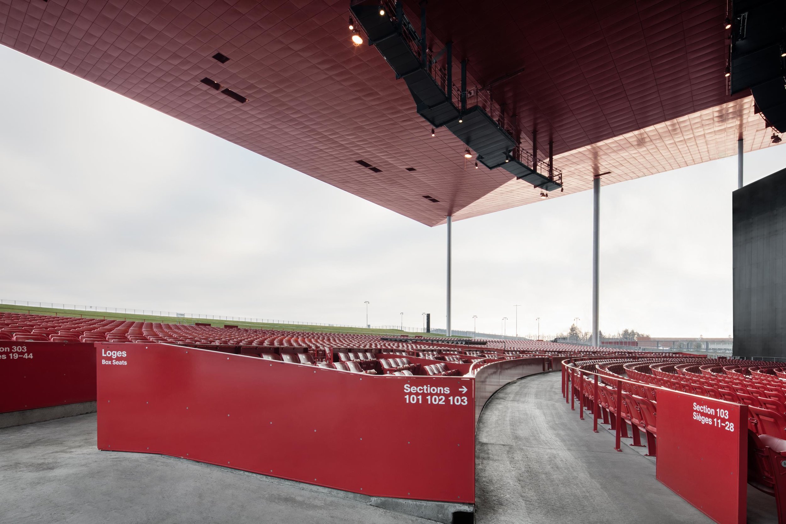
The orchestra is divided into sections from 101 to 303 based on a stadium organization.

Seats in each section are separated between even and odd numbers to help increase crowd flow. The first 10 rows of the orchestra feature movable seats to create a standup zone called a mosh pit, a configuration normally used for rock concerts. There are 397 movable seats in the mosh pit area with rows labelled AA to KK.

Section 200 is considered the VIP section with seats clustered in groups of 12 and 16 in boxes.

There are 38 foldable seats with high legs at the front of sections 301 and 303 that form alcoves for people in wheelchairs to take place.

There are 3 078 fixed seats for a grand total of 3 513 seats including the movable seats. Seat widths range from 20” to 23” to balance rows and create straight side aisles. This variation creates an offset with the seat in the next row in front and resolves visibility issues.


Yellow seats = 20” (508 mm)
Black seats = 21” (533 mm)
Blue seats = 22” (559 mm)
Green seats = 23” (584 mm)

Reserve a wide seat for more comfort!


The Seats

The fixed seats are made of red painted moulded grey cast iron standards with red high density polyethylene seats and backs.

Movable seats are made with a red painted galvanized steel structure with red high density polyethylene seats and backs.

The following shop drawings from Sièges Ducharme show the detailed construction of the fixed and foldable seats.

Shop Drawings by Sièges Ducharme

Photos Marc Gibert and Adrien Williams
 

Performance by ZZ Top

August 21, 2015, ZZ Top gave a show at the Amphitheatre.

The monumental roof created a unified space that unified the crowd with the band.

Photos Adrien Williams


“Will this roof fly away?

“The answer is no. I have my name on it.” (Serge Vézina, structural engineer)


The Foyer, Bar and Ticket Office

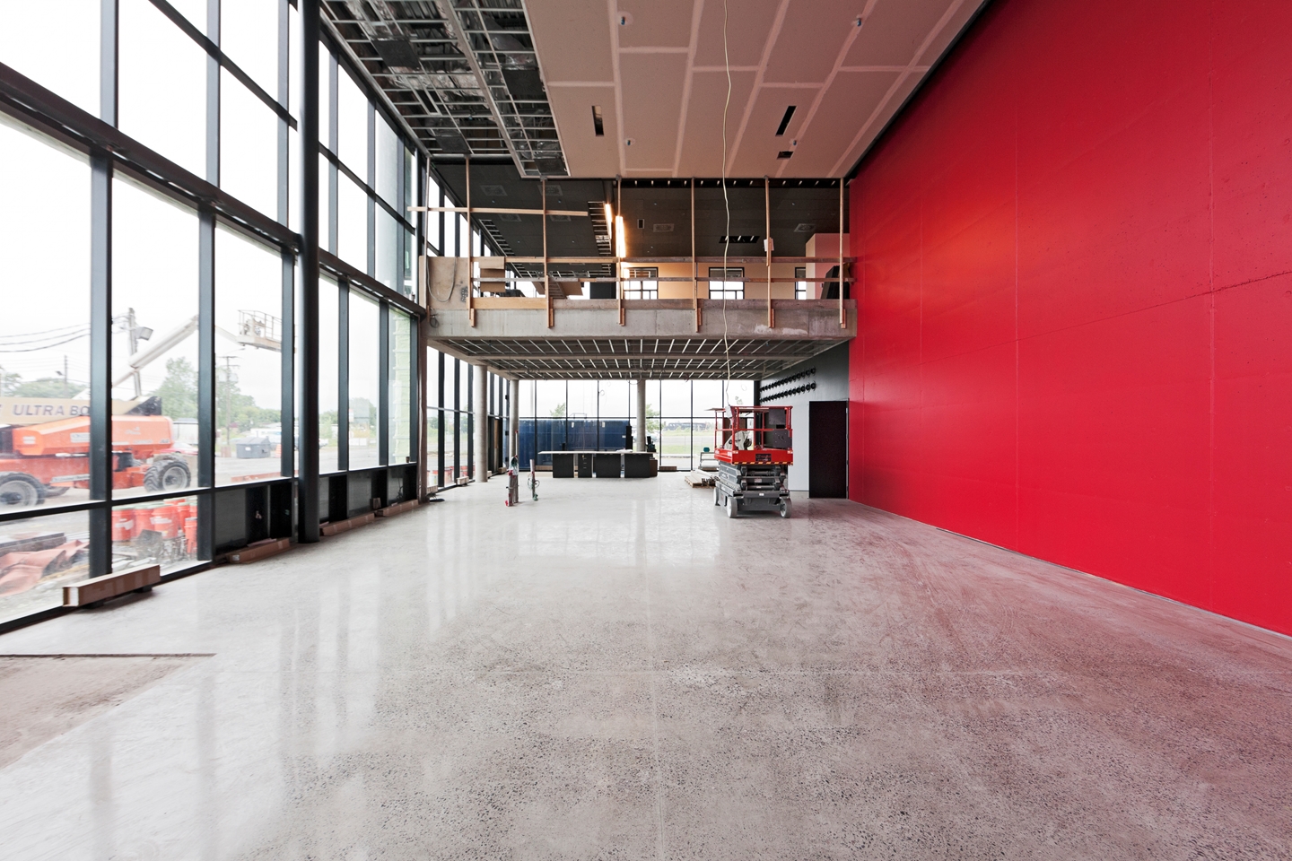
The public zone symbolized by the foyer serves as an exclusive reception area for VIP guests before show. Its double height space makes it an impressive and prestigious hall. An adjoining bar can be opened to the public.

The ticket office is open to the public during off hours. The administration offices overlook the foyer space and benefit from the view over the river.

The architecture uses glass, concrete, steel and black rockwool absorptive panels to control acoustics.

Photos Adrien Williams


Backstage

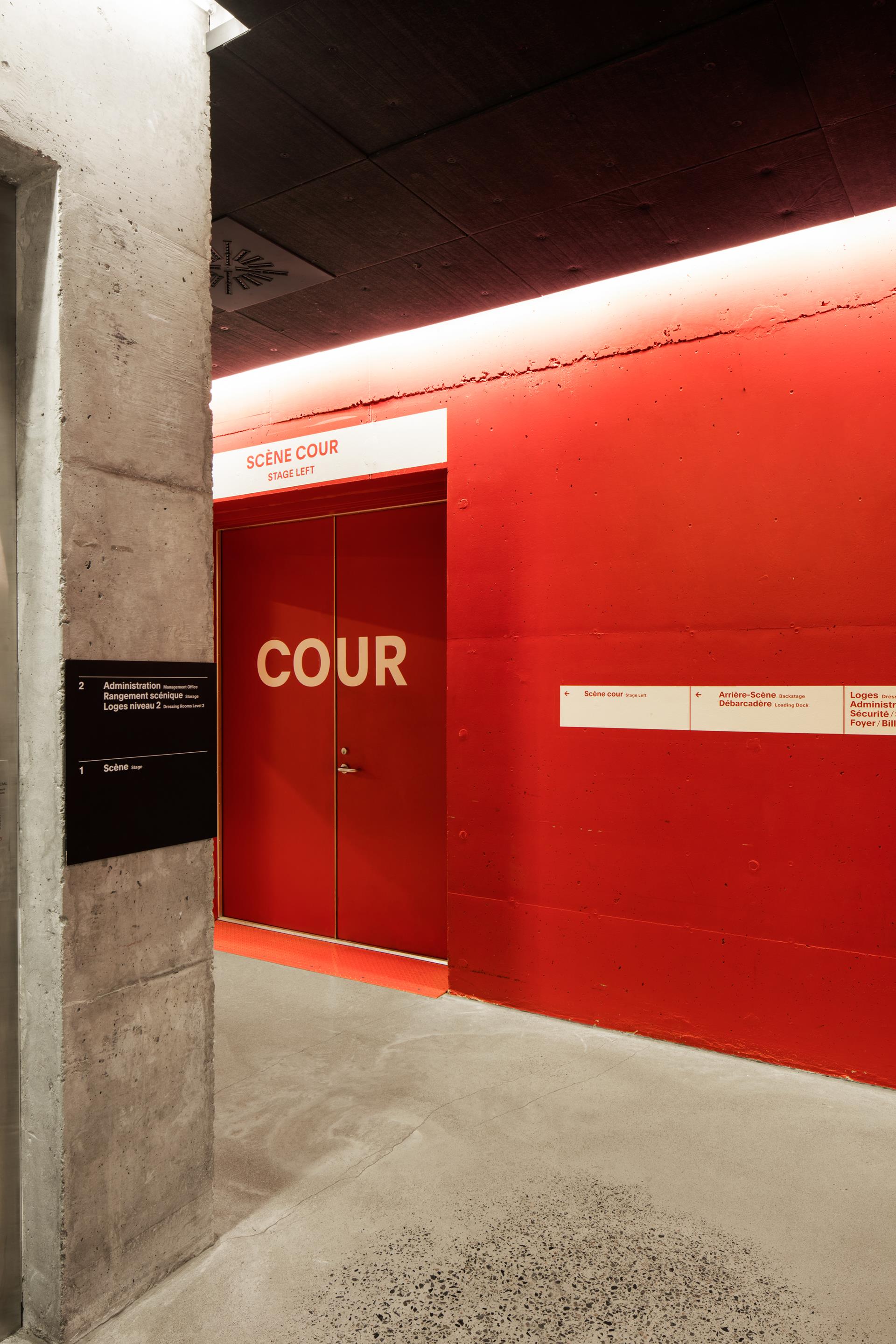
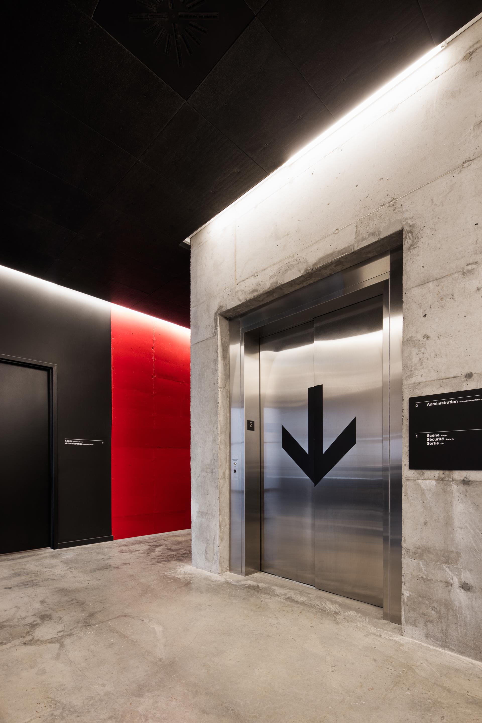
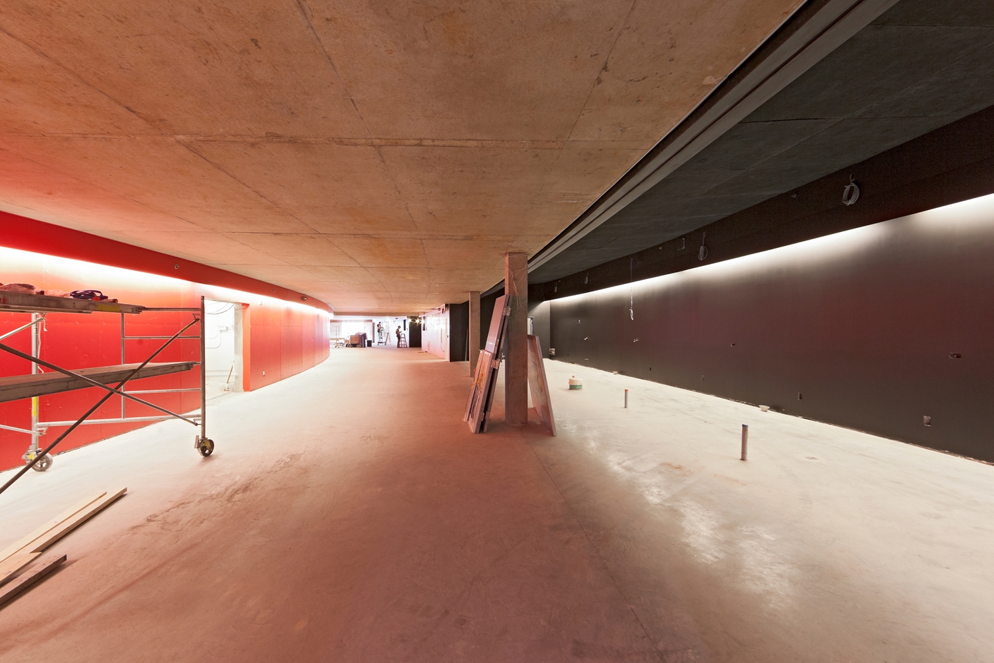
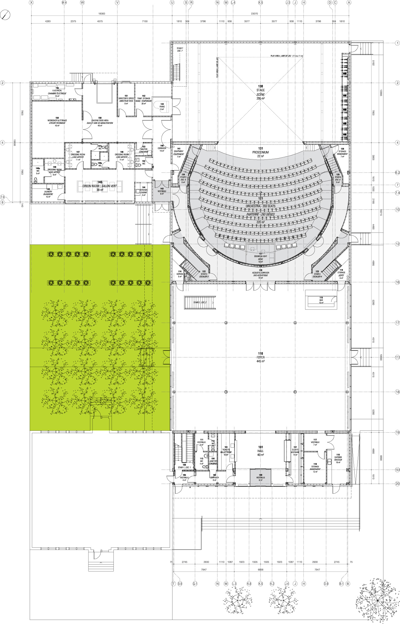
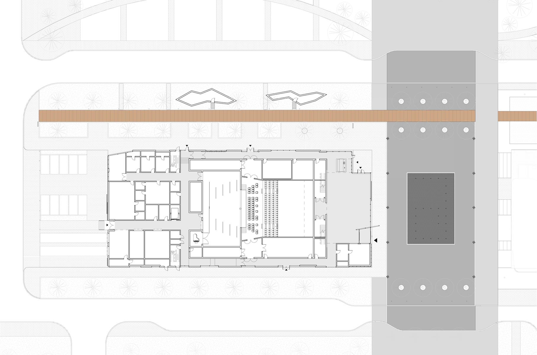
The backstage area is a work space for artists and technicians. It includes the dressing rooms, green room, laundry, loading dock, permanent and temporary storage, tour offices, security and circulations.

These servant spaces should be simple and provide daylight. The plan must create an unobstructed path between the loading dock and the stage. The dressing rooms connect to the backstage corridor to provide efficient stage access.

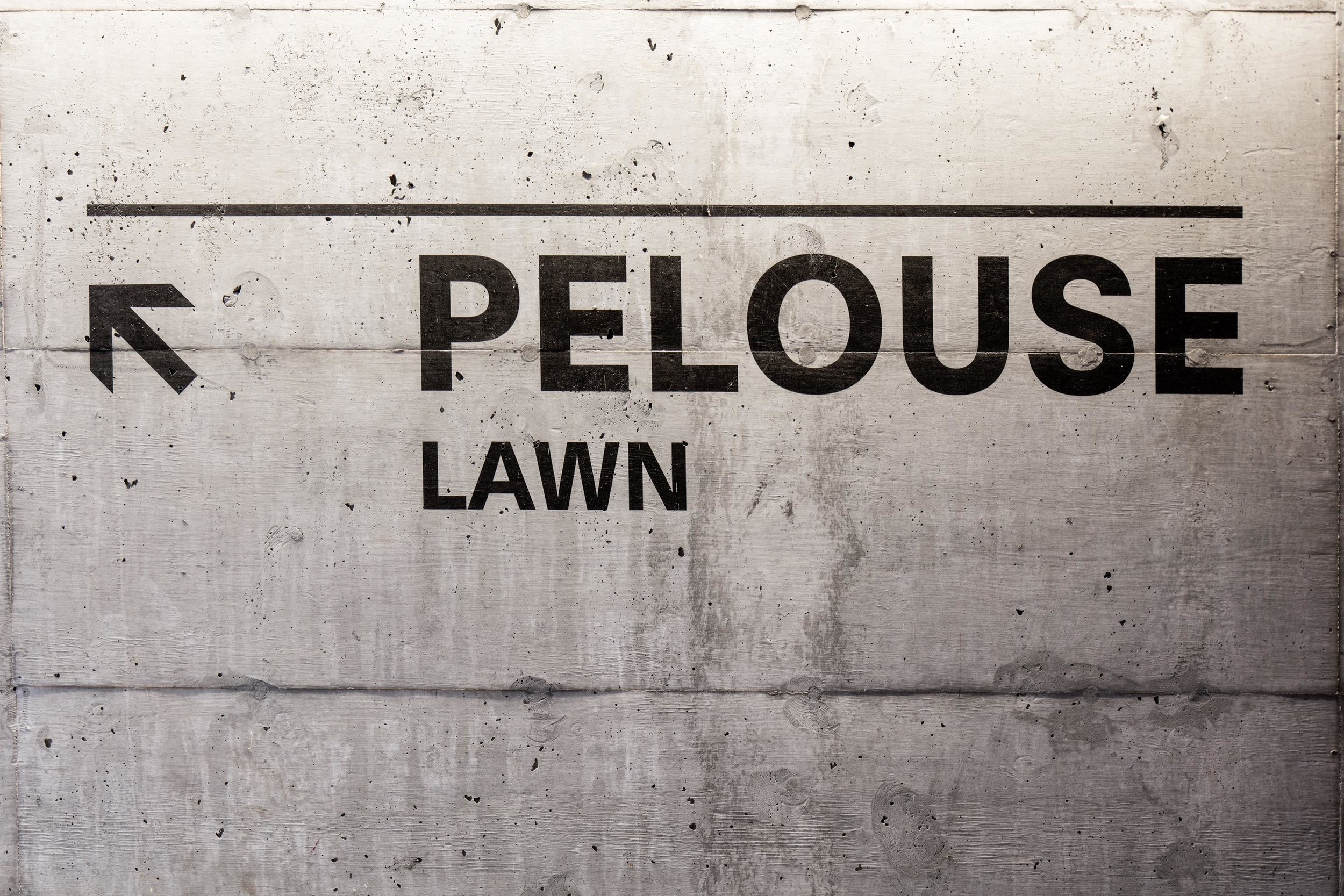
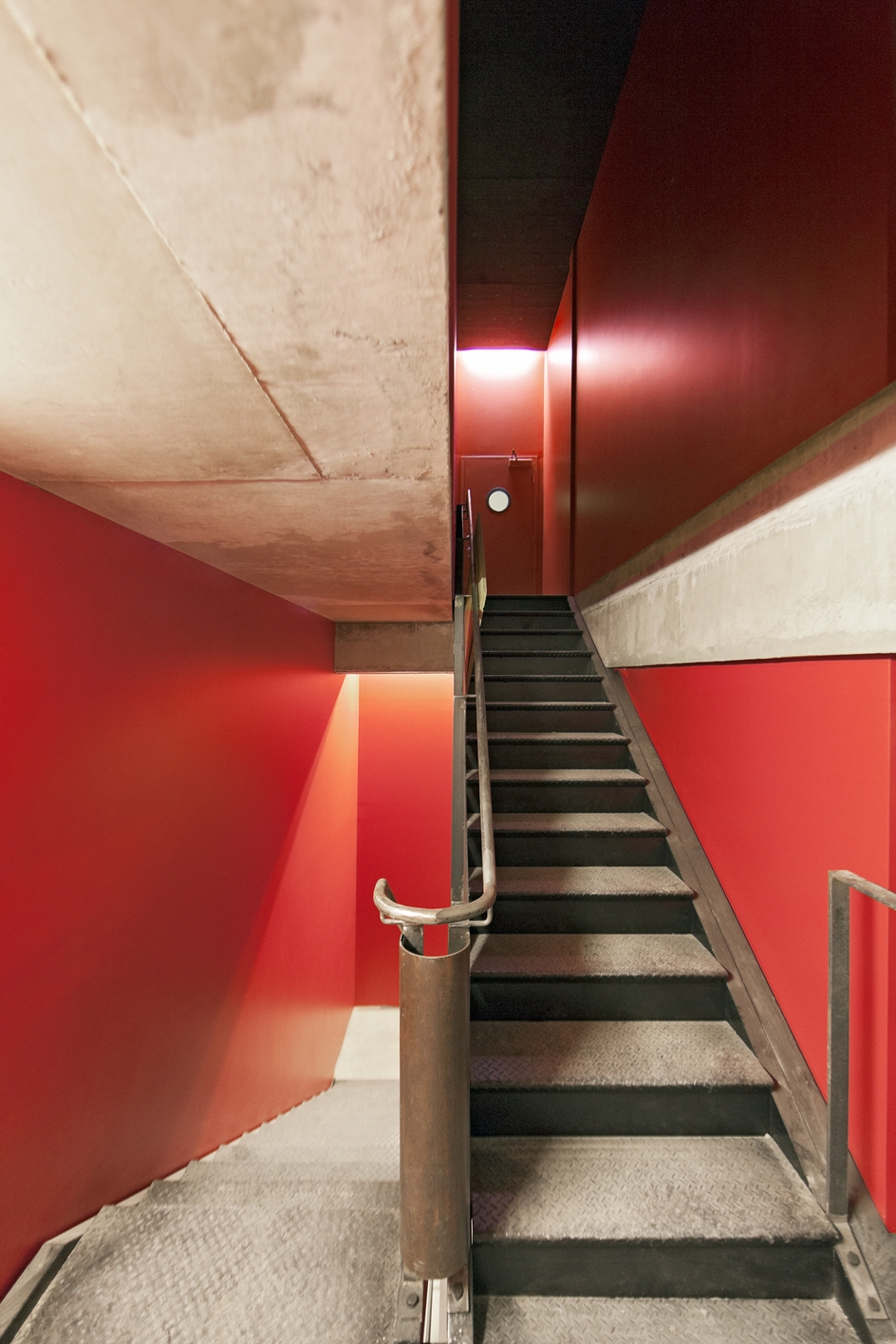
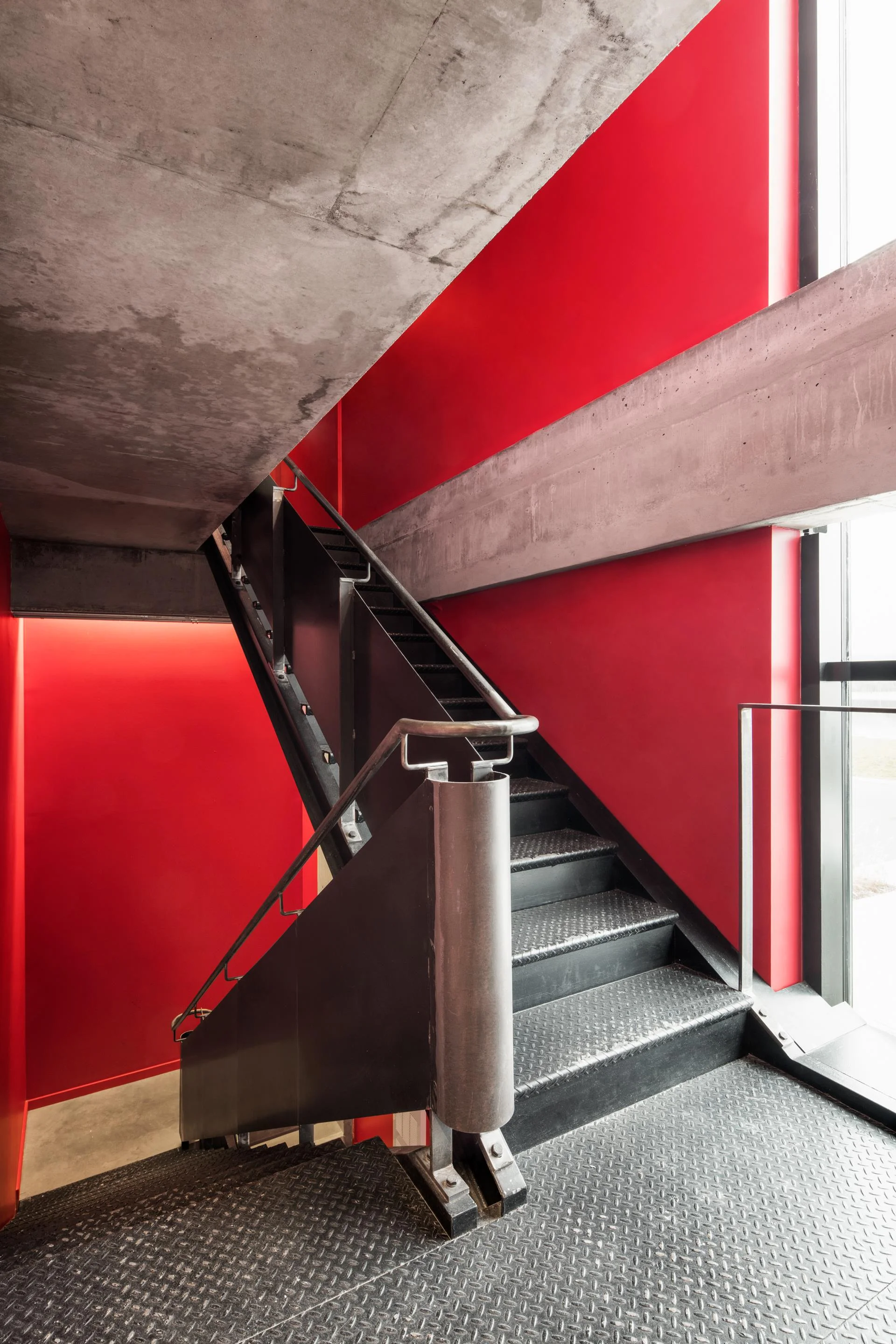
Exposed concrete, steel surfaces, contrasting colours with bilingual signage create a dynamic work environment for the preparation of shows.

Photos Marc Gibert and Adrien Williams
 

The Press


The Stage and Fly Tower

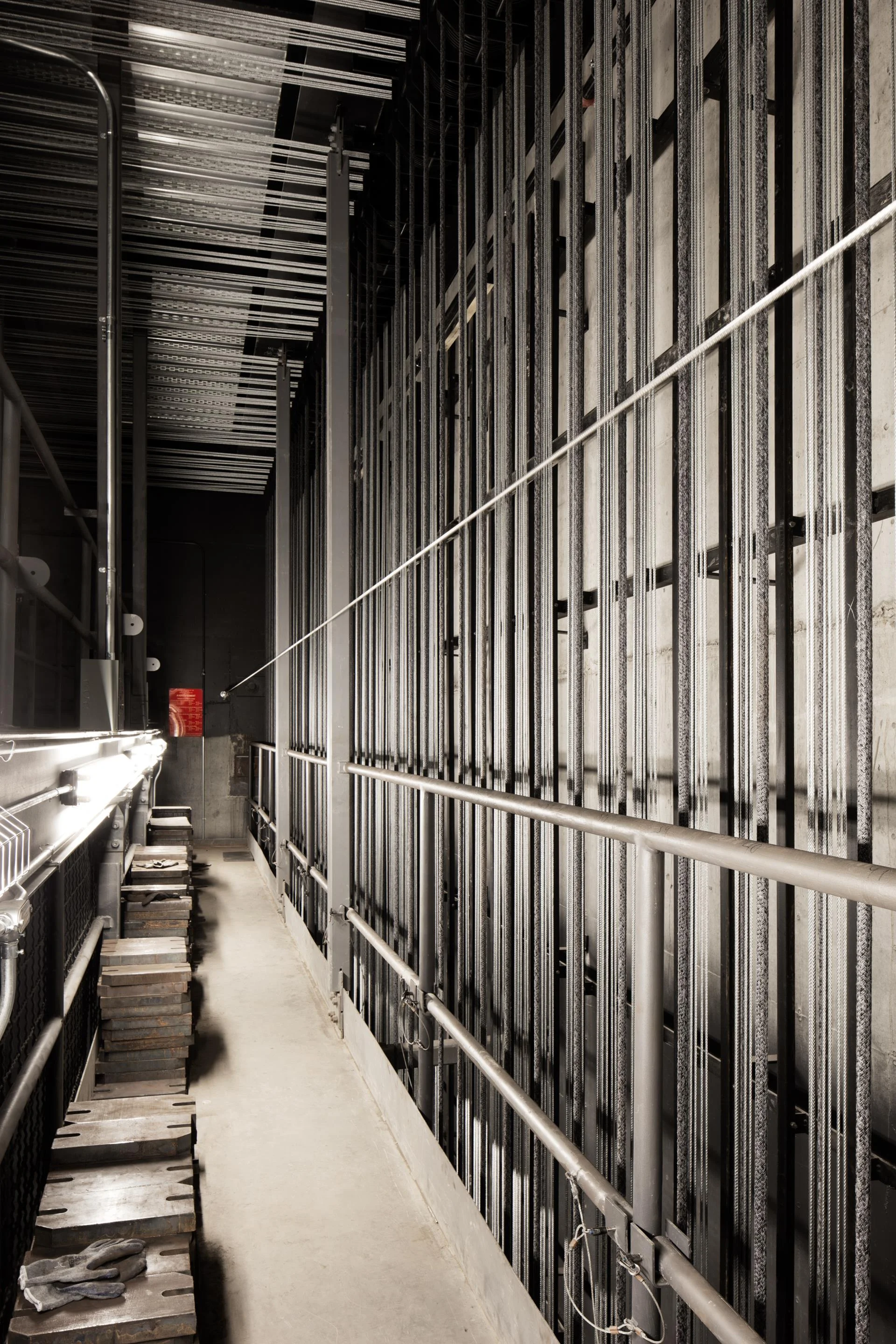
The stage is the heart of a performance space. The fly tower is the vertical extension of the stage that hides the fly system with its battens. It acts as a storage space above the stage opening to hoist props, lighting, curtains and decor elements.

Photos Marc Gibert and Adrien Williams
 

The Stage Door

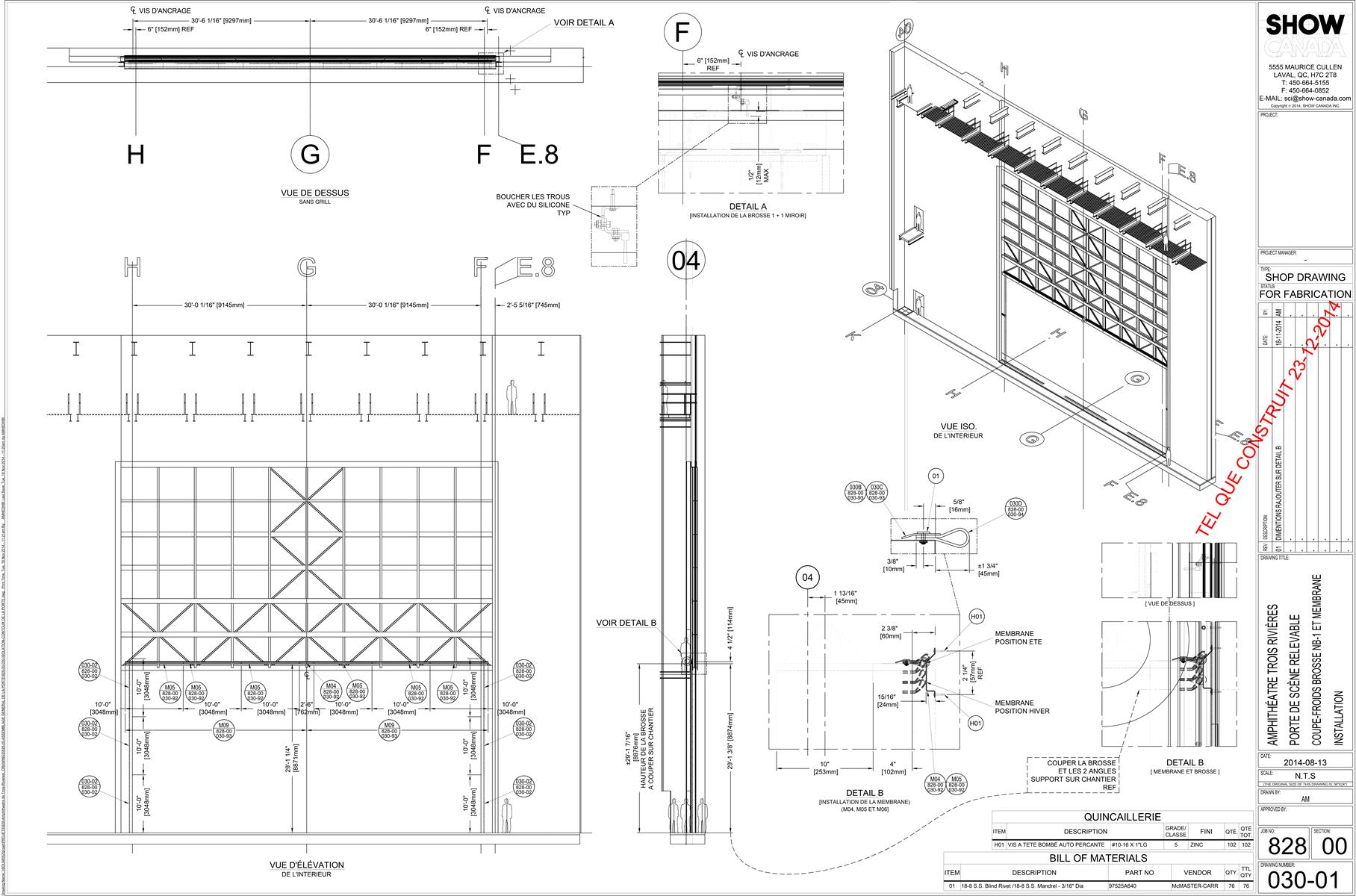
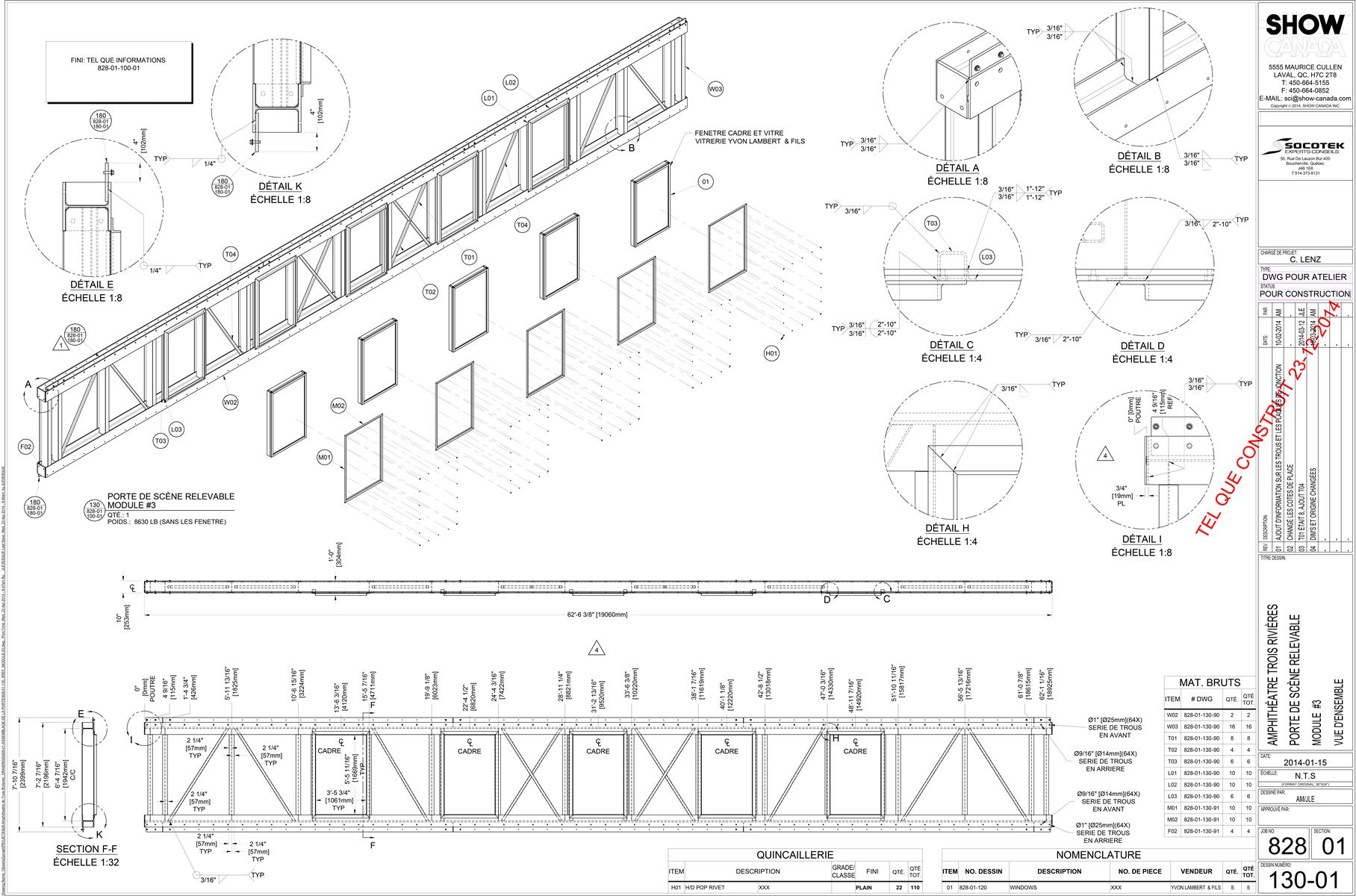
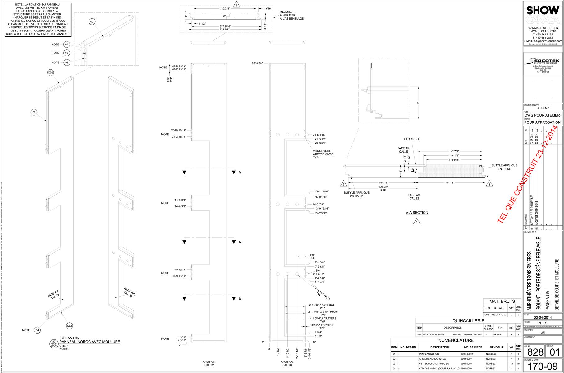
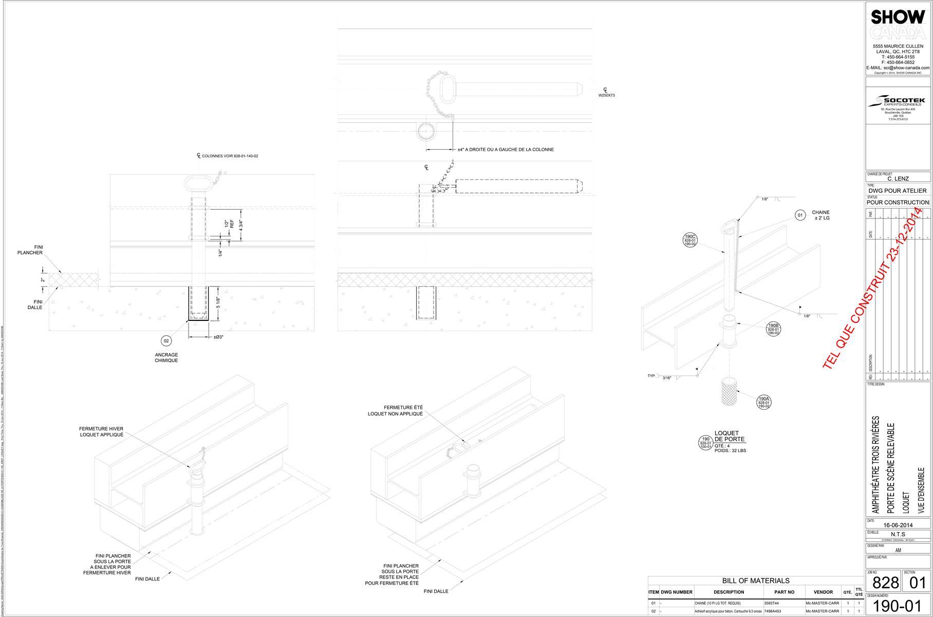
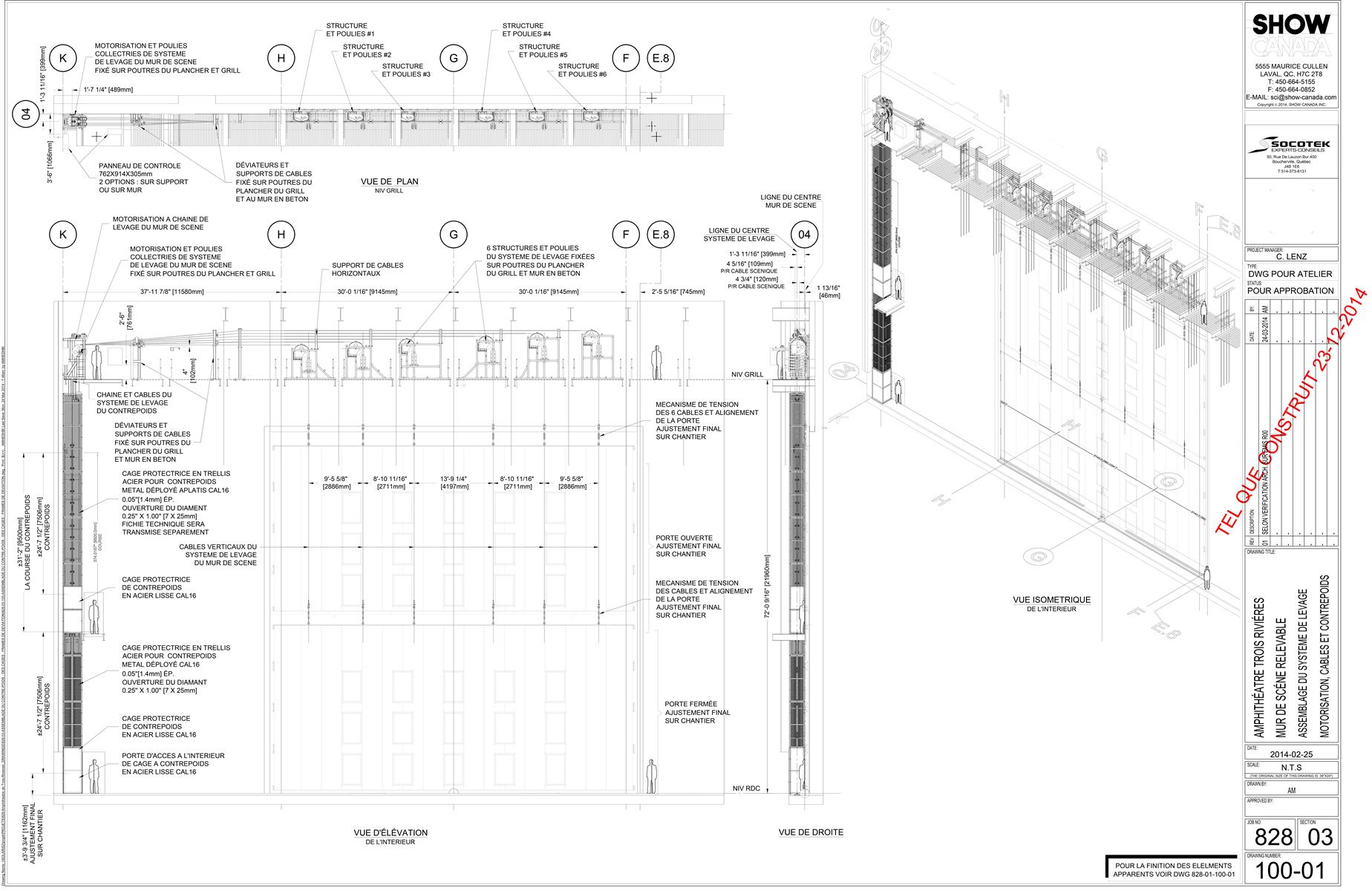
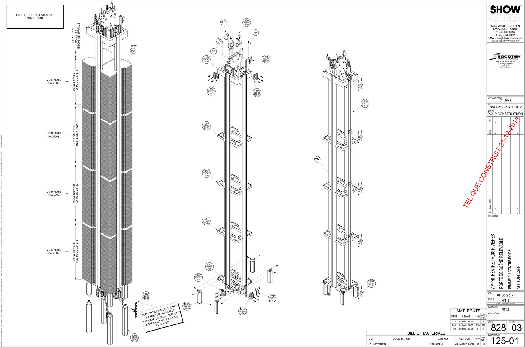
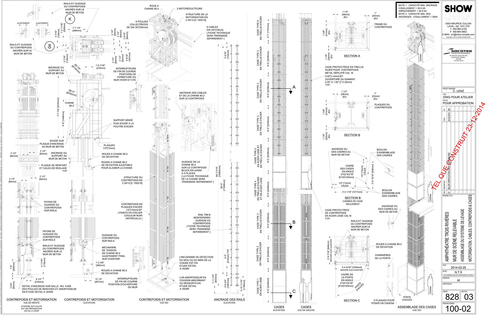
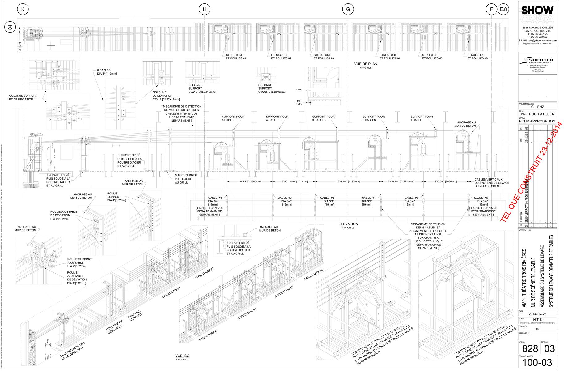
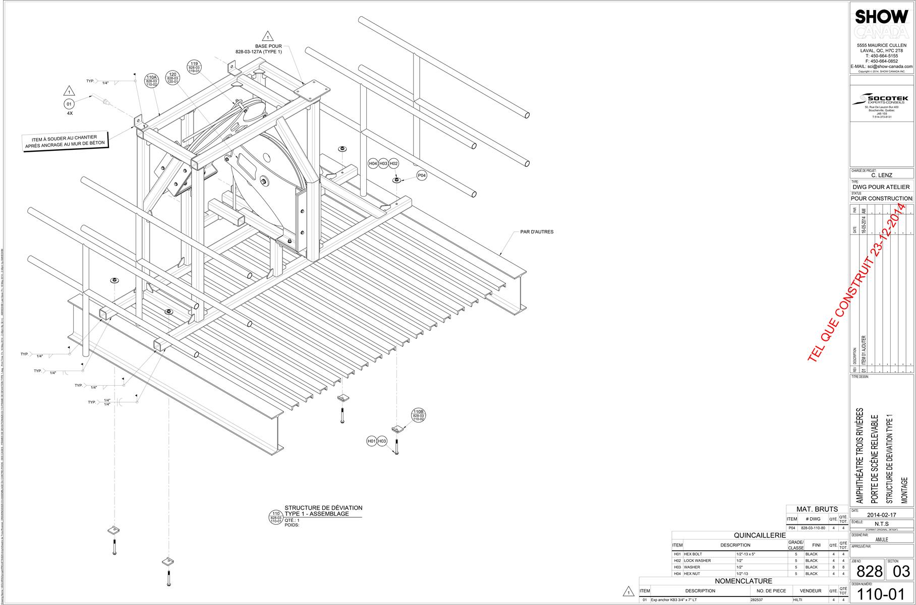
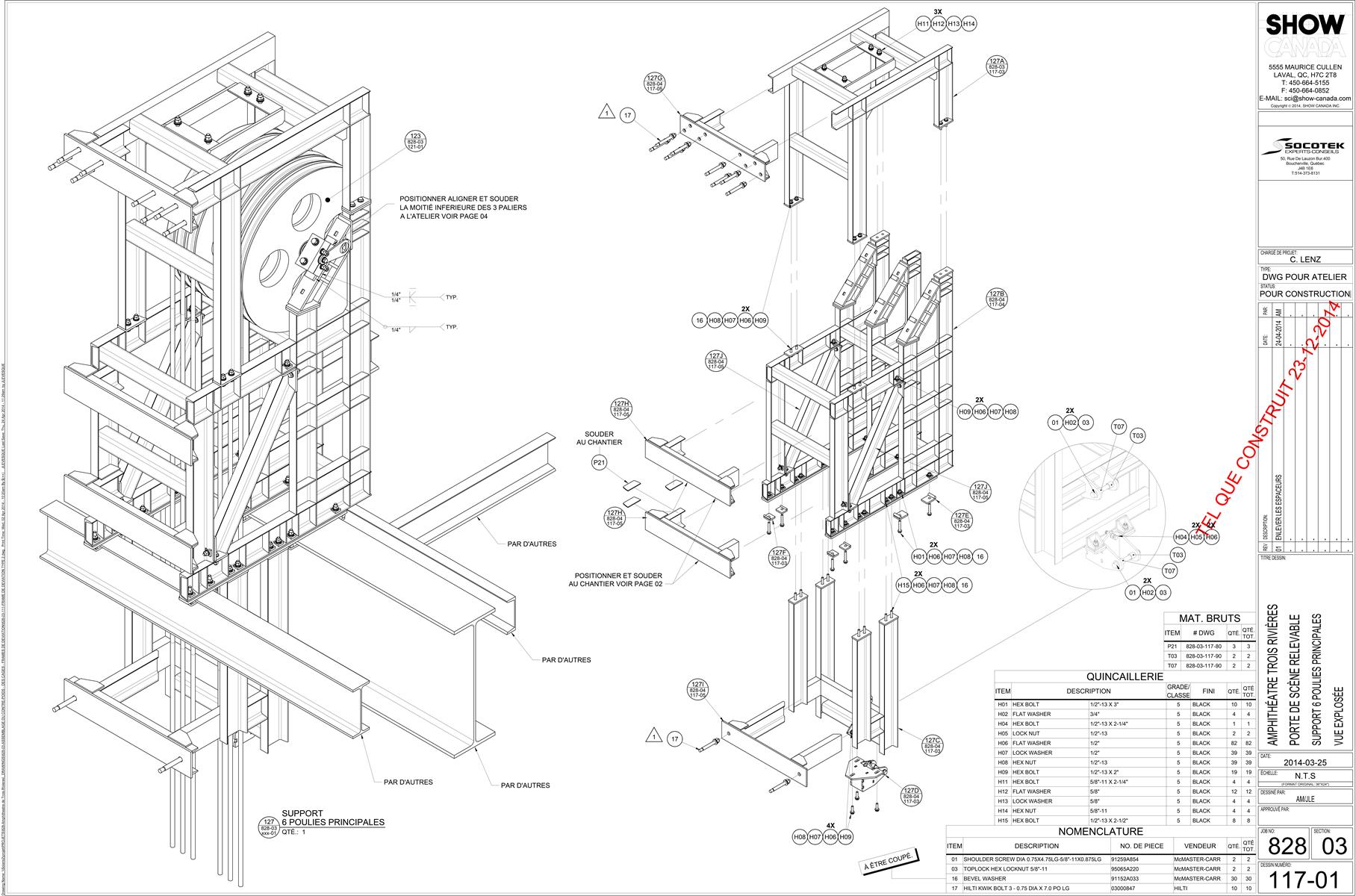
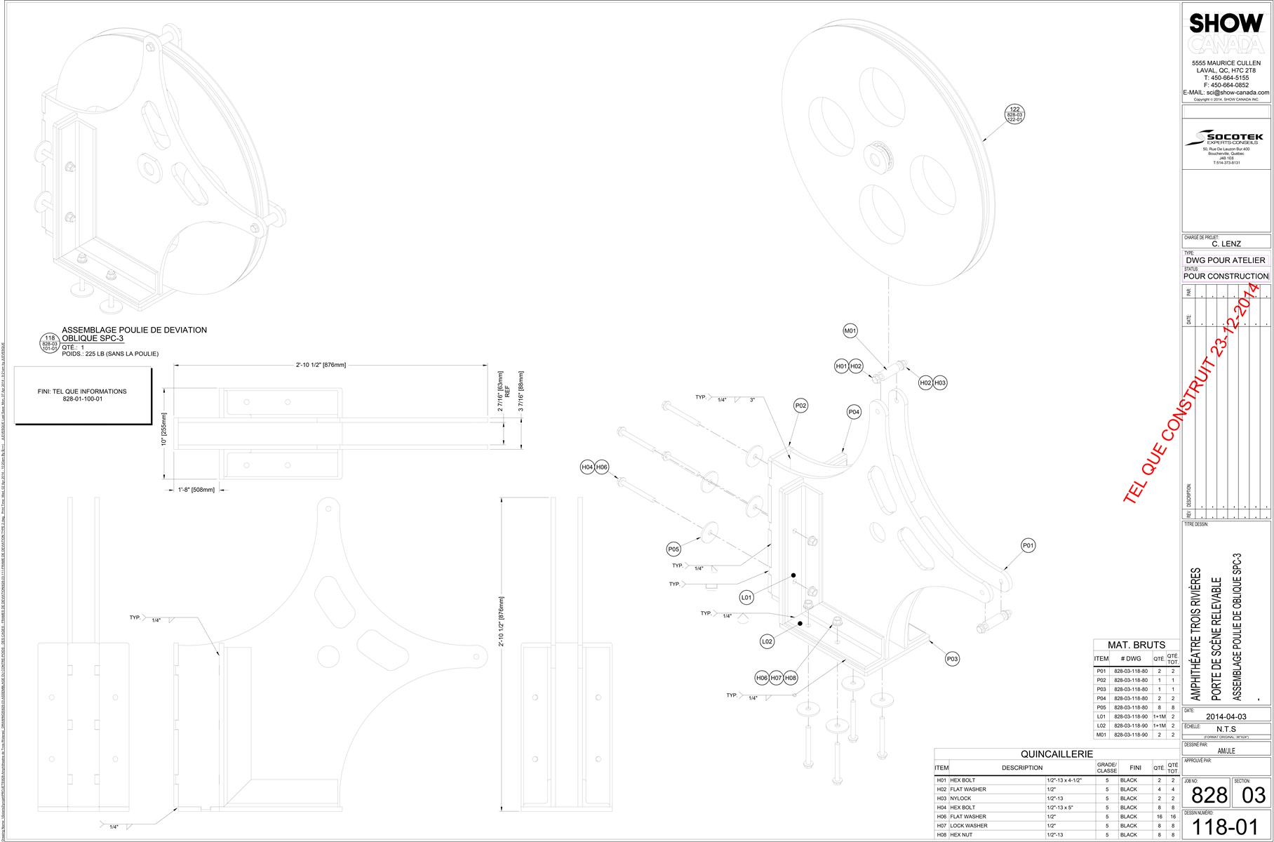
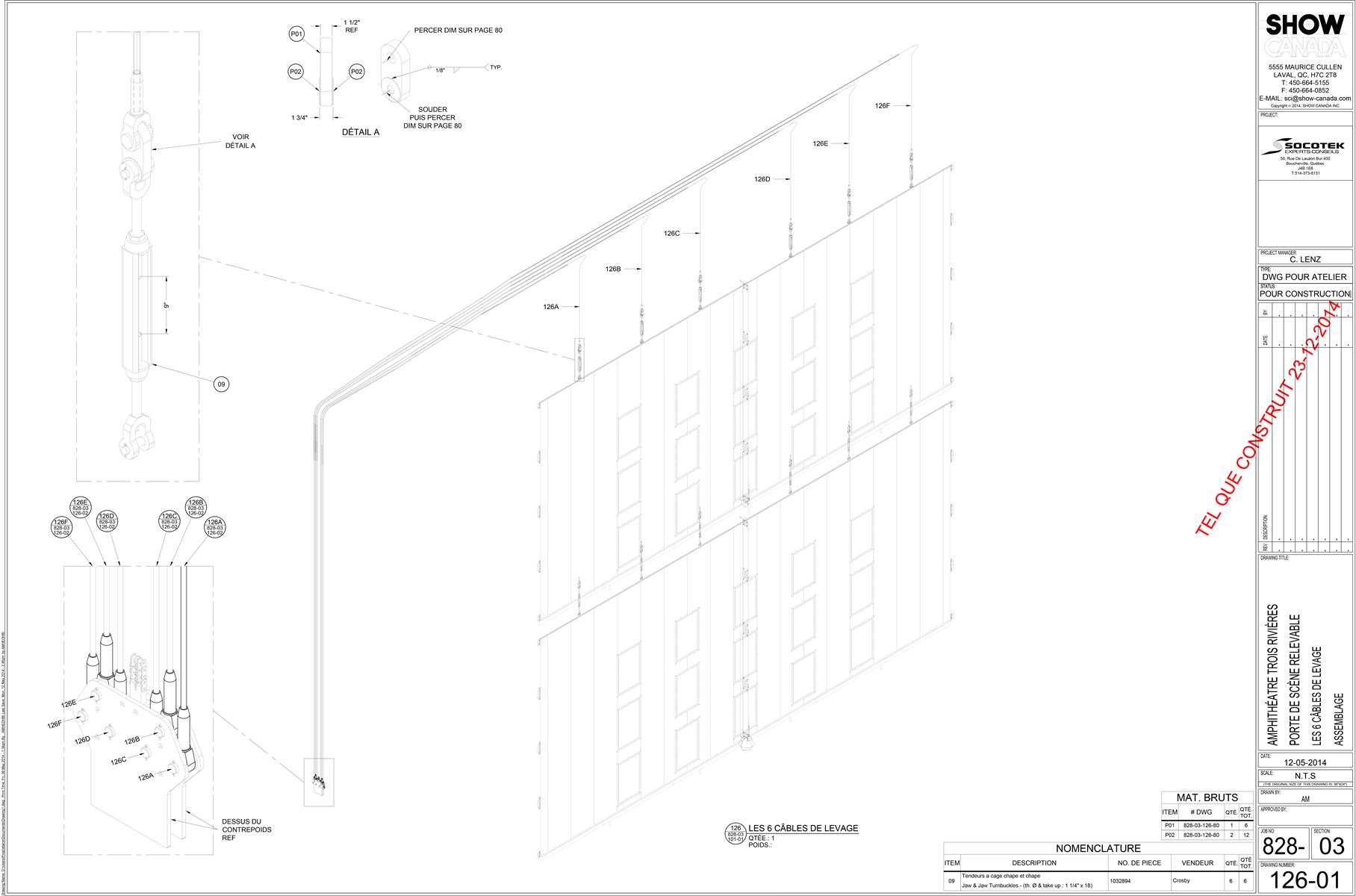
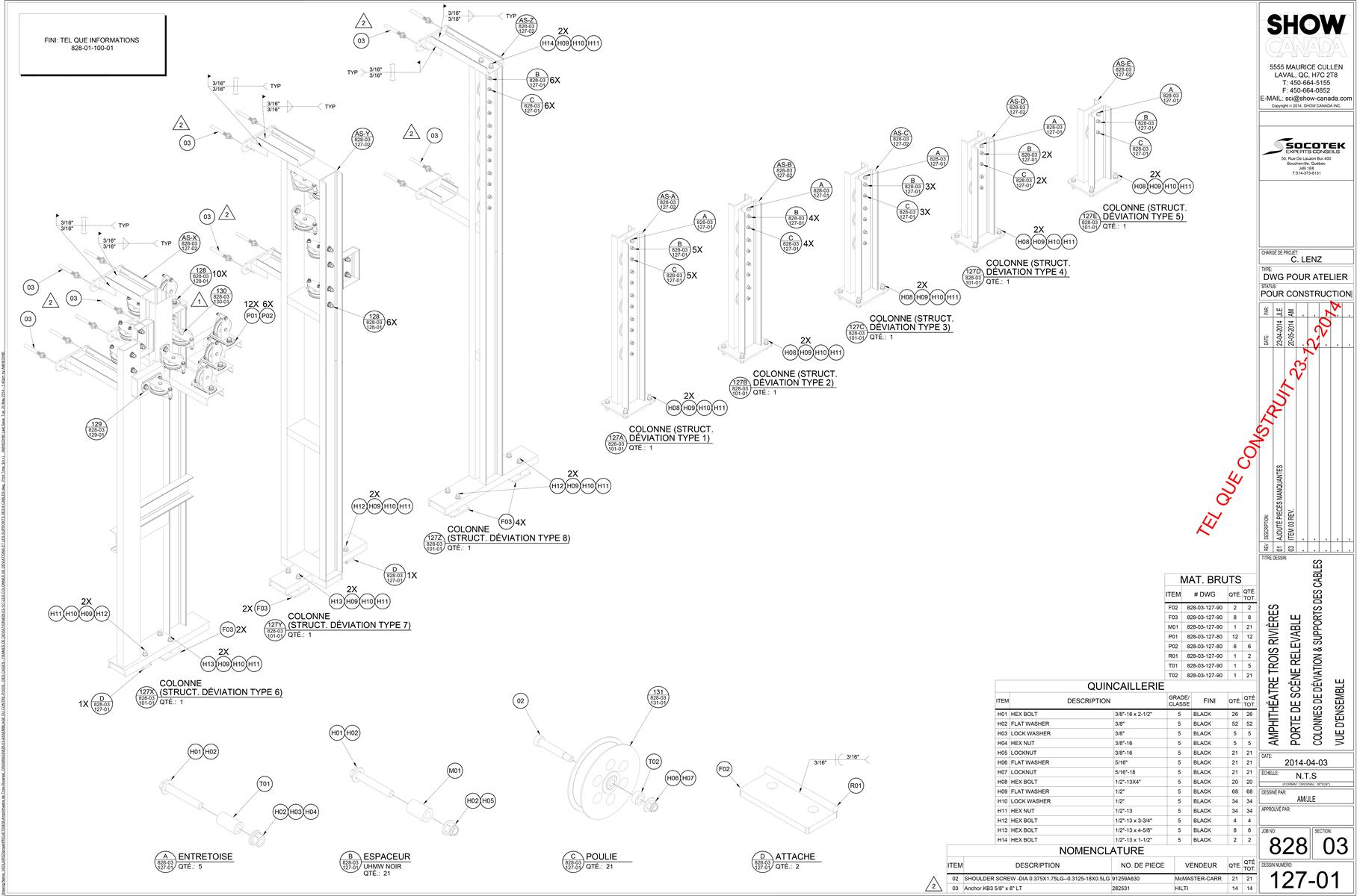
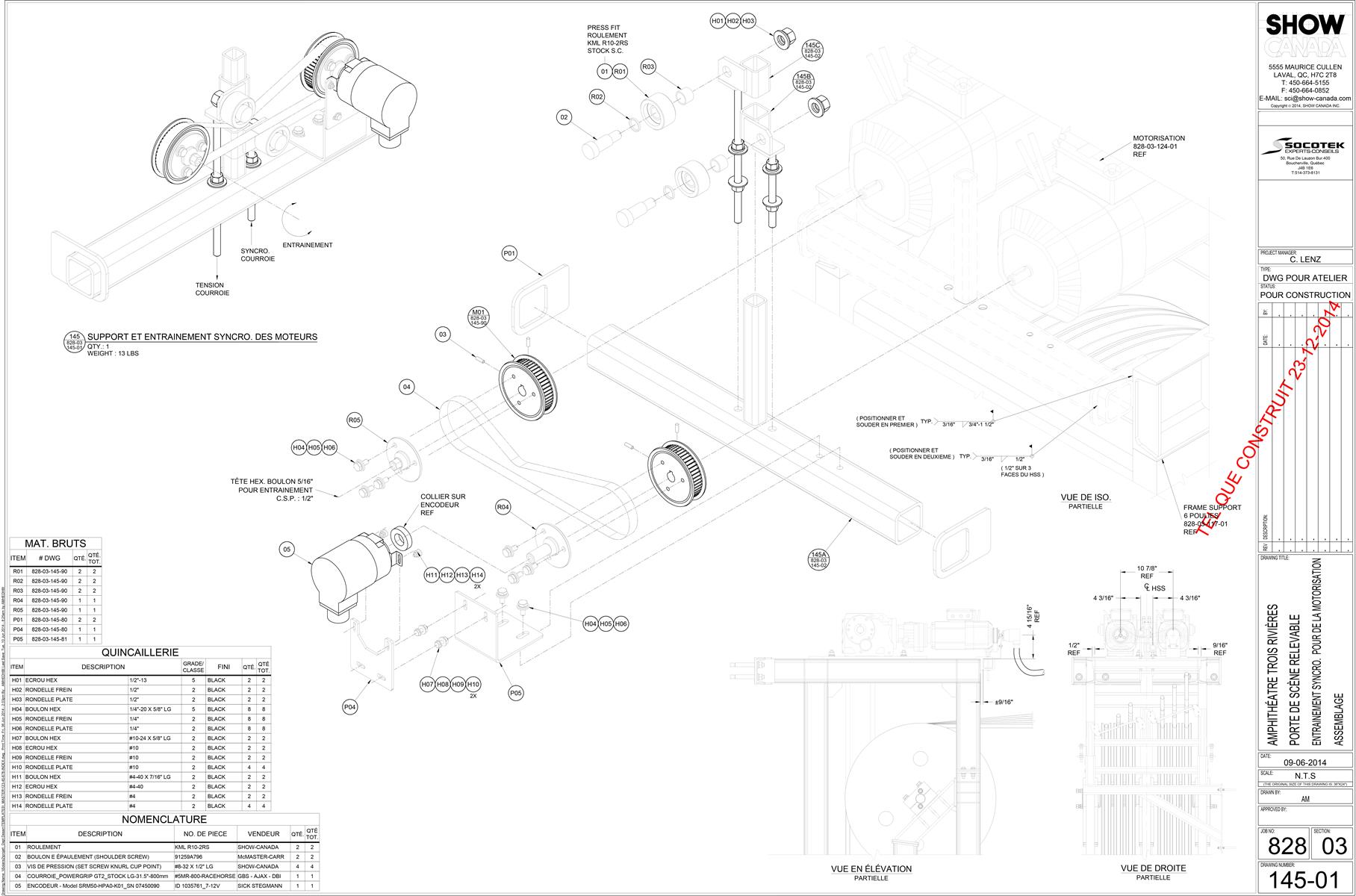
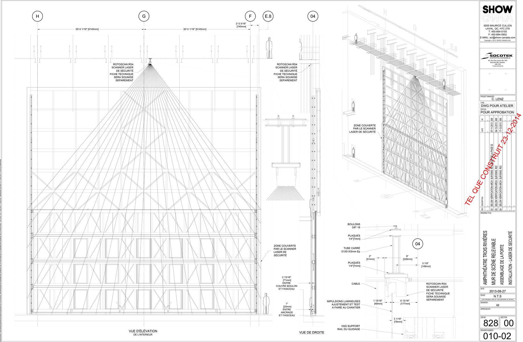
The stage door is actually a steel wall that closes off the stage from the exterior when there are no shows and to protect the stage in general. Measuring 19 meters (62’-6”) wide by 8.8 meters (28’-9”) high, it is held by 6 steel cables attached to a pulley and counterweight.

The following sample of shop drawings by Show Canada illustrate the complexity of this custom designed monumental door.

Shop Drawings by Show Canada
 

The Structure

The building is made of a concrete and steel structure. Concrete is used for the foundations and the core of the stage/fly tower. Steel is used for the monumental roof and backstage building. The walls around the stage form a hollow rectangular core that braces laterally the roof trusses.

The roof measures 80 x 90 meters in plan supported by 26-meter high concrete filled steel columns.

Photos Marc Gibert


Project Team

Architect Paul Laurendeau Architect (competition)
Paul Laurendeau | François R Beauchesne | Architects in Joint Venture
Project Architect and Lead Designer Paul Laurendeau

Engineering and Project Management Groupement Dessau-Pluritec

Theatre Consultant for the Client Trizart Alliance

Theatre Consultant for the Architect Guy Simard

Acoustics Octave acoustique

Lighting Gilles Arpin

Signage Principal

Code consultant Technorm


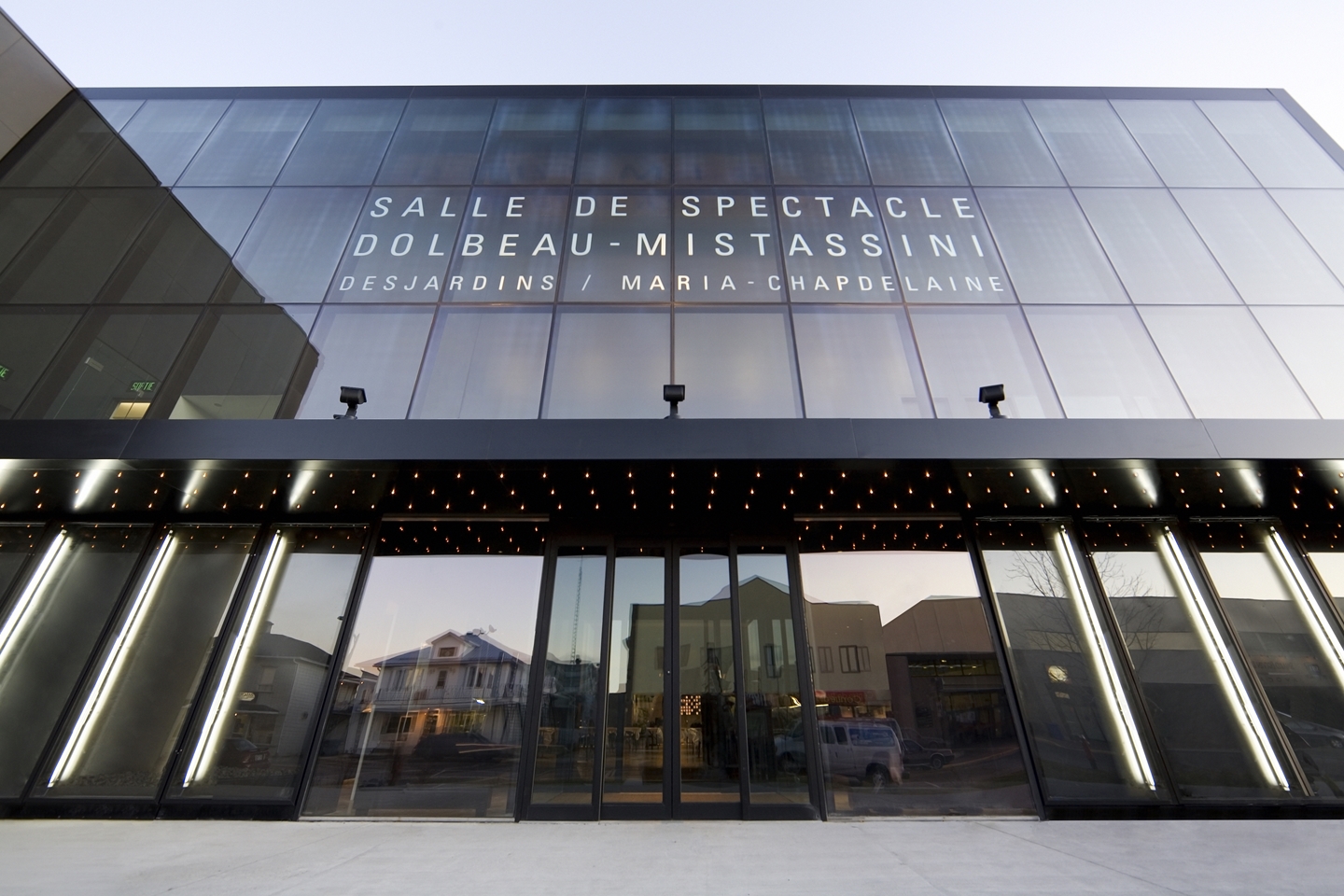
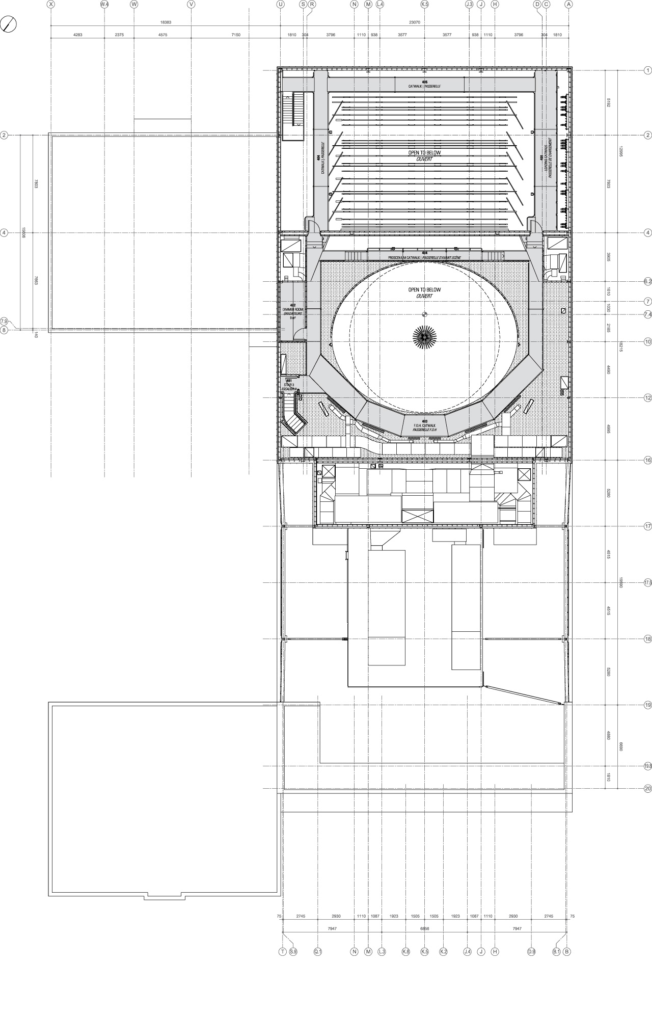
Dolbeau-Mistassini Theatre
Photo Marc Gibert

Photo Marc Gibert


DOLBEAU-MISTASSINI THEATRE


Location 105, avenue de l’Église, Dolbeau-Mistassini, Canada

Status Built 2008

Client City of Dolbeau-Mistassini

Type Theatre, Performance, Cultural, Public

Building Area 2 630 m²

Seating Capacity 491


A Guided Tour with the Architect

Video by Antti Seppänen

See a short video where I revisit in 2013 my project 5 years after its completion. Some testimonies explain how people use it.

This project is a unique theatre that brings audience and artists together because of a tight seating layout.


The Facades

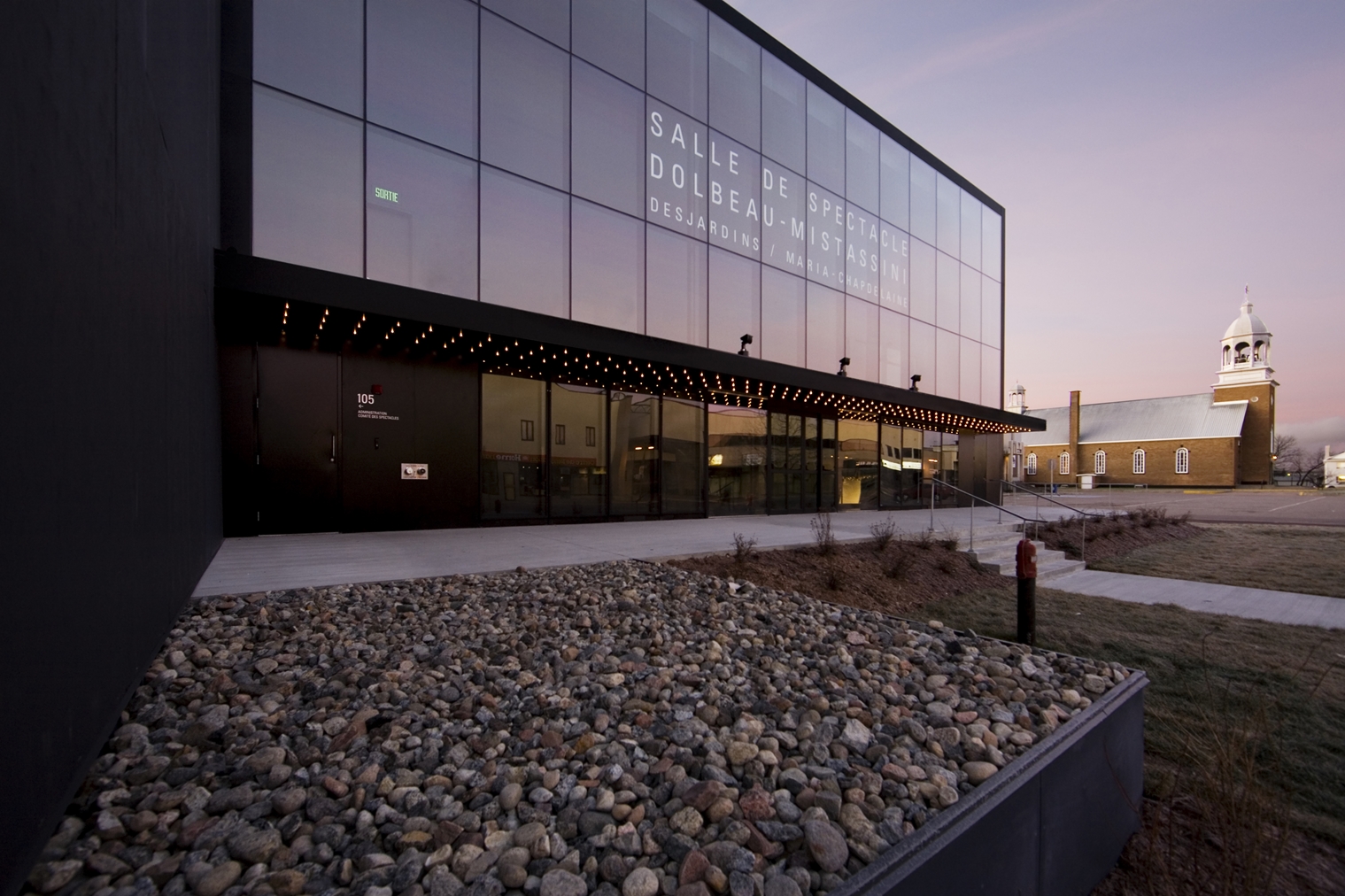
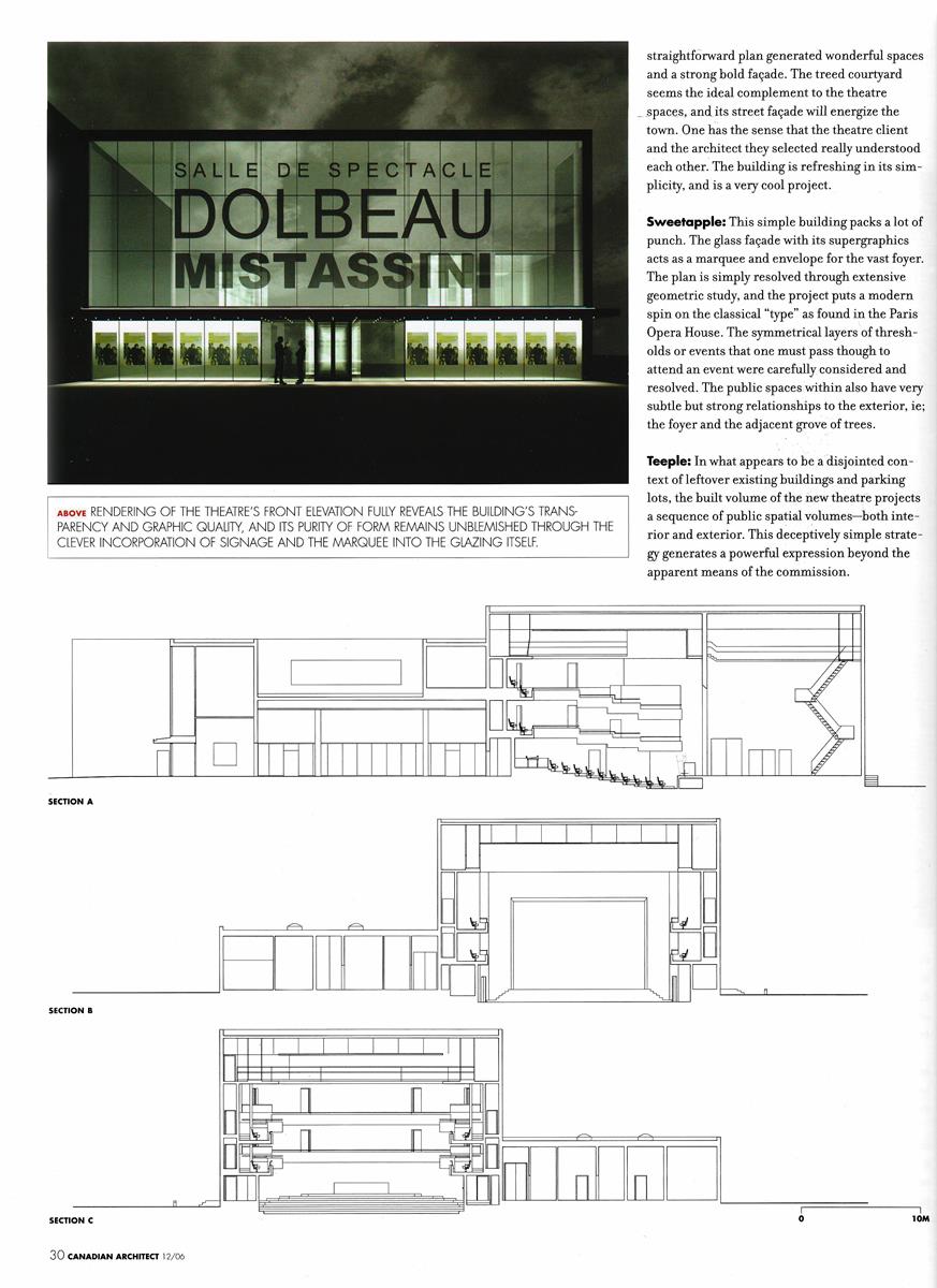
The shape of the building is a series of black boxes put together with a glazed front facade along Church Street.

Photos Marc Gibert


The Canopy

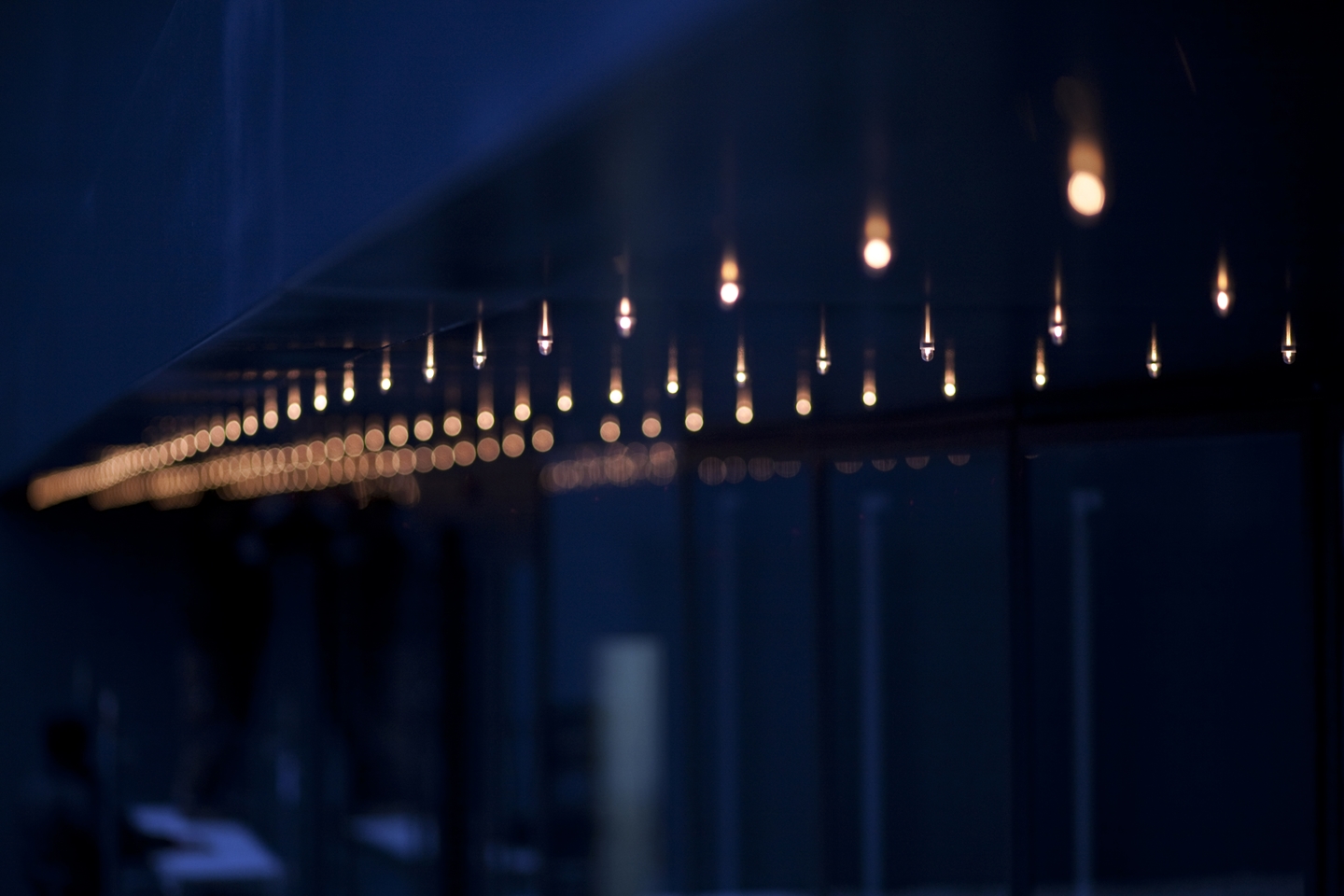
The front canopy is the symbol of a theatre.

Point lights create glitter and subtle attraction.

Full height light boxes display posters for current and upcoming events.

Photos Marc Gibert


The Auditorium

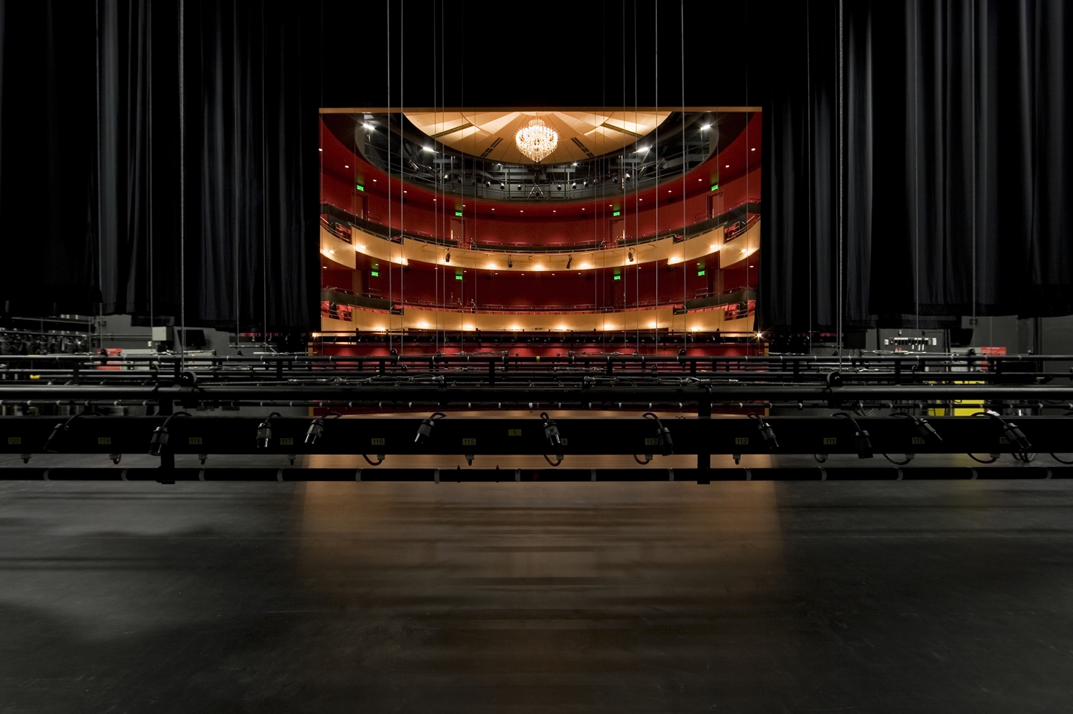
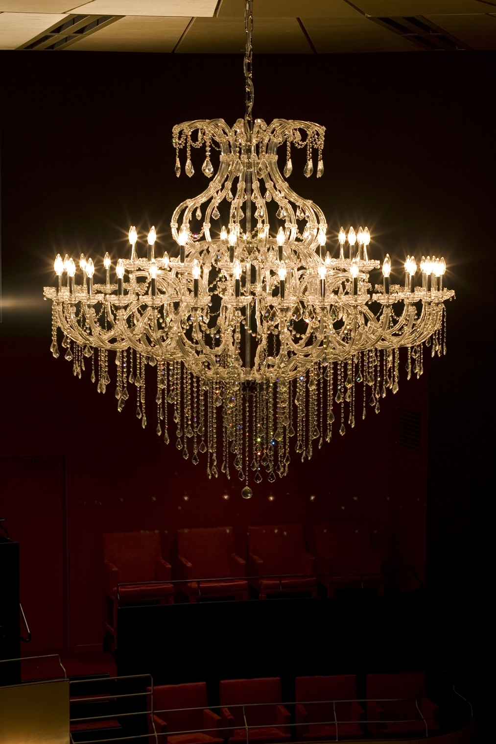
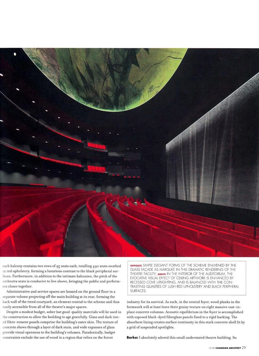
Inspired from 19th century European continental theatres, the auditorium is based on the cylindrical form with a shallow orchestra surrounded by two balconies that bring intimacy.

One of my references in doing this was the inspiring Marie Bell Theatre in Paris.

Photo Marc Gibert


The Seating Layout


Le Lights


The Foyer


The Backstage


The Plans

Selected Publications


Project Team

Architect Paul Laurendeau | Jodoin Lamarre Pratte | Architects in joint venture
Project Architect and Lead Designer Paul Laurendeau

Structural Engineering Dessau-Soprin (today Stantec)

Mechanical/Electrical Engineering Roche (today Norda Stelo)

Theatre Consultant Go Multimedia

Acoustics Legault & Davidson

Signage Uniform (today Principal)

Code Consultant Technorm

General Contractor Constructions Unibec


Maniwaki Theatre Renewal
MANI 2020-09-08 VUE EXT_03c_1920x1080.jpg
 

Maniwaki Theatre Renewal

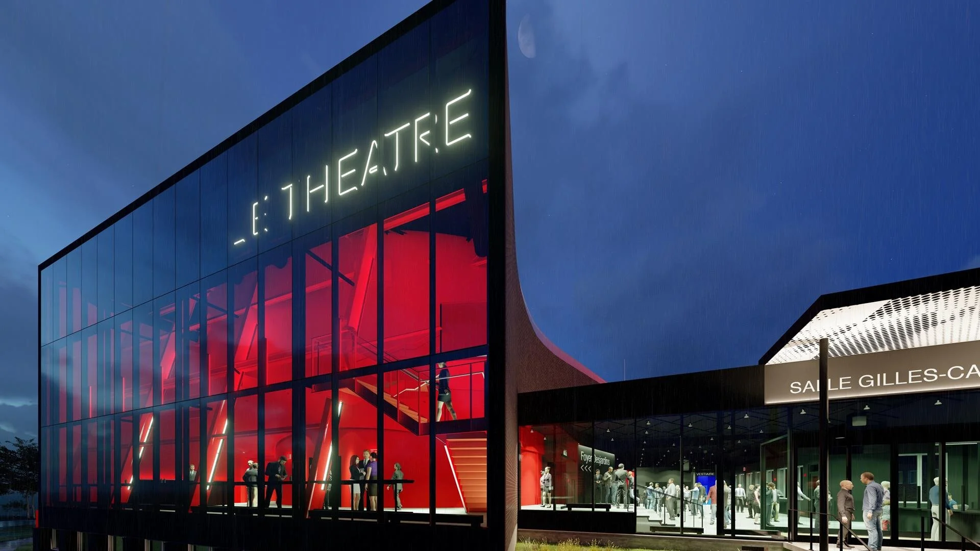
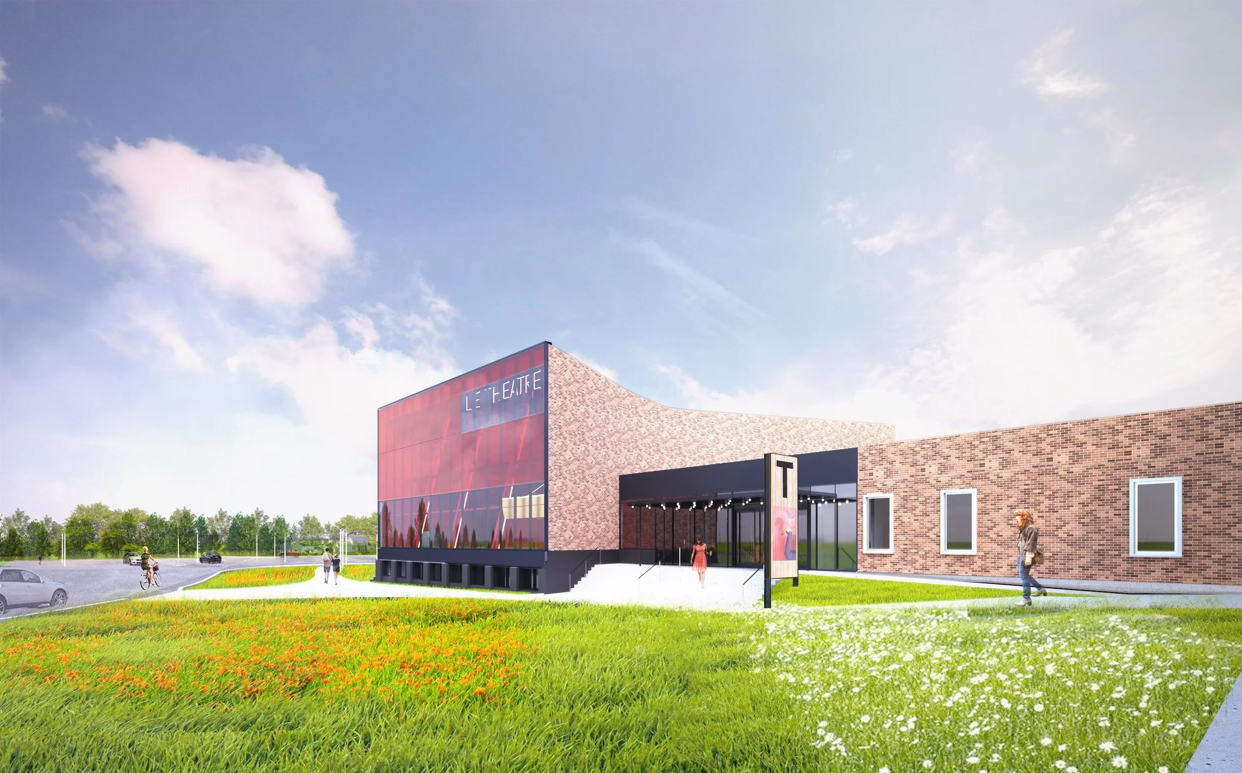
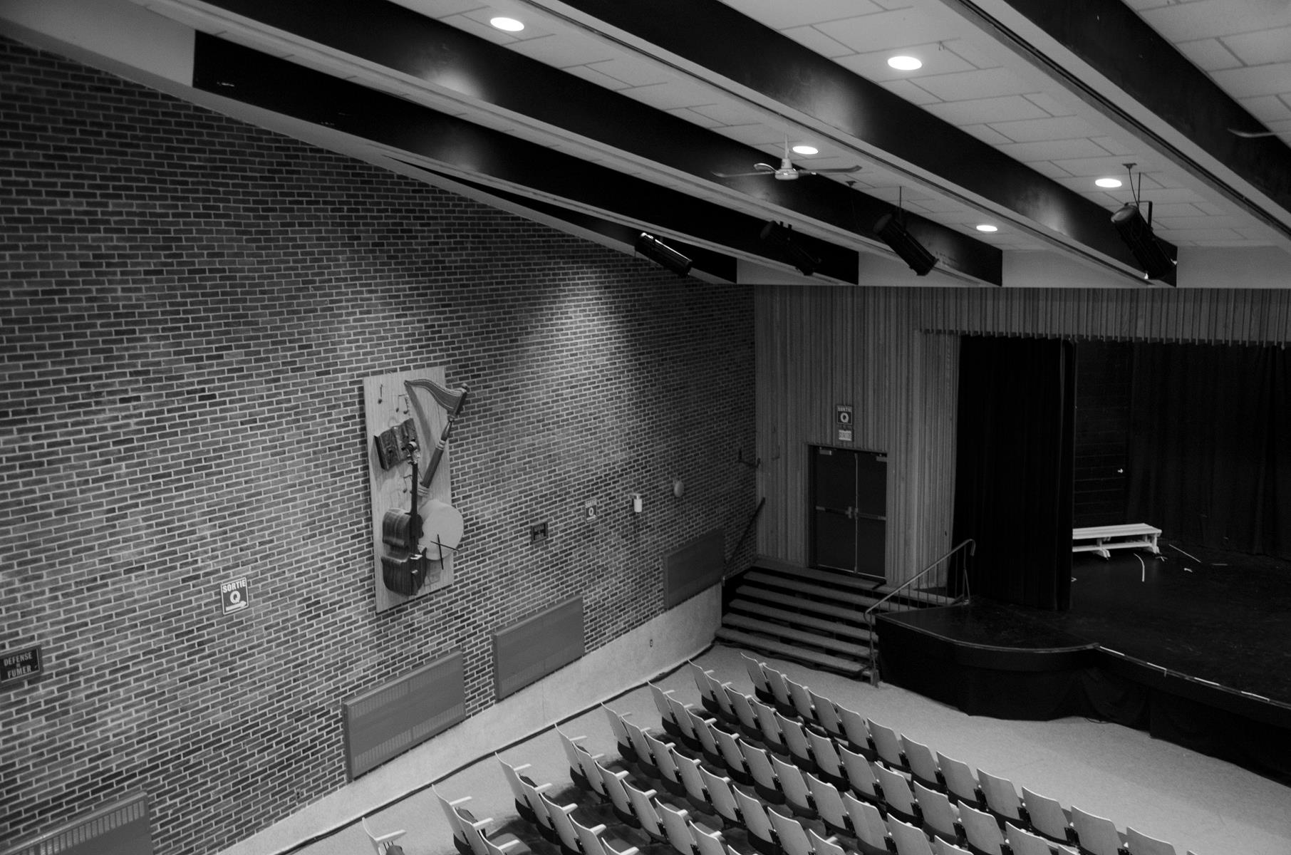
The project about is the transformation of a school auditorium into a professional theatre. For years, the local Cultural Center occupied the school auditorium to host its program after its permanent venue burnt down in 2009. After receiving a public grant, it launched an architectural competition to initiate the process to transform the auditorium.

Location 211, rue Henri-Bourassa, Quebec, Canada

Status Completion expected 2020

Client Maison de la culture de la Vallée-de-la-Haute Gatineau

Type Theatre, Performance, Cultural, Public

Building Area 1 710 m²

Seating Capacity 423


The Red Window

The purpose of the transformation is to create a new vibrant identity in a functional building to attract the public.

The key architectural element is a red glass facade that opens the existing fish shaped building by creating transparency with colour. The grey wood shingle slanted facade is replaced by a contemporary wall that set apart the new theatre from the 1967 school.


The Auditorium

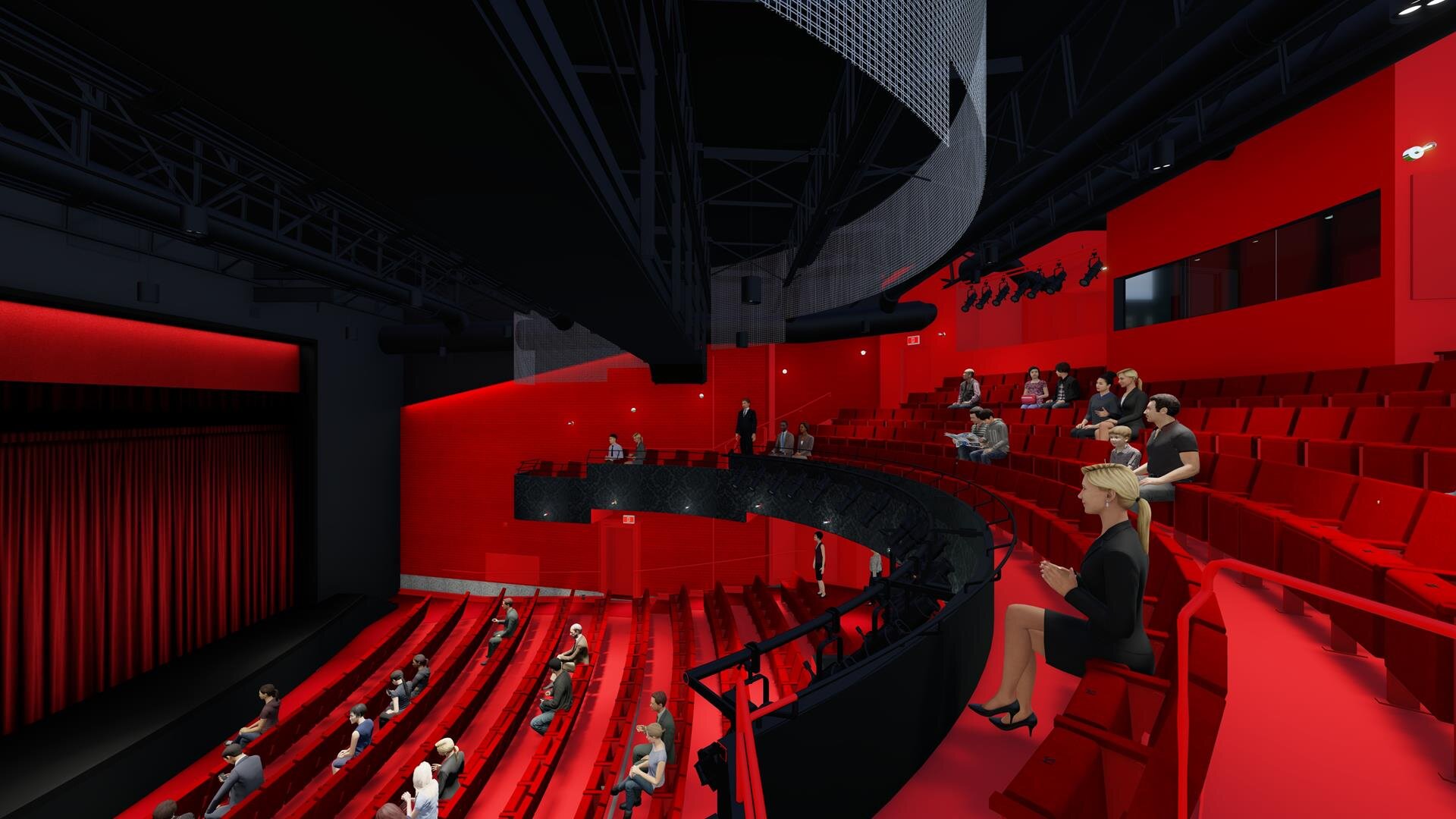
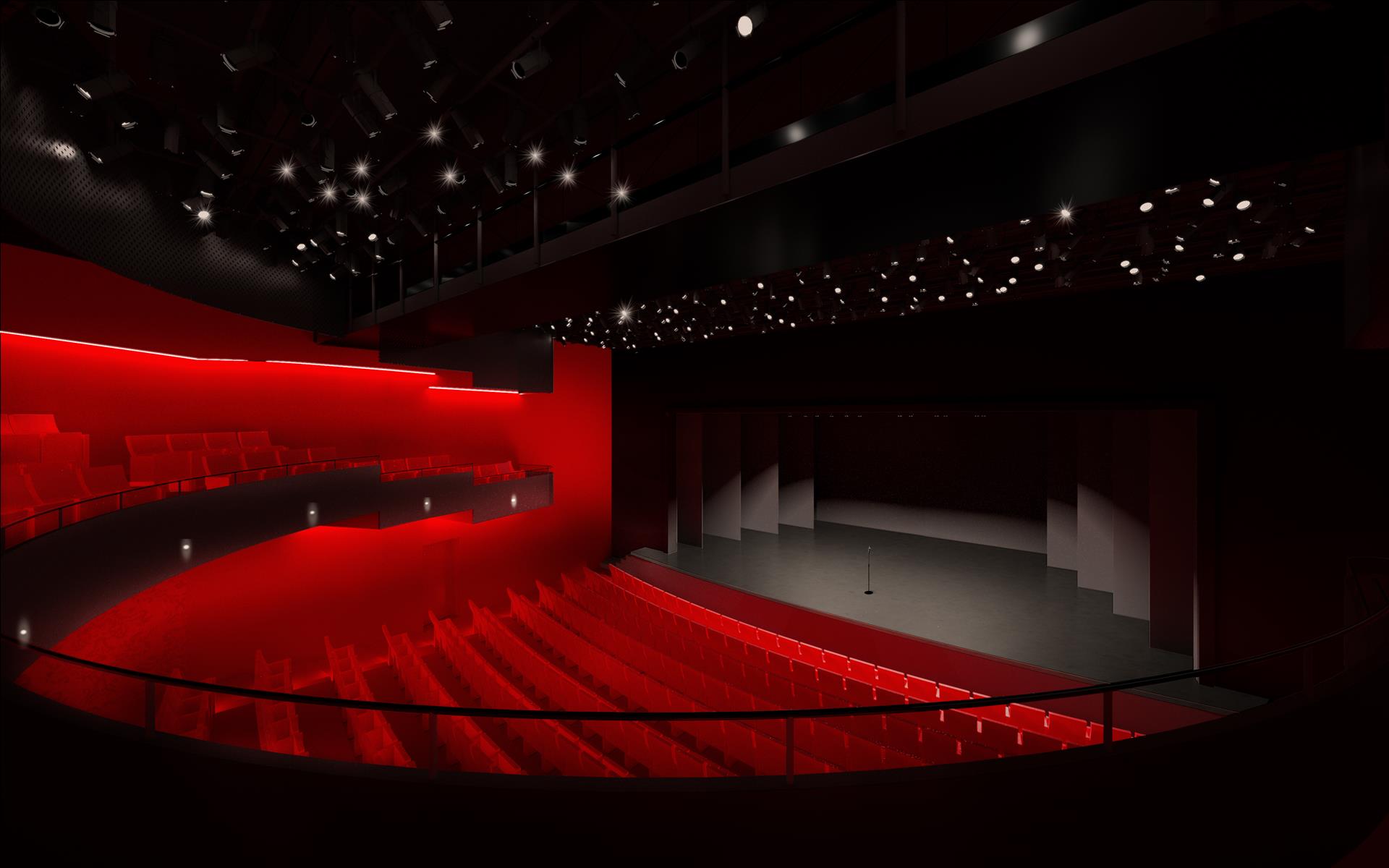
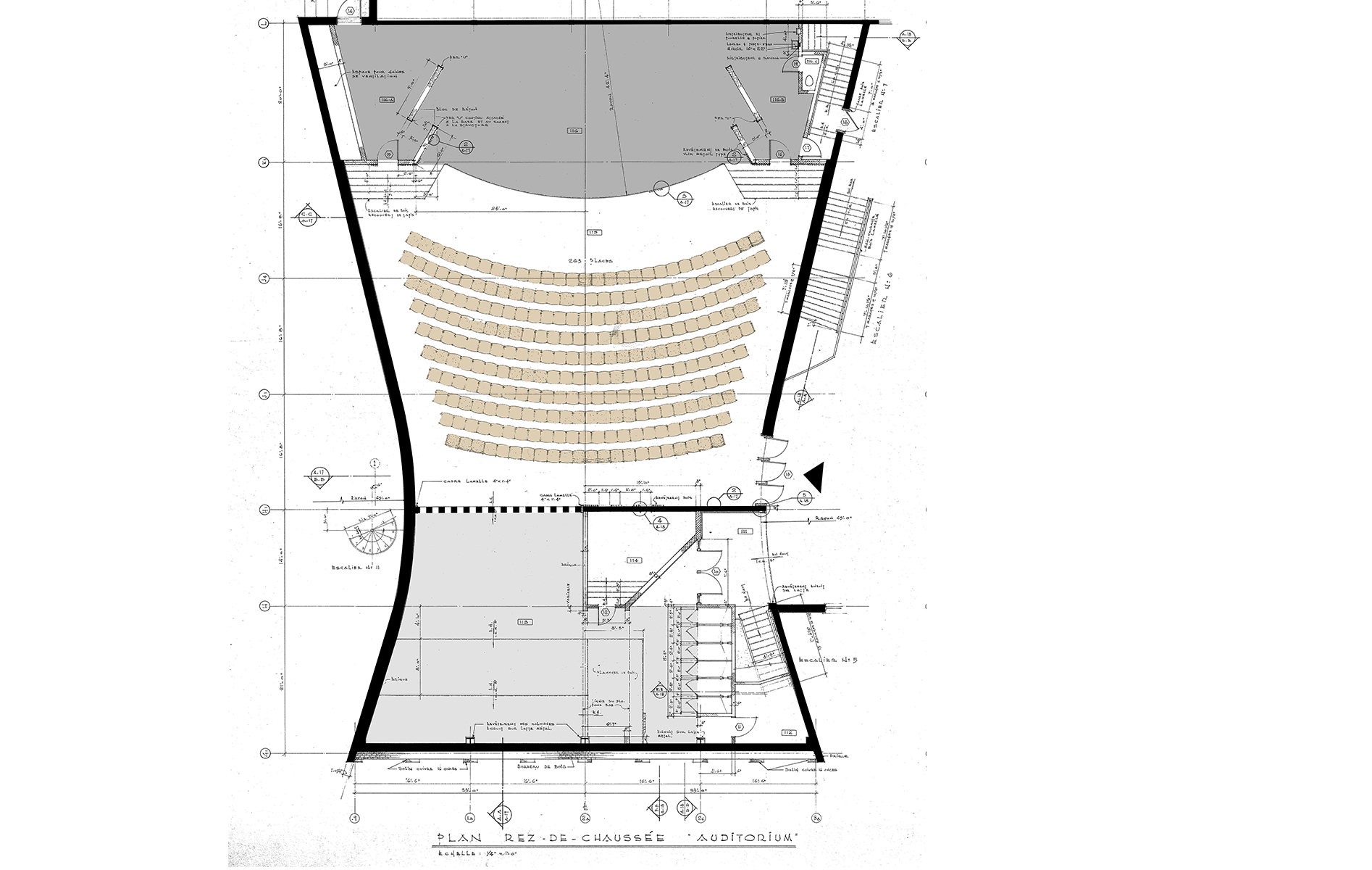
The auditorium renovation transforms the balcony in a horseshoe shape. That configuration creates an interaction between the public of the balcony and the orchestra.

Black and red colours create a dramatic mood appropriate for theatres. Point lights add glitter and emphasize the curved walls.


The Foyer Revisited

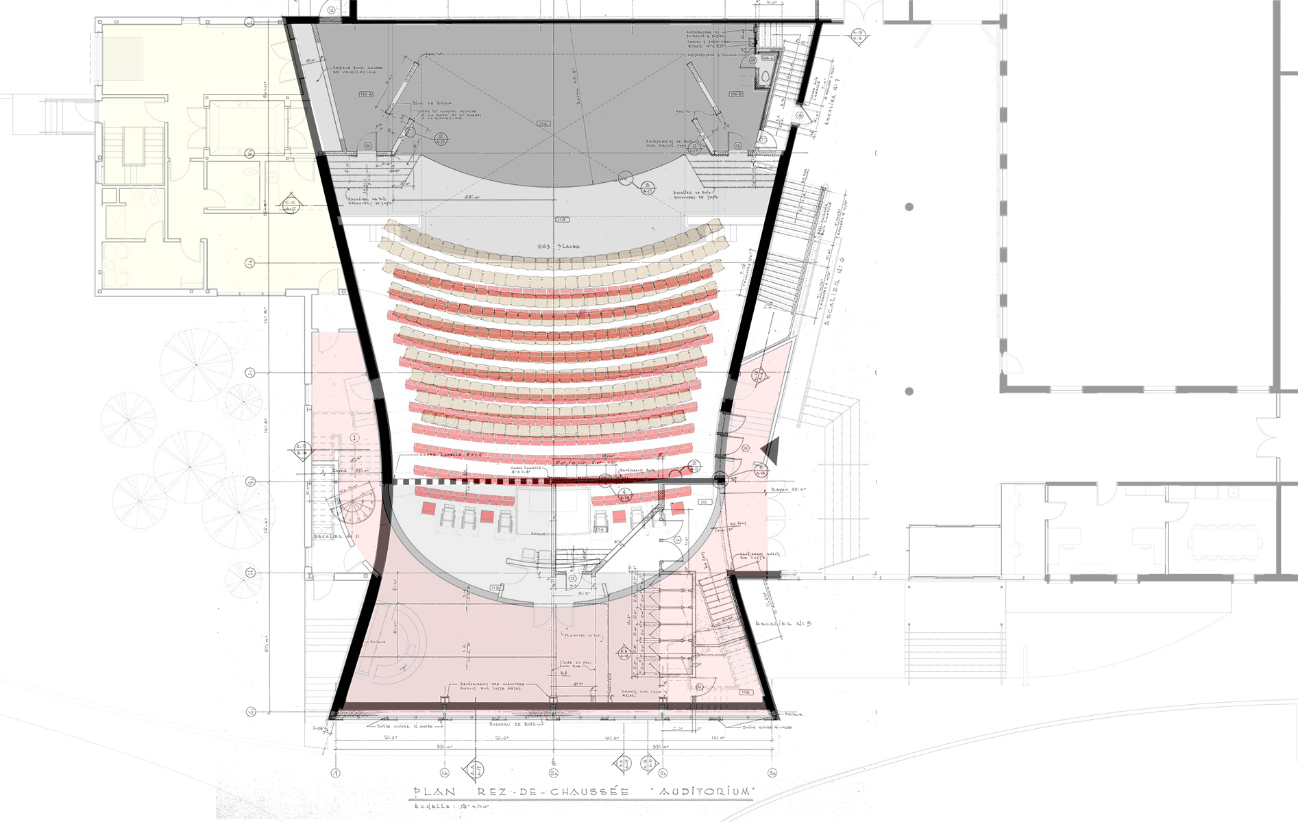
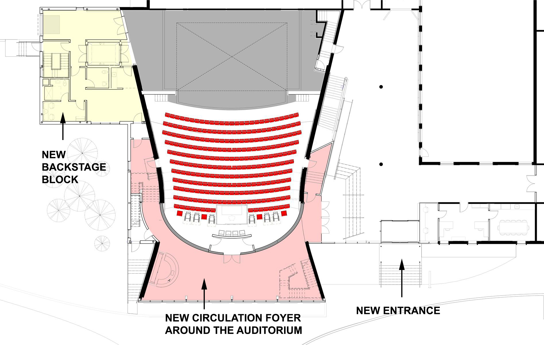
The foyer of the new theatre is twofold: it consists of a wide circulation space used by students to access the school cafeteria and a lobby that encircles the auditorium, separated by a glass partition.


From 1967 to 2019

What used to be an auditorium connected to a school like a classroom, becomes a building in its own right.

The entrance to the theatre is no longer shared with the school. A separate direct access is created beside the new glass wall.


The transformation of the plan

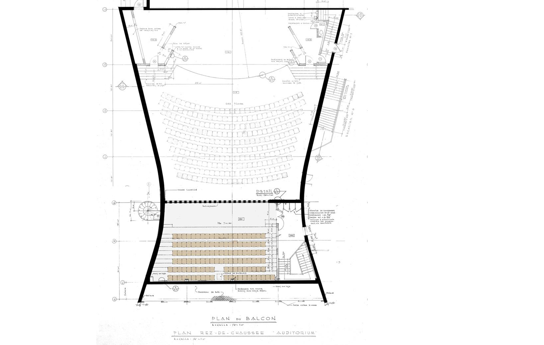
The existing plan undergoes a major transformation.


From Classroom to Horseshoe Balcony

From straight rows to horseshoe shape, the new balcony hugs the space and creates a centre. Its side arms create boxes that bring spectators closer to the stage and generate reciprocal views with the audience sitting in the orchestra seats below.


Adding Structure

To support the new floors and spaces, a steel structure is added inside and outside of the existing auditorium volume.


Project Team

Architect Paul Laurendeau | Poulin Laurin + Parent-Labelle | Architects in Joint Venture
Project Architect and Lead Designer Paul Laurendeau

Structural Engineering Latéral + DWB Consultants

Civil Engineering N Sigouin Infra-conseils

Mechanical/Electrical Engineering Pageau Morel

Theatre Consultant Guy Simard + Go multimédia

Acoustics Sonar

Code consultant Technorm

Project Management Ed Brunet


THEATREPaul Laurendeau
Agora des Arts
AGOR 2018-09-19 01 HD_J_1920x1080.jpg
 

AGORA DES ARTS

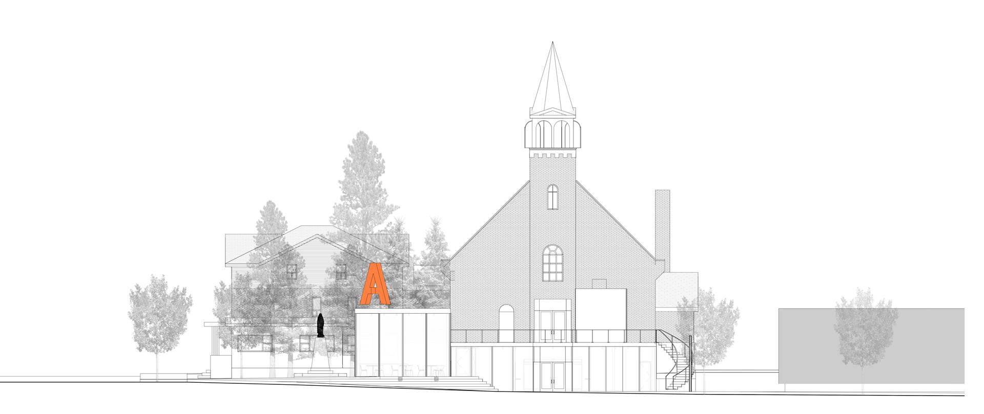
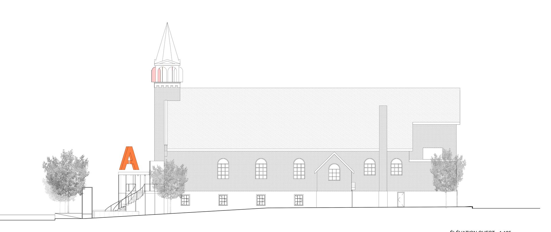
This project is a competition submittal for the recycling of a church into a new cultural centre in a Northern mining city of Quebec. The entrance at street level offers a transparent lobby with an inviting bar-cafe. The main performance space is housed in the former nave with new raked seating and cheerful colours.


Location 170, avenue Murdoch, Rouyn-Noranda, Quebec, Canada

Status Competition, Finalist 2018

Client Agora des Arts

Type Theatre, Performance, Cultural, Public

Building Area 2 080 m²

Seating Capacity 200


New Entrance and Cafe

A new contemporary glazed entry-hall-foyer is proposed at ground level with a setback from the street, creating a front terrace for people to gather.

The bar-cafe is located in a glass box that sits at the corner of the site. Topped with the company’s logo, its generates activity during the day. This is a new trend to maximize the use of theatres.

A series of point lights on the cafe ceiling creates a canopy like effect, with red glass panes associated with entertainment and pleasure.


The Foyer as a Gallery

The theatre’s foyer is a deambulation space linking the ticket booth, cloakroom and bar-café.

A door in the red wall gives access to the stair leading to the main performance space above.


The Auditorium in the Nave

Located in the nave of the former church, the auditorium is housed in a space with narrow proportions topped with a vaulted ceiling.

Red and black create a deep dramatic mood in the side aisles while a yellow and black printed image creates interest above, in the tradition of decorated ceilings often seen in more traditional theatres.


New Seating, Better Visibility

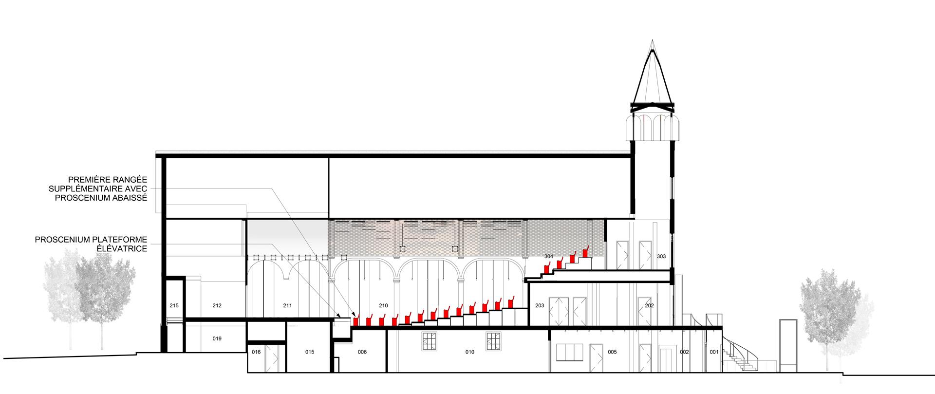
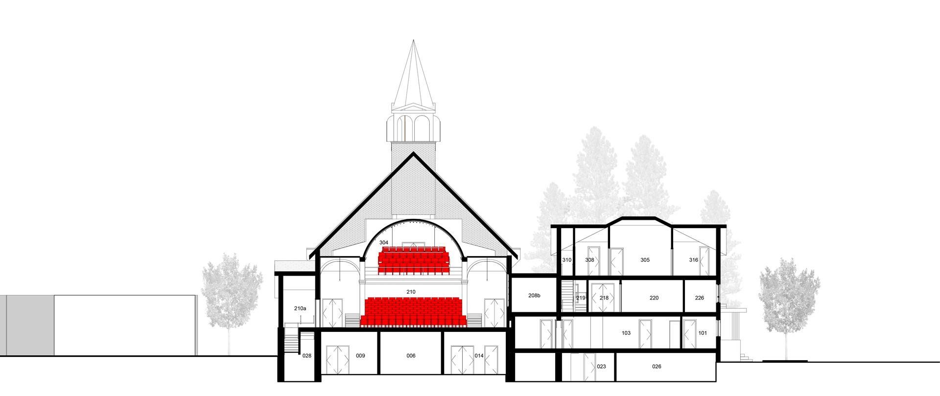
The cross section shows the new raked seating layout. To improve sightlines, a tiered disposition maximizes the visibility of the stage at the orchestra level as well as for the balcony.

The seating technology is based on a modular design with removable seats.

A cabaret configuration is thus possible with chairs and round tables.


Discreet Elements

The transformation keeps the church’s qualities while introduces contemporary elements that make it look and feel like a theatre.

The glass, the colours and the lighting bring new life to the building, making it the new home of the Agora of the Arts.


The Plans

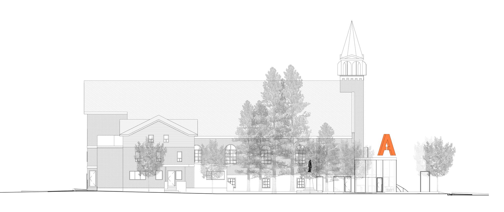
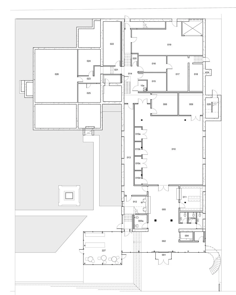
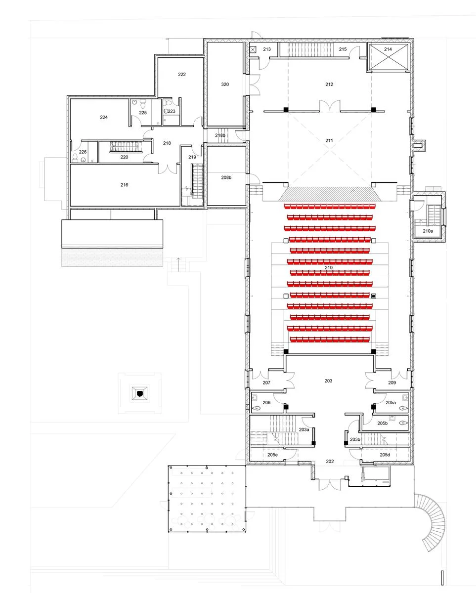
The spaces are organized along the central axis aligned with the bell tower to reinforce the church’s geometry and create easy flow.

The main auditorium with the stage is located in the former church nave on the main level, one storey above the street. Below the auditorium, the community hall becomes the rehearsal room that can also be used for receptions in connection with the foyer.

The presbytery is used to house the backstage and support spaces like the dressing rooms, the green room and storage.

The administation offices are located on a separate floor of that connected building.


Project Team

Architect Atelier Paul Laurendeau | Artcad | Architects in joint venture
Project Architect and Lead Designer Paul Laurendeau

Structural and Civil Engineering Latéral s.e.n.c. + DWB consultants

Mechanical/Electrical Engineering Pageau Morel and Associates

Theatre Consultant Guy Simard


Performance Stage & Pavilion

Photo Mélanie Dusseault


PERFORMANCE STAGE & PAVILION

A new stage along the Saint-Lawrence River reveals the magnificent scenery on the horizon. The white reflective roof creates a protective frame around the performers. The gazebo like structure becomes a belvedere and observation platform that draws the public closer to the water.


Location 12 090 Notre-Dame Street East, Montreal, Canada

Status Built 2018

Client City of Montreal

Type Theatre, Performance, Cultural, Public

Building Area 150 m²


A Significant Location

The pavilion is positioned at the intersection of paths the City of Montreal is creating along the shore line. It is designed as a destination and point of interest in the landscape. From one direction, the roof and columns create a frame towards the river. From another direction, its platform forms boardwalk that becomes an observation deck over a stone retaining wall.

Photos Adrien Williams


Music along the River

The pavilion is a public work financed by the City of Montreal to give local citizens access to the water. It serves as a stage for cultural events and performances during the summer months.

The white cylinder is a subtle while distinct insertion in the lush scenery.

Photos Adrien williams and Mélanie Dusseault


The Lighting

A series of recessed spot lights at the base of the columns illuminate the roof in a dramatic way.

Lights pointing up enhance height in any space, especially vertical element like columns.

Photos Adrien Williams

The Roof and the Horizon

The client was concerned about the pavilion interfering with the view on the river. In response, the roof height was set to match the horizon line.

During the winter, the pavilion is perceived as a delicate white structure along the shore.

Photo Ville de Montréal


The Materials

The base of the pavilion is made of exposed natural materials that keep their intrinsic qualities with time.

The columns and roof are made of steel structural elements and smooth aluminum cladding, painted in high gloss white. The top and bottom parts create a parallel composition, one linked with the terrain, the other with the horizon.

Photos Adrien Williams


Project Team

Architect Atelier Paul Laurendeau
Project Architect and Lead Designer Paul Laurendeau

Structural Engineering Latéral s.e.n.c.

Electrical Engineering Induktion

Theatre Consultant Mario Laliberté

General Contractor Arthier


Paul Laurendeau
Fashionlab Design Agency
 
Photo Marc Cramer

Photo Marc Cramer


FASHIONLAB DESIGN AGENCY

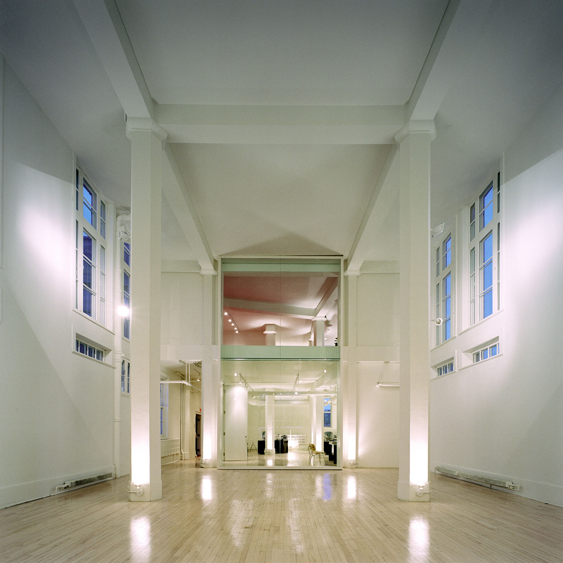
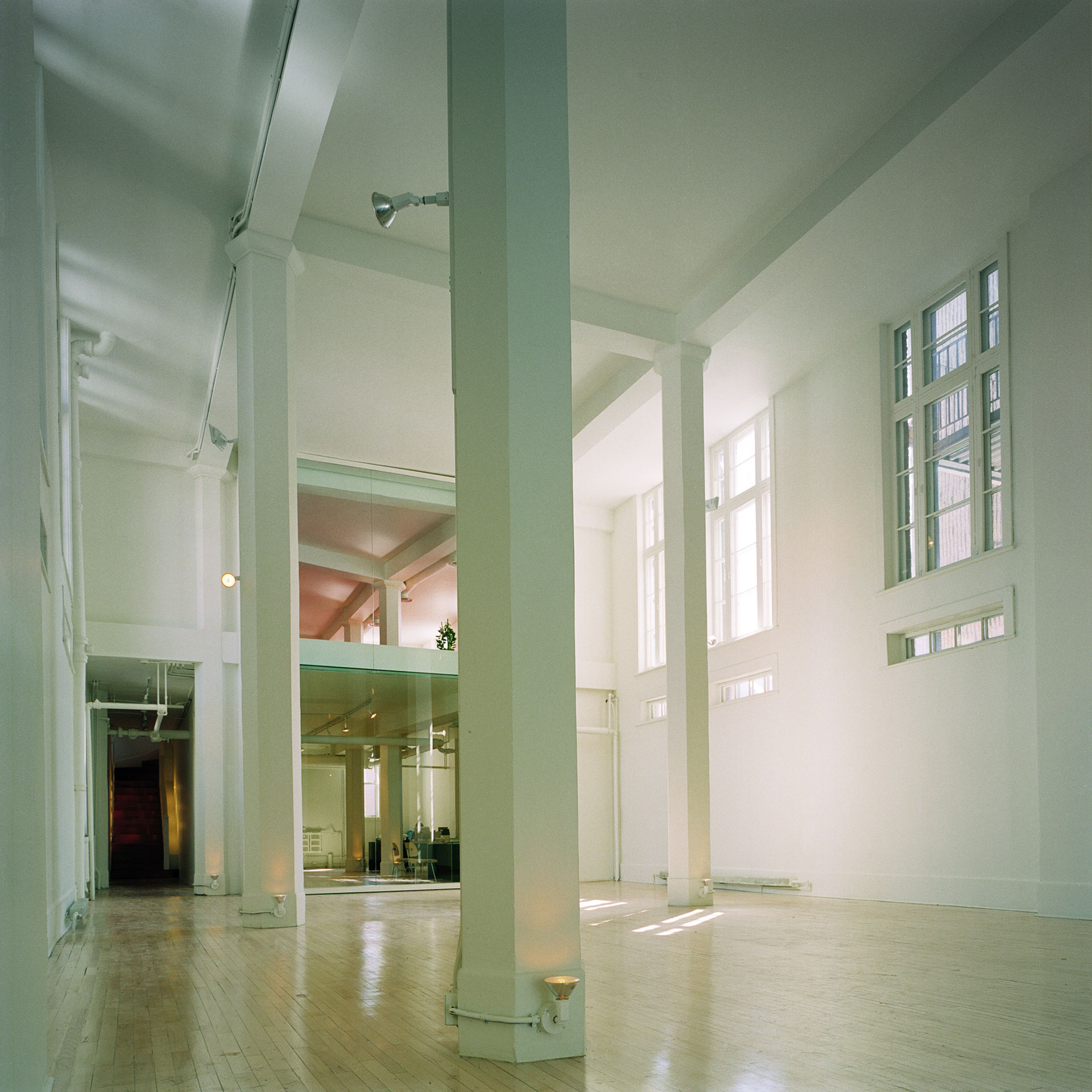
The recycling of a car showroom from bookshop, to arts centre to design office. A subtle architectural intervention values the space’s original qualities, a long gallery framed with columns in a white environment.


Location 314, Sherbrooke Street East, Montreal, Canada

Status Built 2001 - Demolished 2009

Client Chantal Gagnon

Type Office, Showroom, Gallery

Floor Area 460 m²


The Window

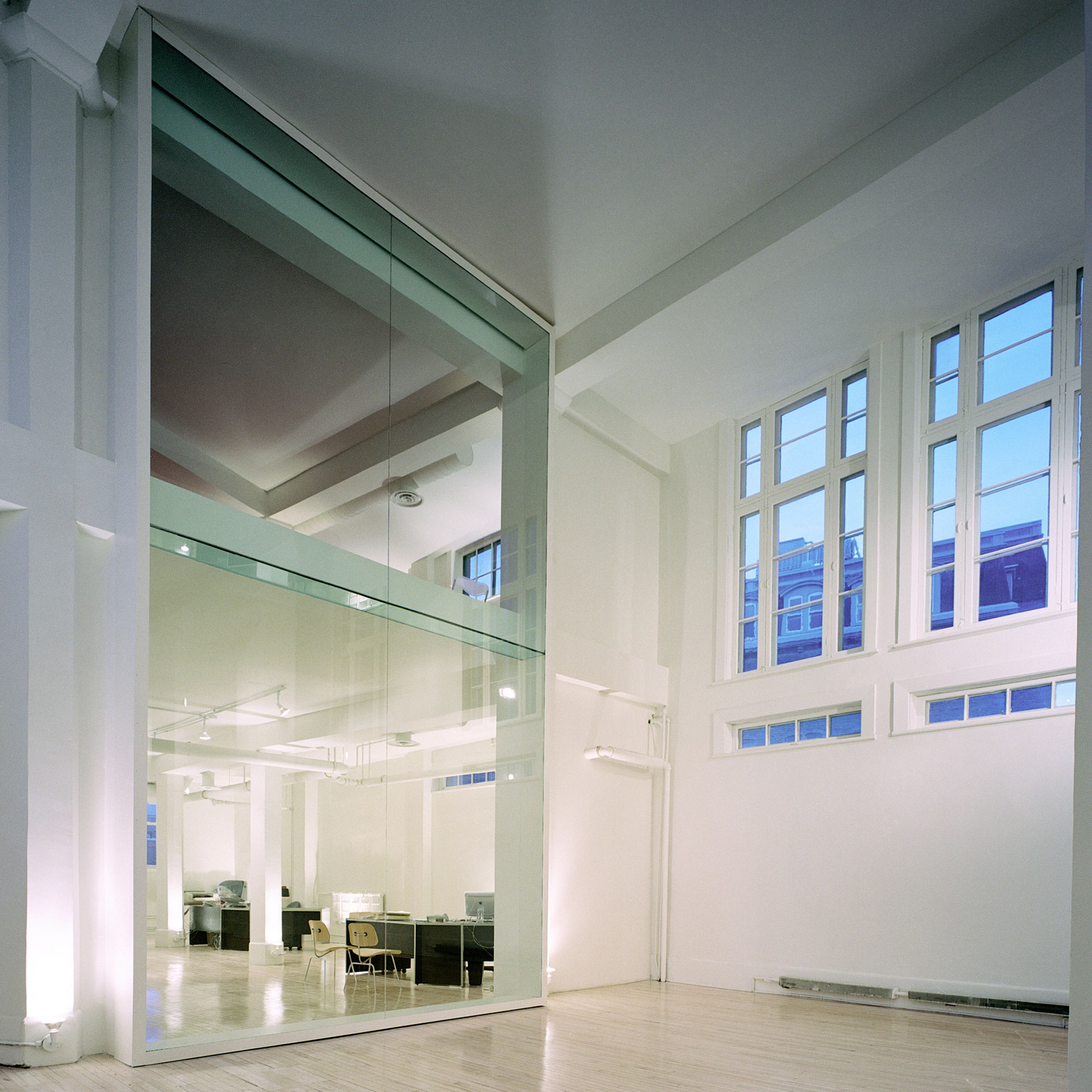
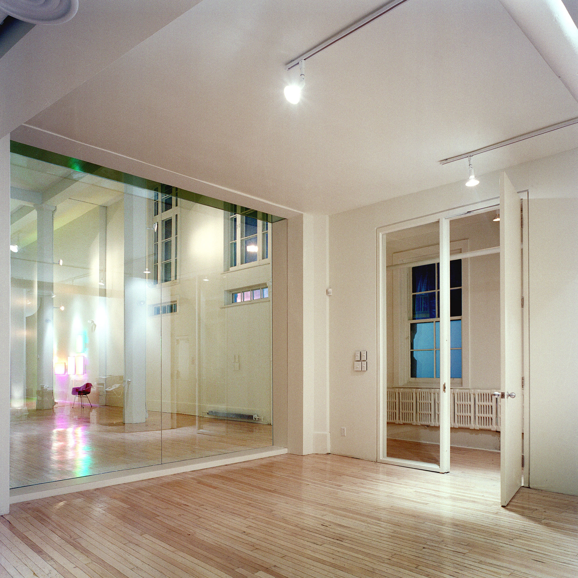
A new glass window creates a transparent surface between the front exhibition space and the administration offices split on two levels.

The transparency increases the space’s depth and reveals the closely spaced back columns that terminate the perspective.

There are no mullions between the glass panes to emphasize the frame.

Photos Marc Cramer


The Golden Section Proportion

Architecture is about proportion. We are concerned with the proportions of our bodies. Architecture is not different.

But what is the right proportion in architecture? The Golden Section defines a rectangle considered harmonious. Surprisingly, a Golden Section rectangle fits between the columns, from floor to ceiling. This is the proportion used for the new glass wall.


The Details

The archtectural feature of the project is the glass partition. The panes are joined with a silicone joint and laterally braced at mid height with a glass stiffener that connects the wall to the mezzanine.


Very Tall Washrooms

The washrooms take advantage of the exhibition hall’s ceiling height.

Unexpected, it is a surprise to enter a small shaft to take care of private business.


The Red Floor

It is one thing to have a red floor. It is another to discover how it makes the ceiling appear pink. Pink was not intended but became part of the project.

White surfaces are great to diffuse ambient colours. They make the columns become discreet silhouettes.


The Lighting

The lighting in the washroom is made of a series of type traditional bulbs screwed in a dissimulated socket located in a built-in steel case.

Intended for fashion conscious people, this simple design is based on the dressing room principle seen in theatres. The face must be evenly lit.


The Solid Handrail

Solid handrails are best. They ground you with the building.

In the case of Fashionlab, they are made of a solid steel bar of 32 mm diameter — as opposed to most handrails made from hollow tubes.

The steel’s mass can be felt at the touch. The grip feels secure. The sound is muted.

FASH-dessin-détail-main-courante.jpg
 

The Montreal Gazette

FASH 2003 Abel 2_1804x1200.jpg
 

Project Team

Architect Paul Laurendeau

Structural Engineering NCK

Mechanical/Electrical Engineering BPA

General Contractor Yergeau Cart Construction


Paul LaurendeauMONTREAL
Alphonse Desjardins Theatre
REPT 01 2018-04-17_ I_1920x1080.jpg
 

Alphonse Desjardins Theatre

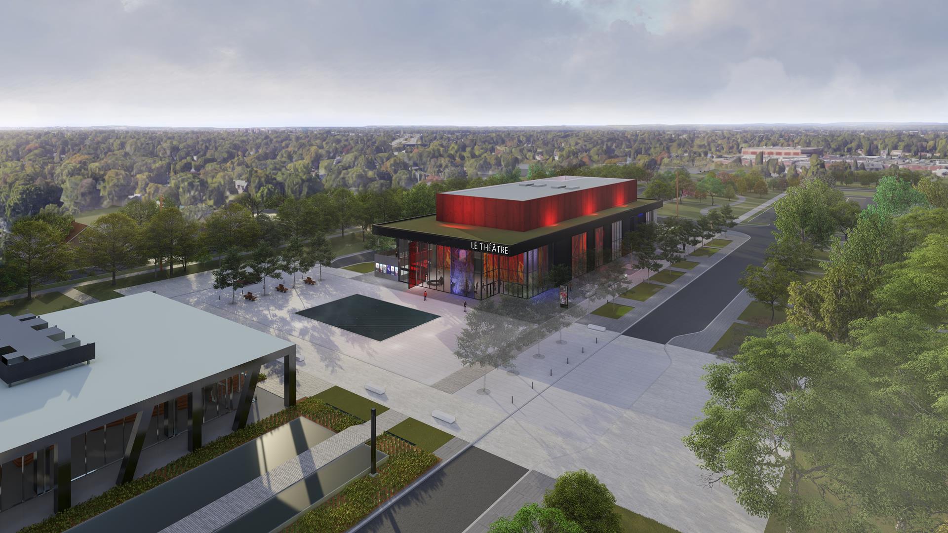
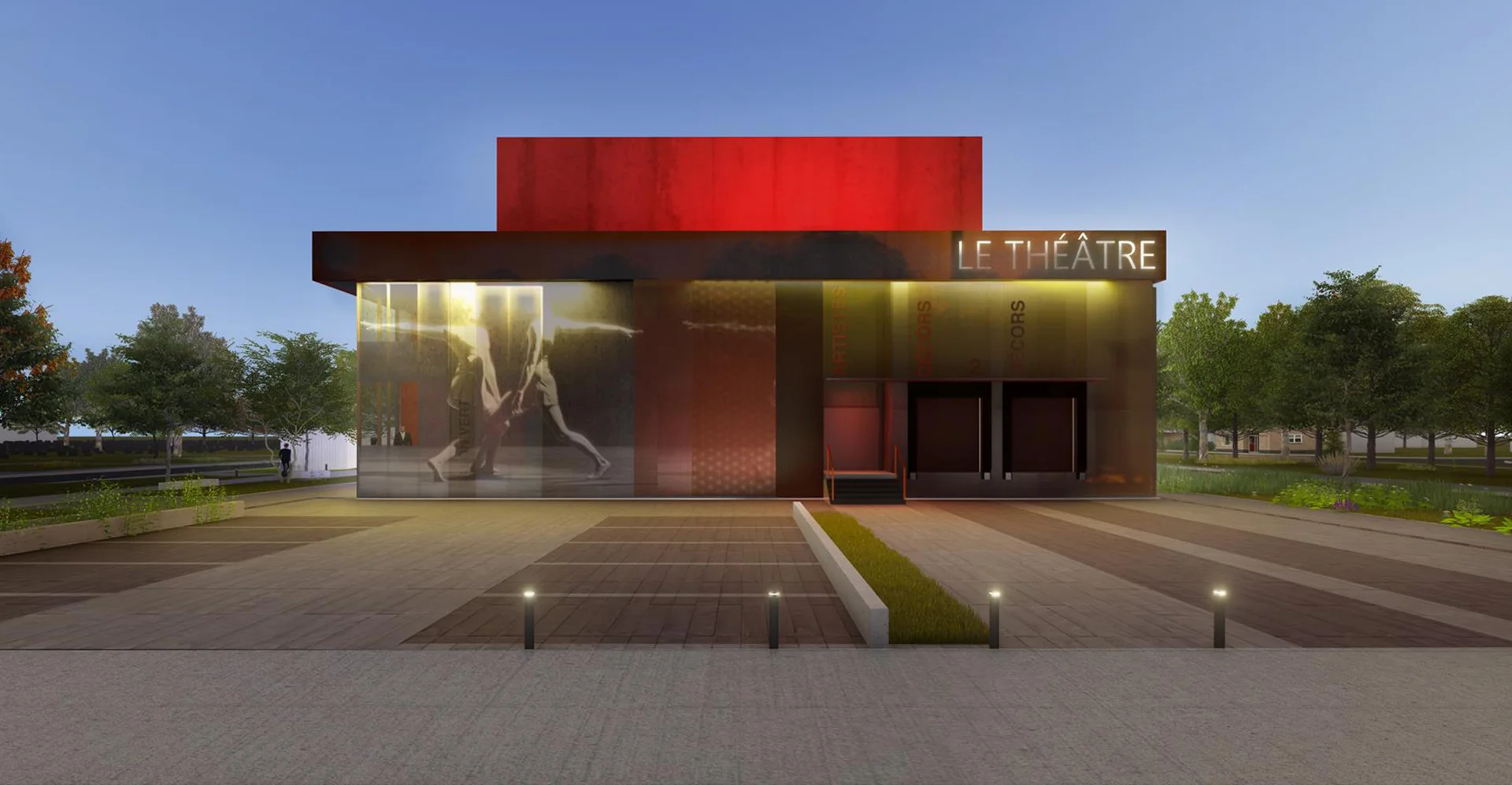
The Alphonse Desjardins Theatre is a competition submittal that proposes a black symmetrical theatre on an open site to form a composition with an existing Arts Center. A plaza between the buildings serves as a gathering space for this new cultural hub.

Location 25, allée de la Création, Repentigny, Quebec, Canada

Status 2018 Competition (Finalist)

Client Repentigny City

Type Theatre, Performance, Cultural, Public

Building Area 2 800 m²
Seating Capacity 275 to 400 according to seating configuration


A Symetrical Composition

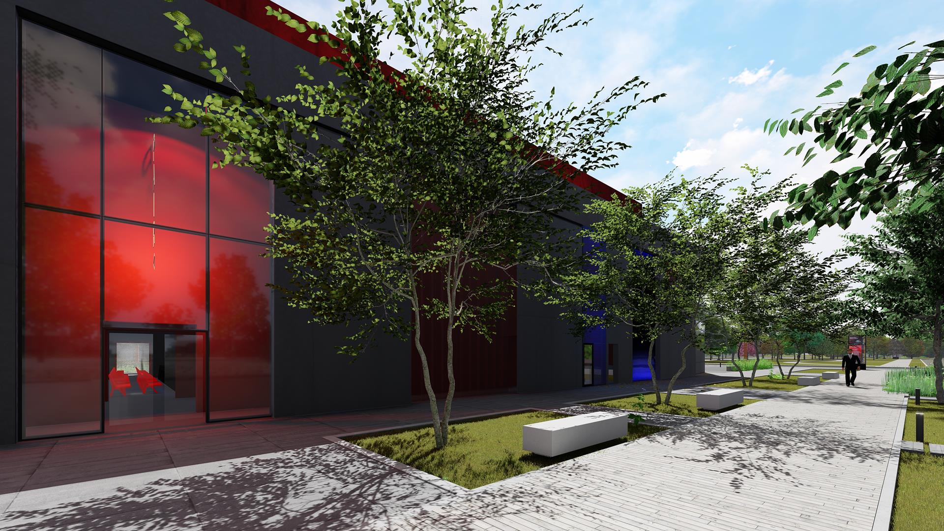
A thick black roof, glass curtain walls, translucid images and a bloody red box with a mysterious hole in its centre confirm that the building is a theatre.


The Auditorium

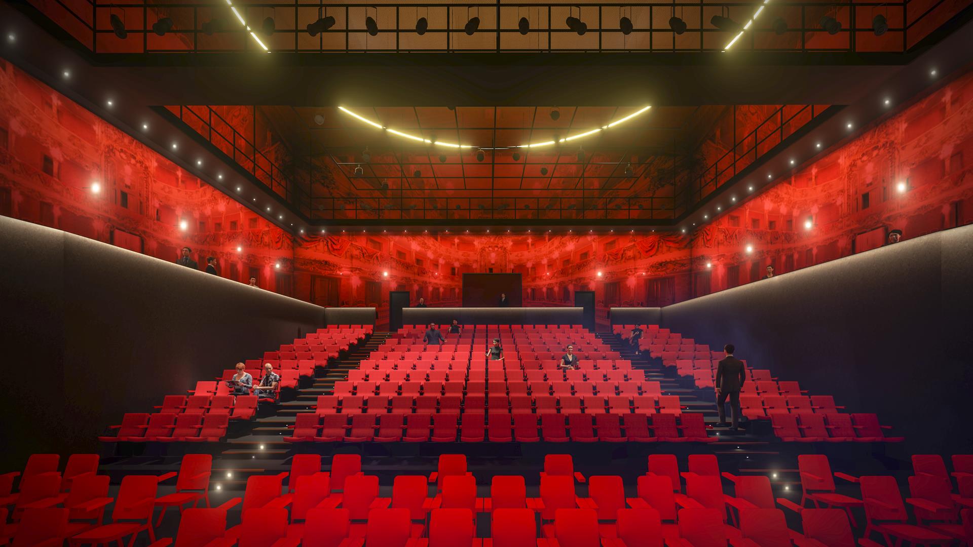
The project proposes a warm while entertainment space, what people come to expect in a theatre. Mixing traditional colours, cherry red and deep black to create contrast and drama, it is about comfort and excitement.


The Foyer

The roof is designed in reference to a canopy in the tradition of theatres. A series of lights create glitter.

At night, the translucent purple character and the interior wall with a printed velvet curtain show the building’s identity on the plaza and invite the public to come in.


The Facades: a Box within a Box

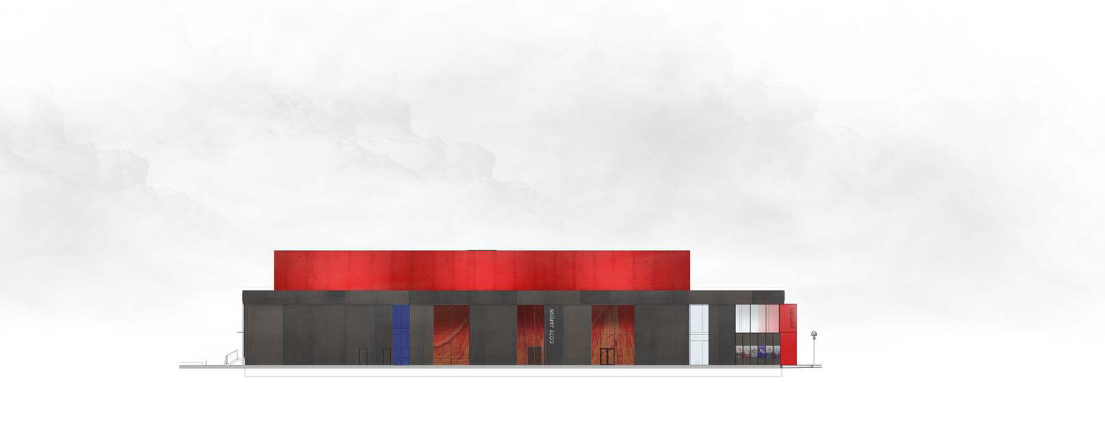
The building being on an open site, all facades are created equal with varying degrees of transparency.

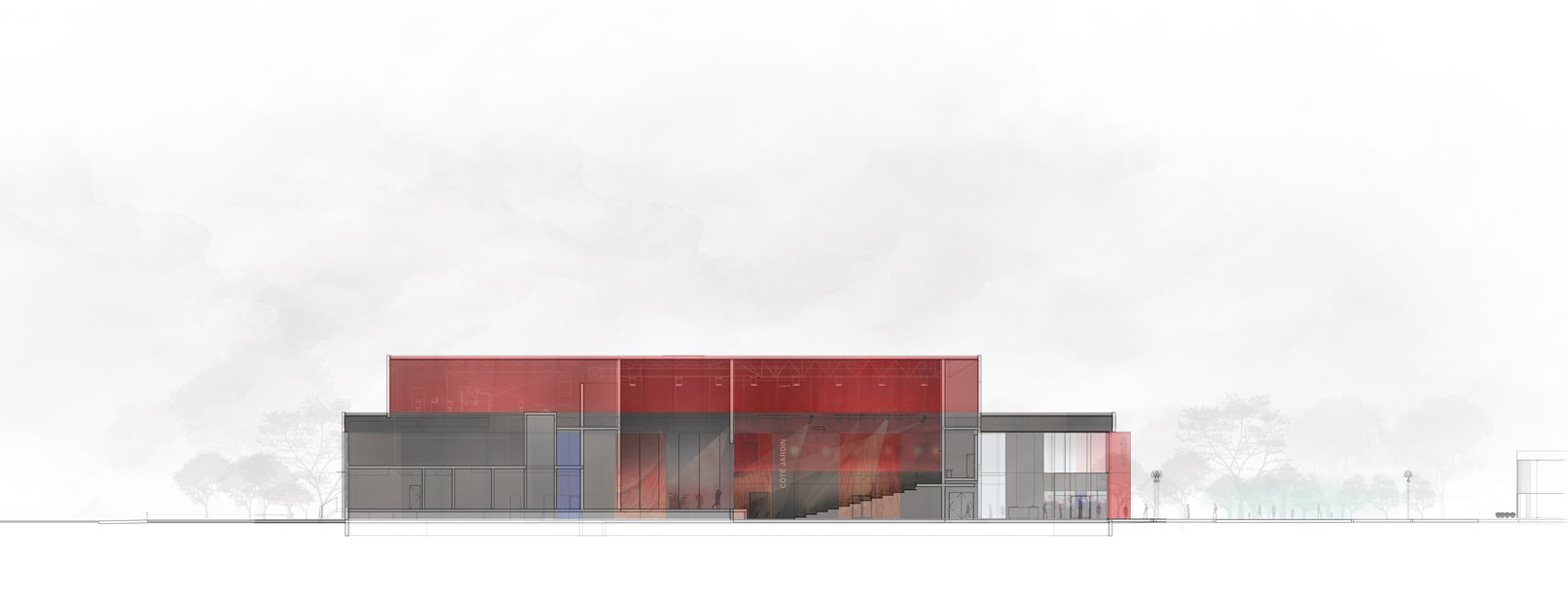
The circulation spaces form a loop between the black outer volume and the interior red volume containing the auditorium and stage.


The Plans

The plan must be clear and efficient to allow a theatre to function properly.

A circulation circles around the stage and auditorium volume. On the left side of the plan are the backstage spaces, on the right side, the foyer and the plaza.


Structure

A conventional steel structure rests on pile foundations. Roof girders are designed to frame the central spaces without columns.

REPT-axo-structure_1791x1200.jpg
 

Project Team

Architect Atelier Paul Laurendeau + DKA Architectes
Project Architect and Lead Designer Paul Laurendeau

Landscape Architect Projet Paysage

Structural Engineering Latéral + DWB Consultants

Mechanical/Electrical Engineering SNC-Lavalin

Theatre Consultant Guy Simard

Cost Consultant Legico-CHP


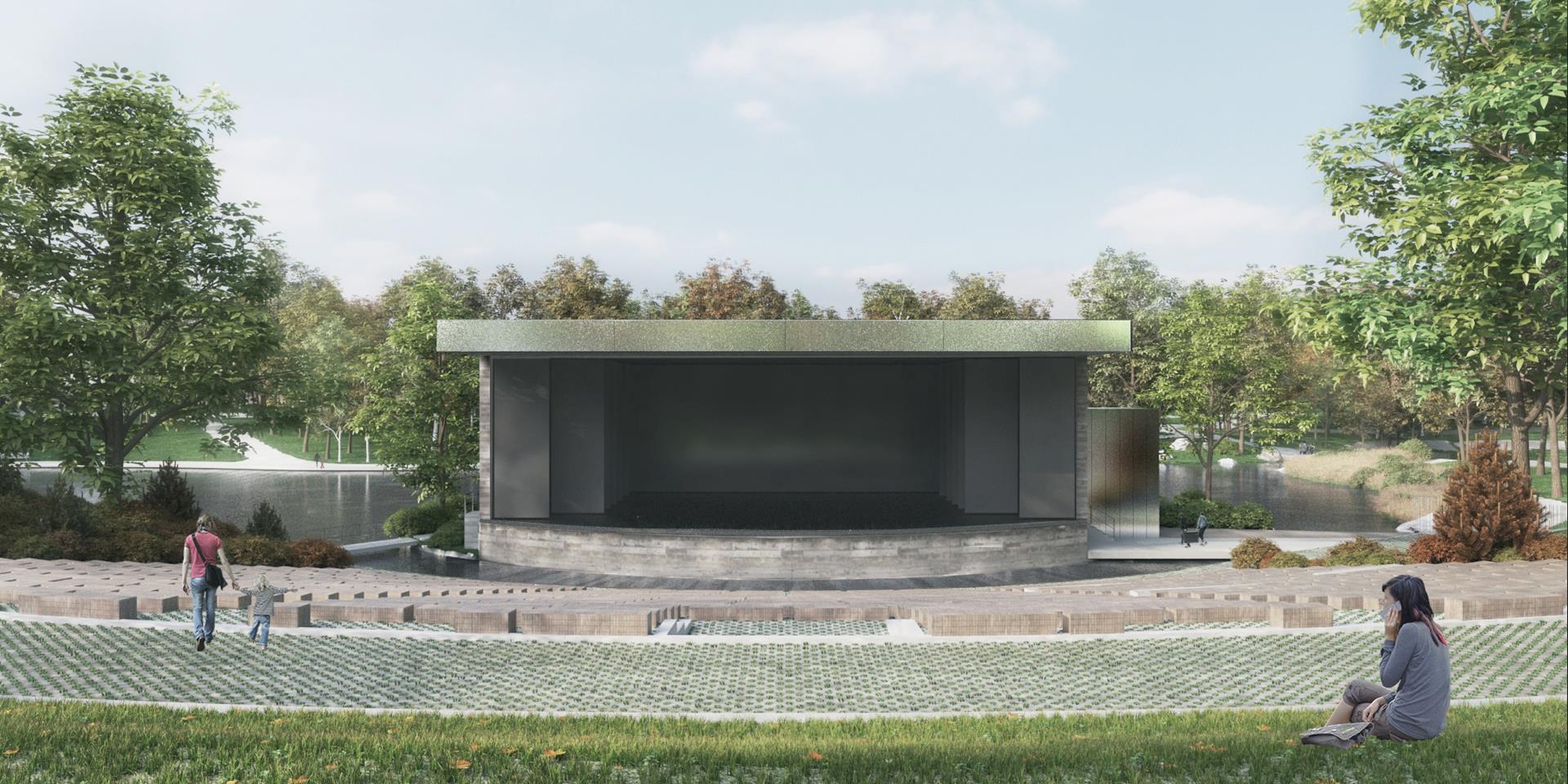
Théâtre de Verdure
THVD vue gradin - hors-saison_1920x960.jpg
 

Open Air Theatre

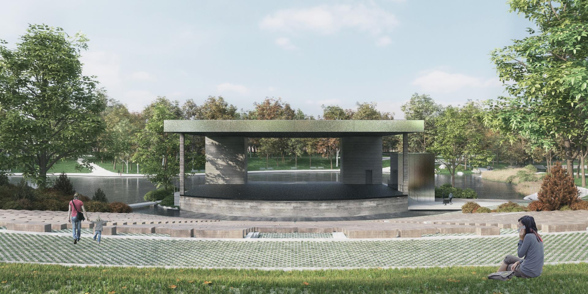
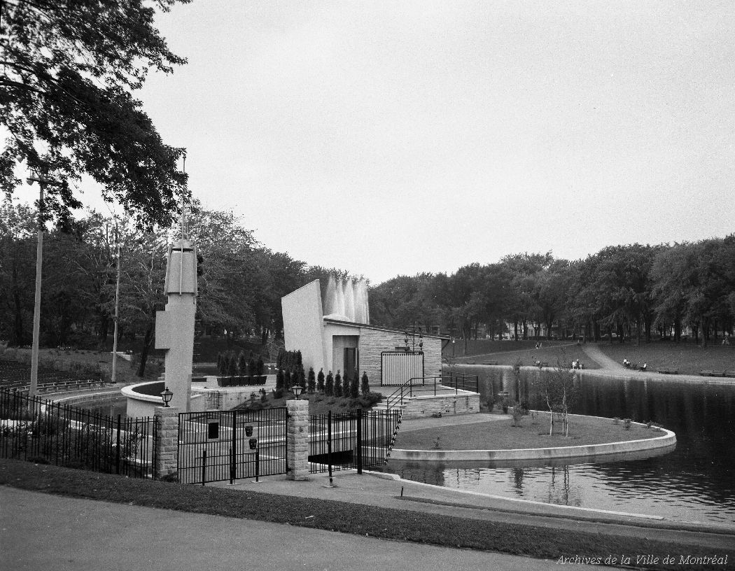
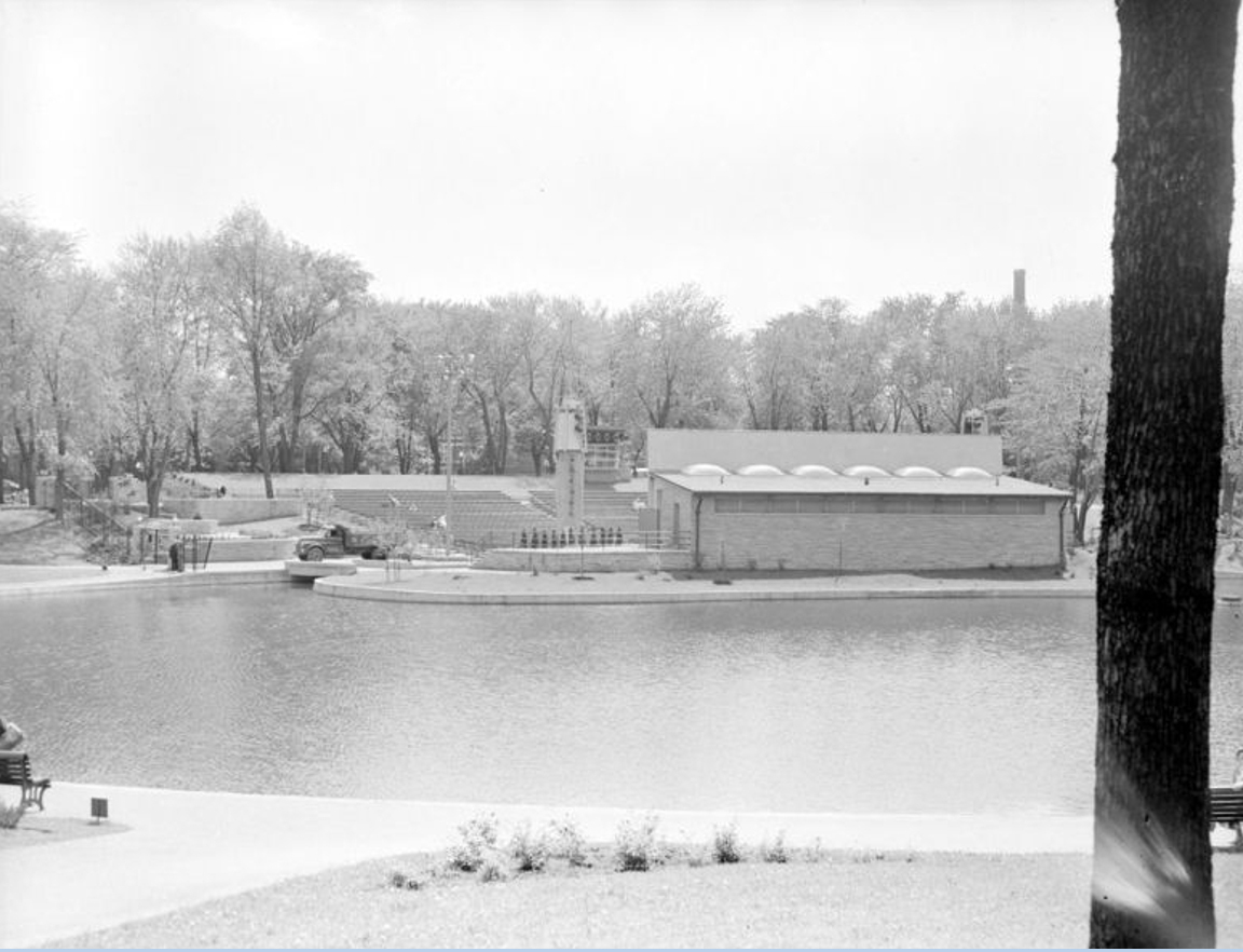
The “Théâtre de Verdure” is an existing open air amphitheatre located in the La Fontaine Park in Montreal. It is in need of renovation and updating. Designed in 1956 as an outdoor cinema, its programing has shifted towards dance and comedy. The stage must be increased in size, there must be a permanent roof to suspend the props, it must also integrate in the landscape of the park.

Location 4020, avenue du Parc-La Fontaine, Montréal, Canada

Status Feasibility study 2016

Client City of Montreal

Type Theatre, Performance, Cultural, Public

Site Area 2 800 m²

Seating Capacity 3 000


The Stage and the Park

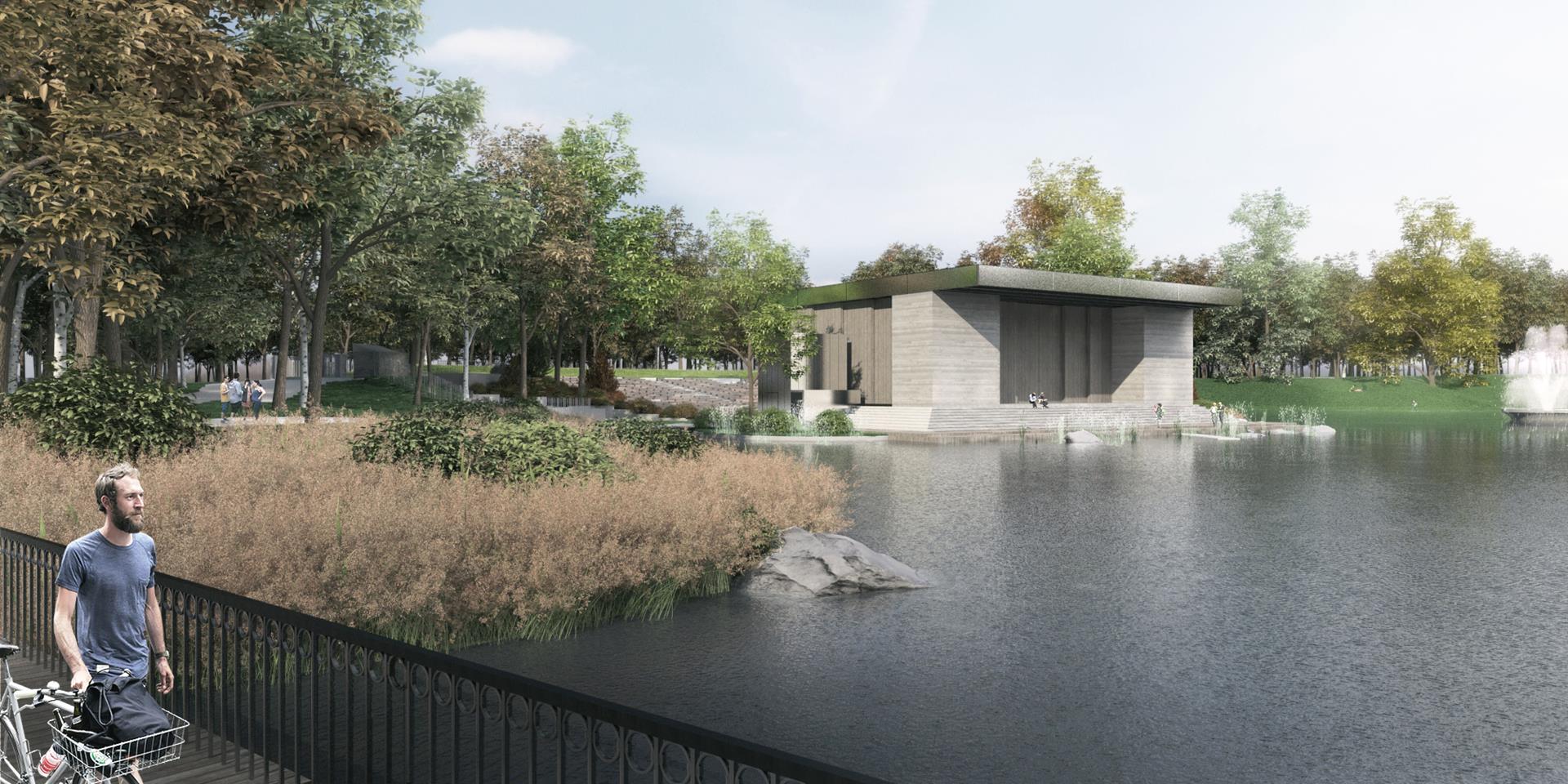
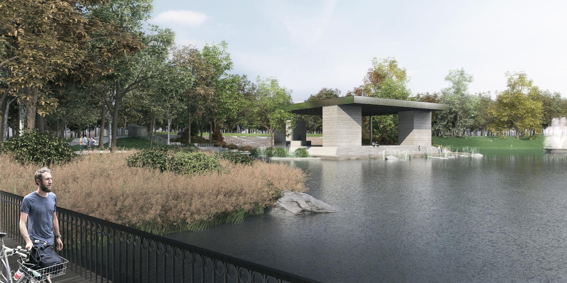
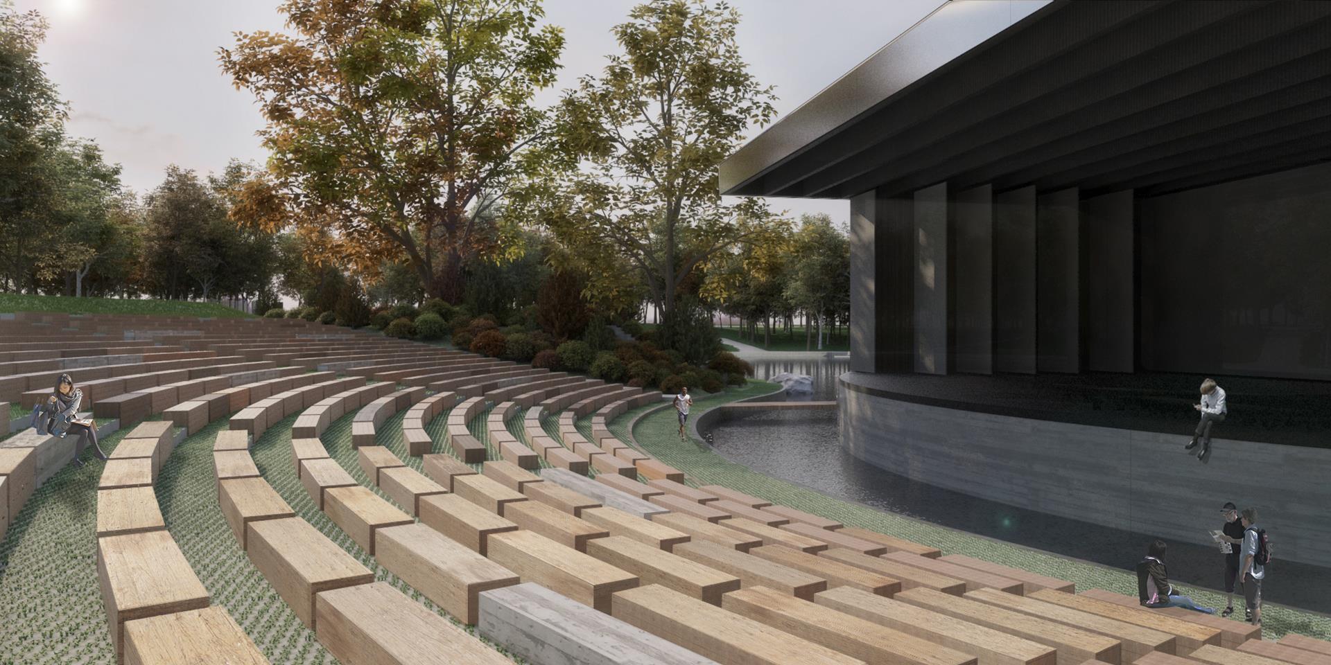
The proposed stage, used for 3 months of the year for shows, is equipped with sliding back and side panels to make it an accessible pavilion during the remaining 9 months.

The stage’s backdrop was originally a projection screen for movies.


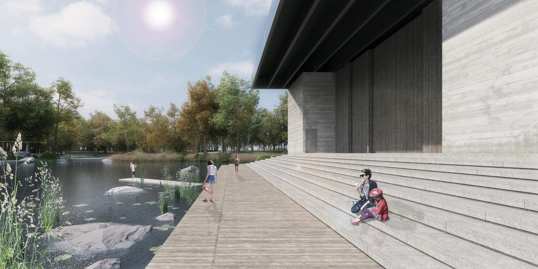
An Island that becomes a Boardwalk

Built on an artificial island, the original stage of 1956 turned its back on the lake.

The new stage is designed as a park pavilion and esplanade that gives access to the water.


A Flexible Stage

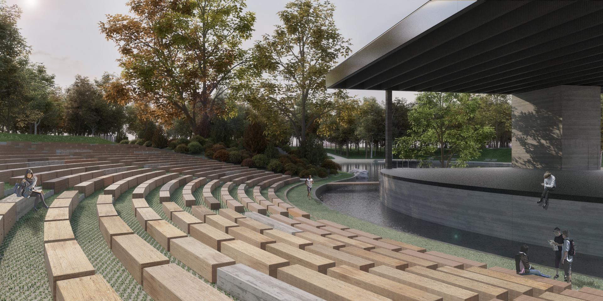
The new proposed stage is designed as a platform with a roof supported by two columns and two technical cores that store a series of sliding panels.

The panels allow to close the back and sides of the play area for shows.

The stage island is linked with the existing path network. It is no longer a barrier, but becomes part of the landscape.

THVD-Gif-animé-(axonométrie)_LR.gif

The cross section shows the evolution of the amphitheatre, from the original 1956 design, to the 2004 adaptation, to the 2016 proposal.


The Seats

The purpose of the renovation is to make the amphitheatre accessible and inviting throughout the year. The agora must allow a crowd to attend a show.

Rows of wood blocks laid in an arc pattern create a series of steps and surfaces to sit and rest. There are no backrests to allow people to hop from one row to another.

The original stage was much smaller. It had an orchestra pit and two side towers for projector lights and speakers.


Closing the Loop

The renovation of the open air amphitheatre makes it an all year pavillon. The island is made accessible.

The theatre functions are located under the stage to free the views and be secure.

THVD-Gif-anime-(sentier)_LR.gif
 

The Plan

The Theatre de Verdure is similar to the Cogeco amphitheatre project in scale. The seating capacity of 3 000 (including the lawn) is similar to the total seating of 3 500. The stage of this project accepts smaller shows and does not have the technical capacities of the Cogeco.

This building is expected to blend in the landscape rather than being an urban landmark.


Project Team

Architect Atelier Paul Laurendeau
Project Architect and Lead Designer Paul Laurendeau

Theatre Consultant Guy Simard


Drolet-Villeneuve Housing
 

DROLET VILLENEUVE HOUSING

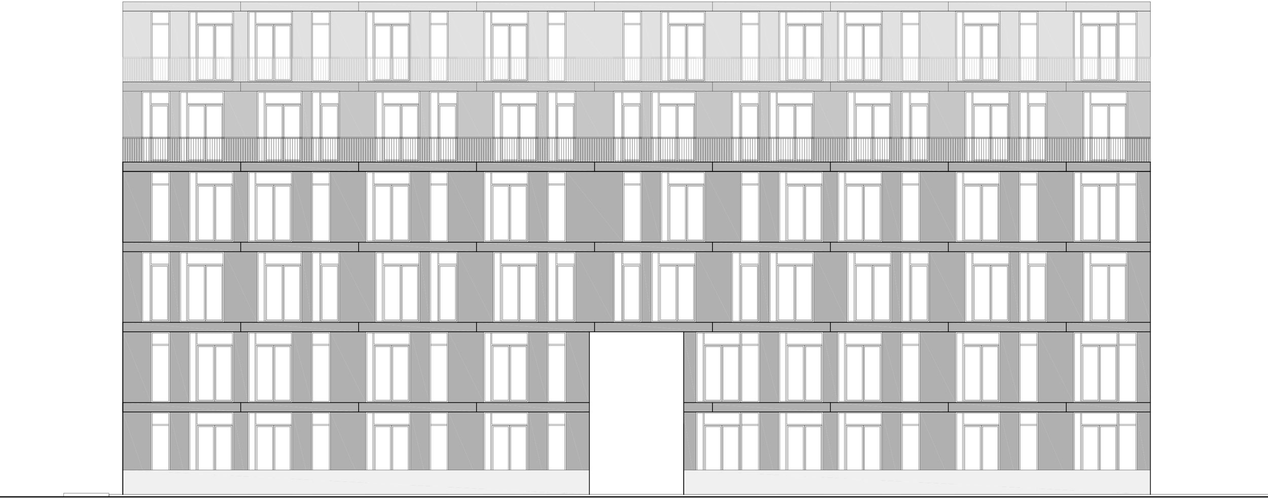
This housing project densifies a central borough of Montreal by proposing a building twice the allowed height. The 6 storey building has recessed upper floors as seen in New York City and Paris to let light in and offer balconies. A wood fence creates a privacy wall at street level. A double height central gateway leads to the central courtyard.


Location 4680, Drolet Street, Montreal, Canada

Status Unbuilt, Urban Study 2010

Type Housing, Private

Land Area 1013 m²

Building Area 3 690 m²

Building Height 20 m²

Number of Housing Units 34

Density 3.64


The Megabloc and the Haussmanian influence

The design is inspired from European housing models that create density and street presence with brick and stone. The idea is to have a mass along the street and an inner court for the residents that brings in light.

The clear geometry, high ceilings and vertical proportions are praised in this contemporary interpretation.


The Courtyard and the Balconies

The courtyard gives two opposing facades to most dwellings. It allows for cross ventilation and light to enter the apartments.

The long and narrow balconies are designed as an extension of the interior spaces.


The Floor Plan

The plan is a grid of 8 squares measuring 10 x 10 meters each. Two inner squares are void and represent the court.

Each dwelling occupies one or two squares. The slenderness of the volume allows to have windows in each room, including kitchen and bathroom.

DRVI plan niv3.jpg
 

The Dwelling

The plan of a corner dwelling is laid out on 2 floors with an interior stair. In lieu of views insite the court, its corner position provides windows on two perpendicular exterior walls.

logm DRVI vue int-128.jpg
 

The Facades

The simple rectangular geometry is reflected in the facade composition. Tall vertical proportions alternate between fill and void, between glass and brick.


The Materials

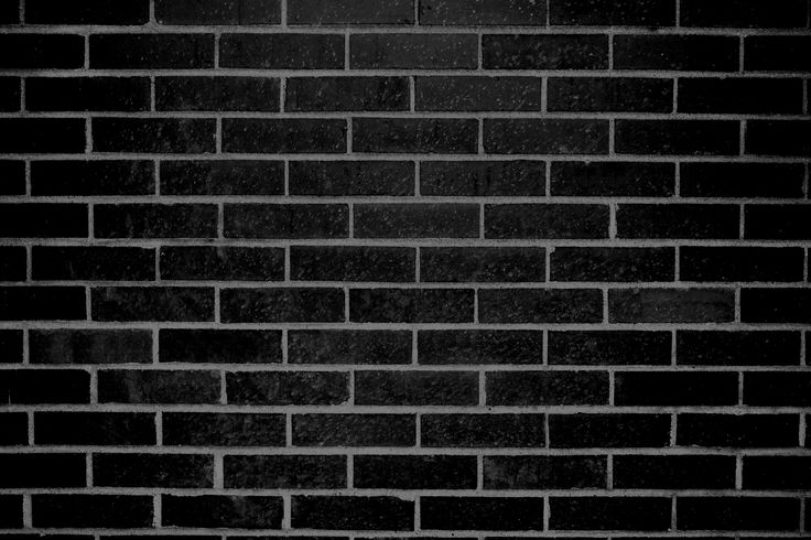
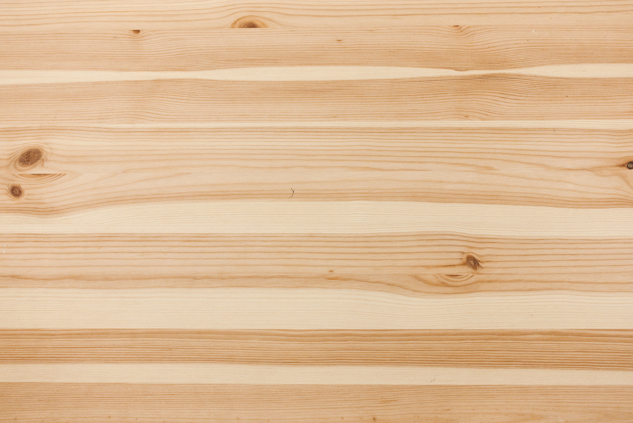
We love our buildings for what they are made of. Brick, concrete, glass and wood make up the solid surfaces that ground the daily experience in a soft aging materiality.


Paul Laurendeau
Event Scenography
Photo Marc Gibert

Photo Marc Gibert


DESERT - EVENT DESIGN

Location Incinérateur des Carrières, Montreal, Quebec, Canada

Status Completed 2004 and removed (temporary event)

Client Champ Libre

Type Theatre, Performance, Cultural, Public

Occupied Area 7 000 m²


The Visitor’s Walk

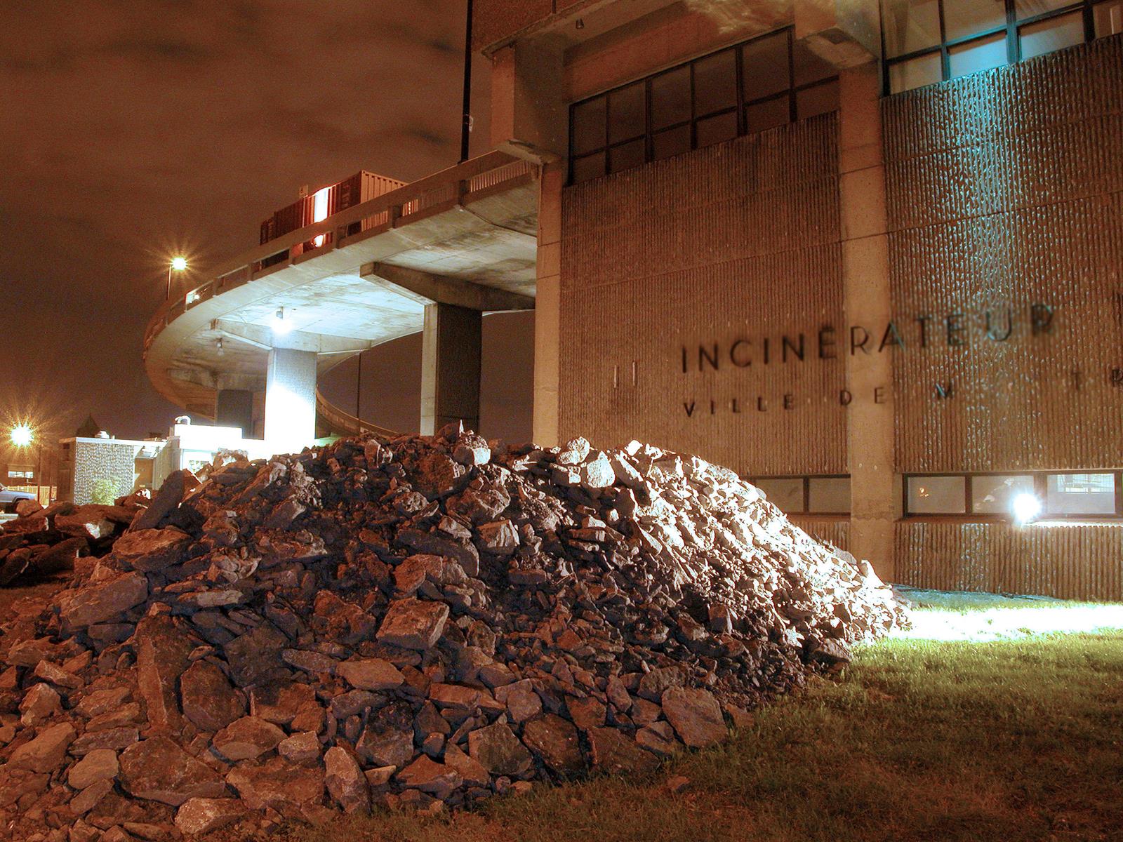
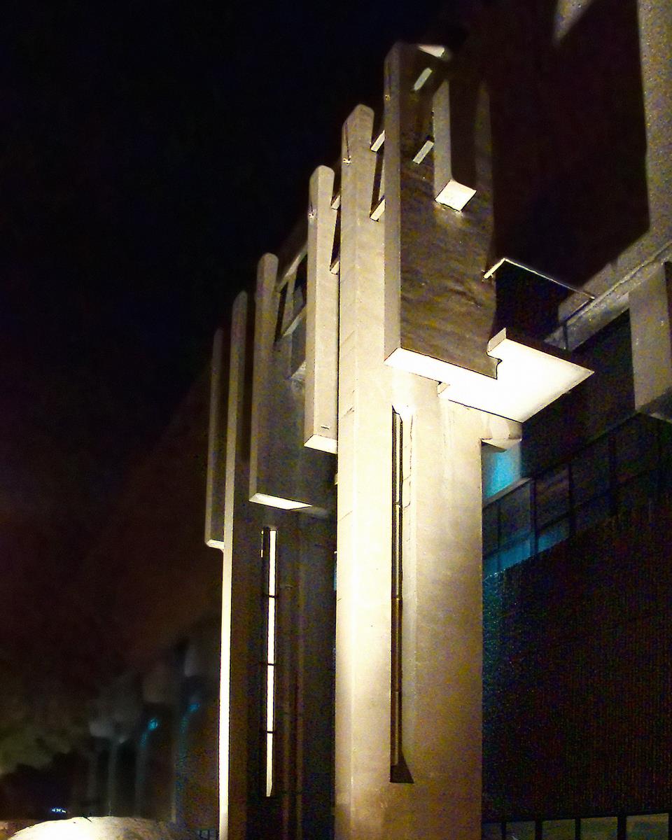
The event is designed to view video artworks in a decommissioned incinerator, making architecture part of the experience.

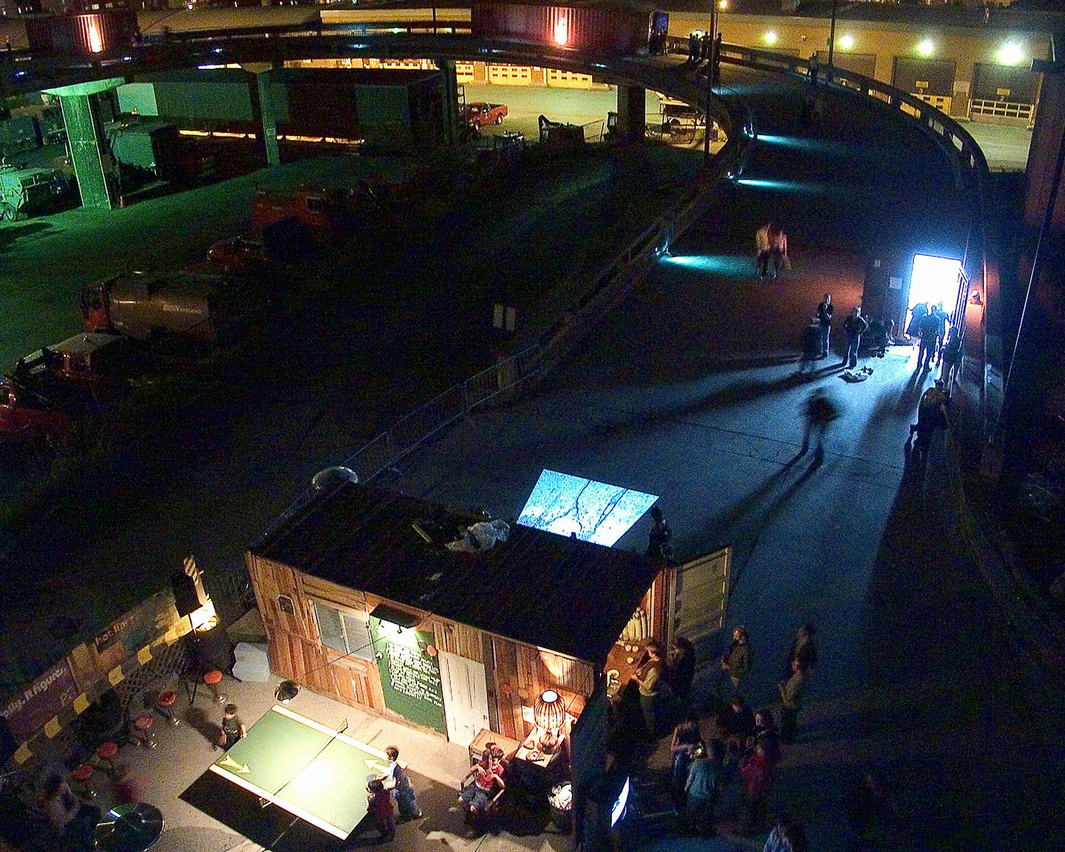
The layout creates a path between different zones of the site and links inside and outside spaces of the imposing building.

Photo Marc Gibert


The Lighting of the Concrete

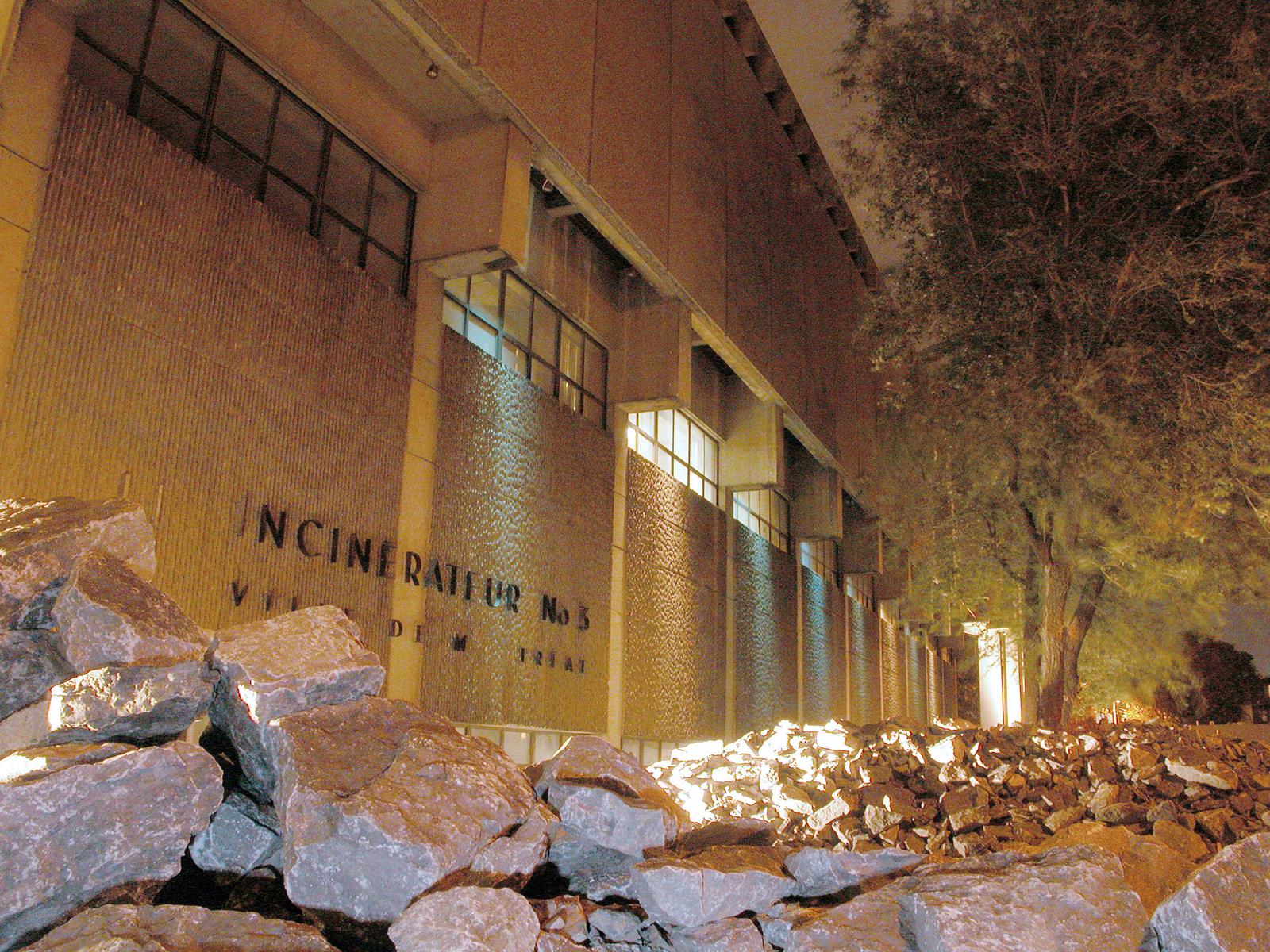
The incinerator is a concrete volume with monumental spaces and a spiraling ramp for the trucks to access the upper floor and dispose of their load. The most effective way to give life to a building is to light its walls with different colours and emphasize its shapes and textures.

A pile of rocks designed by vlan paysages is meant to evoke urban construction and the rocks that were formerly extracted from the site.

Photos Marc Gibert


The Ramp and the Containers

Steel containers house individual video installations, laying out the event on the site and linking the spaces together.

Photos Marc Gibert

dsrt mg03 DSCN6968_1500x1200.jpg
dsrt mg02 DSCN6248_1600x1200.jpg
 

The Screens

The major interior spaces were used to project artworks. The artist Isabelle Hayeur emphasized the perspective of a tunnel with a screen showing an infinite path to an imaginary landscape.

Photos Marc Gibert

dsrt mg07 DSCN6559_1600x1200.jpg
 

Press Articles


Invitation Flyer

pe05 desert_1581x1188.jpg


Project Team

Architect Paul Laurendeau

Electrical Engineering Dupras Ledoux